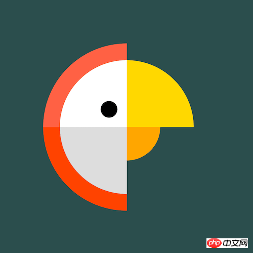
How to use pure CSS to achieve the effect of cartoon parrot
This article mainly introduces how to use pure CSS to achieve the effect of cartoon parrots. It has certain reference value. Now I share it with you. Friends in need can refer to it
Source code download
Please download all the source code of the daily front-end practical series from github:
https://github.com/comehope/front-end-daily-challenges
Code Interpretation
Define dom, the container contains 3 sub-elements:
<p>
    </p><p></p>
    <p></p>
    <p></p>
Centered display:
body {
    margin: 0;
    height: 100vh;
    display: flex;
    align-items: center;
    justify-content: center;
    background-color: darkslategray;
}Define container size:
.parrot {
    width: 10em;
    height: 10em;
    font-size: 30px;
}Draw the feathers on the parrot’s head:
.parrot {
    position: relative;
    display: flex;
    align-items: center;
    justify-content: center;
}

.parrot .outer {
    position: absolute;
    width: 100%;
    height: 100%;
    border: 1em solid;
    border-color: transparent transparent orangered tomato;
    border-radius: 50%;
}Draw the parrot’s head and the upper part of its beak:
.parrot .middle {
    position: absolute;
    width: 80%;
    height: 80%;
    border: 4em solid;
    border-color: gold transparent gainsboro white;
    border-radius: 50%;
}Draw the lower part of the parrot’s beak:
.parrot .inner {
    position: absolute;
    width: 40%;
    height: 40%;
    border: 2em solid;
    border-color: transparent orange transparent transparent;
    border-radius: 50%;
}Use pseudo elements to draw the parrot’s eyes:
.parrot .inner::before {
    content: '';
    position: absolute;
    width: 1em;
    height: 1em;
    background-color: black;
    border-radius: 50%;
    left: -2em;
    top: -0.5em;
}Turn the picture to the right side:
.parrot > * {
    transform: rotate(45deg);
}Set the mouse hover effect, and the parrot’s head turns to the other side when hovering:
.parrot > * {
    transition: 0.5s;
}

.parrot:hover .outer {
    transform: rotate(225deg);
    border-color: transparent transparent tomato orangered;
}

.parrot:hover .middle {
    transform: rotate(calc(225deg - 360deg));
    border-color: transparent gold white gainsboro;
}

.parrot:hover .inner {
    transform: rotate(135deg);
}Finally, modify the color of the parrot when hovering:
.parrot:hover .outer {
    border-color: transparent transparent lightseagreen darkcyan;
}

.parrot:hover .middle {
    border-color: transparent gold white gainsboro;
}

.parrot:hover .inner {
    border-color: transparent orange transparent transparent;
}You’re done!
The above is the entire content of this article. I hope it will be helpful to everyone's study. For more related content, please pay attention to the PHP Chinese website!
Related recommendations:
How to use CSS to implement the effect of a single element dot matrix loader
The above is the detailed content of How to use pure CSS to achieve the effect of cartoon parrot. For more information, please follow other related articles on the PHP Chinese website!

Hot AI Tools

Undresser.AI Undress
AI-powered app for creating realistic nude photos

AI Clothes Remover
Online AI tool for removing clothes from photos.

Undress AI Tool
Undress images for free

Clothoff.io
AI clothes remover

Video Face Swap
Swap faces in any video effortlessly with our completely free AI face swap tool!

Hot Article

Hot Tools

Notepad++7.3.1
Easy-to-use and free code editor

SublimeText3 Chinese version
Chinese version, very easy to use

Zend Studio 13.0.1
Powerful PHP integrated development environment

Dreamweaver CS6
Visual web development tools

SublimeText3 Mac version
God-level code editing software (SublimeText3)

Hot Topics
 How to use bootstrap in vue
Apr 07, 2025 pm 11:33 PM
Using Bootstrap in Vue.js is divided into five steps: Install Bootstrap. Import Bootstrap in main.js. Use the Bootstrap component directly in the template. Optional: Custom style. Optional: Use plug-ins.
 The Roles of HTML, CSS, and JavaScript: Core Responsibilities
Apr 08, 2025 pm 07:05 PM
HTML defines the web structure, CSS is responsible for style and layout, and JavaScript gives dynamic interaction. The three perform their duties in web development and jointly build a colorful website.
 How to write split lines on bootstrap
Apr 07, 2025 pm 03:12 PM
There are two ways to create a Bootstrap split line: using the tag, which creates a horizontal split line. Use the CSS border property to create custom style split lines.
 Understanding HTML, CSS, and JavaScript: A Beginner's Guide
Apr 12, 2025 am 12:02 AM
WebdevelopmentreliesonHTML,CSS,andJavaScript:1)HTMLstructurescontent,2)CSSstylesit,and3)JavaScriptaddsinteractivity,formingthebasisofmodernwebexperiences.
 What Does H5 Refer To? Exploring the Context
Apr 12, 2025 am 12:03 AM
H5referstoHTML5,apivotaltechnologyinwebdevelopment.1)HTML5introducesnewelementsandAPIsforrich,dynamicwebapplications.2)Itsupportsmultimediawithoutplugins,enhancinguserexperienceacrossdevices.3)SemanticelementsimprovecontentstructureandSEO.4)H5'srespo
 How to insert pictures on bootstrap
Apr 07, 2025 pm 03:30 PM
There are several ways to insert images in Bootstrap: insert images directly, using the HTML img tag. With the Bootstrap image component, you can provide responsive images and more styles. Set the image size, use the img-fluid class to make the image adaptable. Set the border, using the img-bordered class. Set the rounded corners and use the img-rounded class. Set the shadow, use the shadow class. Resize and position the image, using CSS style. Using the background image, use the background-image CSS property.
 How to use bootstrap button
Apr 07, 2025 pm 03:09 PM
How to use the Bootstrap button? Introduce Bootstrap CSS to create button elements and add Bootstrap button class to add button text
 How to set up the framework for bootstrap
Apr 07, 2025 pm 03:27 PM
To set up the Bootstrap framework, you need to follow these steps: 1. Reference the Bootstrap file via CDN; 2. Download and host the file on your own server; 3. Include the Bootstrap file in HTML; 4. Compile Sass/Less as needed; 5. Import a custom file (optional). Once setup is complete, you can use Bootstrap's grid systems, components, and styles to create responsive websites and applications.


