 Web Front-end
 JS Tutorial
 Detailed explanation of Vue's built-in component transition (picture and text)
Detailed explanation of Vue's built-in component transition (picture and text)
This article mainly introduces the detailed explanation (pictures and text) about the transition of Vue's built-in component. It has a certain reference value. Now I share it with you. Friends in need can refer to it
Basic concepts
Vue provides many different ways to apply transition effects when inserting, updating, or removing the DOM
In CSS transitions and animations Automatic application class
can be used with third-party CSS animation libraries, such as Animate.css
Use JavaScript in the transition hook function to directly manipulate the DOM
Can be used with third-party JavaScript animation libraries, such as Velocity.js
Simple usage
Use
v-if/v-showto control the display and hiding, and use the transition component to control its change processA page child The component router-view disappears and hides, and the transition component is used to control its change process
<template>
// 子组件
    <transition>
      <router-view></router-view>
    </transition>
// if/show控制
    <transition>
      <p></p>
    </transition>
</template>
Class name introduction
v-enter: Defines the start state of the entry transition. It takes effect before the element is inserted and is removed on the next frame after the element is inserted.
v-enter-active: Defines the state when the entry transition takes effect. Applies throughout the transition, takes effect before the element is inserted, and removes after the transition/animation completes. This class can be used to define process times, delays and curve functions for entering transitions.
v-enter-to: Version 2.1.8 and above Defines the end state of the entry transition. Takes effect the next frame after the element is inserted (at the same timev-enteris removed), and is removed after the transition/animation is complete.
v-leave: Defines the starting state of the leave transition. It takes effect immediately when the leaving transition is triggered and is removed the next frame.
v-leave-active: Defines the state when the leave transition takes effect. Applies throughout the exit transition, takes effect immediately when the exit transition is triggered, and removes after the transition/animation completes. This class can be used to define process times, delays and curve functions for exit transitions.
v-leave-to: Version 2.1.8 and above Defines the end state of the leave transition. Takes effect the next frame after the leave transition is triggered (at the same timev-leaveis removed), and is removed after the transition/animation completes.
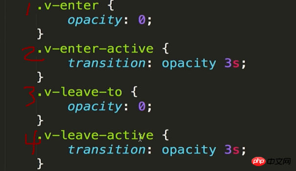
The above is the vuejs official website introducing the notes I usually record below. Combined with pictures and texts, it is easier to understand
Principles of change


##Animation process appears:
Start the frame before: Click to appear animation, the element changes from none to block, the frame before the animation starts, insert opacity:0
attribute"1", and the monitoring opacity property change time is 3s “2”- ##Second frame of animation:
opacity:0, attribute
"1"Remove, cause "2" Monitor execution time changes - Last frame of animation:
The animation ends, remove all

- Start the previous frame:
Click to disappear animation, the element changes from block to none, the frame before the animation starts, only insert the monitoring opacity attribute change time is 3s "4"
- Second frame of animation:
Insertion, “3” Attribute opacity:0 causes “2” Monitor execution event changes
- The last frame of the animation:
The animation ends, remove all
The above is the entire content of this article, I hope it will help everyone learn Helpful, please pay attention to the PHP Chinese website for more related content!
Related recommendations:
Analysis of vue using element to implement navigationHow to solve the method closure in methods in vue Caching problemThe above is the detailed content of Detailed explanation of Vue's built-in component transition (picture and text). For more information, please follow other related articles on the PHP Chinese website!

Hot AI Tools

Undresser.AI Undress
AI-powered app for creating realistic nude photos

AI Clothes Remover
Online AI tool for removing clothes from photos.

Undress AI Tool
Undress images for free

Clothoff.io
AI clothes remover

AI Hentai Generator
Generate AI Hentai for free.

Hot Article

Hot Tools

Notepad++7.3.1
Easy-to-use and free code editor

SublimeText3 Chinese version
Chinese version, very easy to use

Zend Studio 13.0.1
Powerful PHP integrated development environment

Dreamweaver CS6
Visual web development tools

SublimeText3 Mac version
God-level code editing software (SublimeText3)

Hot Topics
 1377
1377
 52
52
 How to use bootstrap button
Apr 07, 2025 pm 03:09 PM
How to use the Bootstrap button? Introduce Bootstrap CSS to create button elements and add Bootstrap button class to add button text
 How to resize bootstrap
Apr 07, 2025 pm 03:18 PM
To adjust the size of elements in Bootstrap, you can use the dimension class, which includes: adjusting width: .col-, .w-, .mw-adjust height: .h-, .min-h-, .max-h-
 How to view the date of bootstrap
Apr 07, 2025 pm 03:03 PM
Answer: You can use the date picker component of Bootstrap to view dates in the page. Steps: Introduce the Bootstrap framework. Create a date selector input box in HTML. Bootstrap will automatically add styles to the selector. Use JavaScript to get the selected date.
 How to write split lines on bootstrap
Apr 07, 2025 pm 03:12 PM
There are two ways to create a Bootstrap split line: using the tag, which creates a horizontal split line. Use the CSS border property to create custom style split lines.
 How to set up the framework for bootstrap
Apr 07, 2025 pm 03:27 PM
To set up the Bootstrap framework, you need to follow these steps: 1. Reference the Bootstrap file via CDN; 2. Download and host the file on your own server; 3. Include the Bootstrap file in HTML; 4. Compile Sass/Less as needed; 5. Import a custom file (optional). Once setup is complete, you can use Bootstrap's grid systems, components, and styles to create responsive websites and applications.
 How to insert pictures on bootstrap
Apr 07, 2025 pm 03:30 PM
There are several ways to insert images in Bootstrap: insert images directly, using the HTML img tag. With the Bootstrap image component, you can provide responsive images and more styles. Set the image size, use the img-fluid class to make the image adaptable. Set the border, using the img-bordered class. Set the rounded corners and use the img-rounded class. Set the shadow, use the shadow class. Resize and position the image, using CSS style. Using the background image, use the background-image CSS property.
 Vue.js vs. React: Project-Specific Considerations
Apr 09, 2025 am 12:01 AM
Vue.js is suitable for small and medium-sized projects and fast iterations, while React is suitable for large and complex applications. 1) Vue.js is easy to use and is suitable for situations where the team is insufficient or the project scale is small. 2) React has a richer ecosystem and is suitable for projects with high performance and complex functional needs.
 How to verify bootstrap date
Apr 07, 2025 pm 03:06 PM
To verify dates in Bootstrap, follow these steps: Introduce the required scripts and styles; initialize the date selector component; set the data-bv-date attribute to enable verification; configure verification rules (such as date formats, error messages, etc.); integrate the Bootstrap verification framework and automatically verify date input when form is submitted.


