

Bootstrap must learn drop-down menu every day_javascript skills

1. Drop-down menu (basic usage)
Friends, please note that the drop-down menu component in the Bootstrap framework is an independent component. According to different versions, its corresponding file:
☑ LESS version: The corresponding source code file is dropdowns.less
☑ Sass version: The corresponding source code file is _dropdowns.sass
☑ Compiled Bootstrap version: View lines 3004 to 3130 of the bootstrap.css file
When using the drop-down menu of the Bootstrap framework, you must call the bootstrap.js file provided by the Bootstrap framework. Of course, if you are using the uncompiled version, you can find a file named "dropdown.js" in the js folder. You can also call this js file. However, in our tutorial, we uniformly call the compressed "bootstrap.min.js" file:
Special statement: Because Bootstrap’s component interaction effects all rely on plug-ins written by the jQuery library, jquery.min must be loaded before using bootstrap.min.js .js will produce the effect.
Let’s first look at a simple example on the official website:
<div class="dropdown">
<button class="btn btn-default dropdown-toggle" type="button" id="dropdownMenu1" data-toggle="dropdown">
下拉菜单
<span class="caret"></span>
</button>
<ul class="dropdown-menu" role="menu" aria-labelledby="dropdownMenu1">
 <li role="presentation"><a role="menuitem" tabindex="-1" href="#">下拉菜单项</a></li>
 …
 <li role="presentation" class="divider"></li>
 <li role="presentation"><a role="menuitem" tabindex="-1" href="#">下拉菜单项</a></li>
</ul>
</div>
Usage:
When using the drop-down menu component in the Bootstrap framework, it is very important to use the correct structure. If the structure and class name are not used correctly, it will directly affect whether the component can be used normally. Let’s take a quick look:
1. Use a container named "dropdown" to wrap the entire drop-down menu element. In the example:
2. Use a
data-toggle="dropdown"
3. The drop-down menu item uses a ul list and defines a class name "dropdown-menu". This example is:
Example
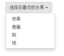
<!DOCTYPE HTML>
<html>
<head>
<meta http-equiv="Content-Type" content="text/html; charset=utf-8">
<title>下拉菜单</title>
<link rel="stylesheet" href="//maxcdn.bootstrapcdn.com/bootstrap/3.2.0/css/bootstrap.min.css">
</head>
<body>

<div class="dropdown">
 <button class="btn btn-default dropdown-toggle" type="button" id="dropdownMenu1" data-toggle="dropdown">
 选择你喜欢的水果
 <span class="caret"></span>
 </button>
 <ul class="dropdown-menu" role="menu" aria-labelledby="dropdownMenu1">
 <li role="presentation"><a role="menuitem" tabindex="-1" href="#">苹果</a></li>
 <li role="presentation"><a role="menuitem" tabindex="-1" href="#">香蕉</a></li>
 <li role="presentation"><a role="menuitem" tabindex="-1" href="#">梨</a></li>
 <li role="presentation"><a role="menuitem" tabindex="-1" href="#">桃</a></li>
 </ul>
</div>
 <script src="http://libs.baidu.com/jquery/1.9.0/jquery.js"></script>
 <script src="//maxcdn.bootstrapcdn.com/bootstrap/3.2.0/js/bootstrap.min.js"></script>
</body>
</html>
2. Drop-down menu (principle analysis)
The drop-down menu component in the Bootstrap framework, its drop-down menu items are hidden by default, as shown below:

Because the default style of "dropdown-menu" is set to "display:none", please view the detailed source code from lines 3010 to 3029 of the bootstrap.css file:
.dropdown-menu {
 position: absolute;/*设置绝对定位,相对于父元素div.dropdown*/
 top: 100%;/*让下拉菜单项在父菜单项底部,如果父元素不设置相对定位,该元素相对于body元素*/
 left: 0;
 z-index: 1000;/*让下拉菜单项不被其他元素遮盖住*/

 display: none;/*默认隐藏下拉菜单项*/

 float: left;
 min-width: 160px;
 padding: 5px 0;
 margin: 2px 0 0;
 font-size: 14px;
 list-style: none;
 background-color: #fff;
 background-clip: padding-box;
 border: 1px solid #ccc;
 border: 1px solid rgba(0, 0, 0, .15);
 border-radius: 4px;
 -webkit-box-shadow: 0 6px 12px rgba(0, 0, 0, .175);
 box-shadow: 0 6px 12px rgba(0, 0, 0, .175);
}
When the user clicks on the parent menu item, the drop-down menu will be displayed. When the user clicks again, the drop-down menu will continue to be hidden.
Principle analysis:
Now let's analyze the implementation principle. It is very simple. Through js technology, add or remove the class name "open" to the parent container "div.dropdown" to control the display or hiding of the drop-down menu. That is to say, by default, "div.dropdown" does not have the class name "open". When the user clicks for the first time, "div.dropdown" will add the class name "open"; when the user clicks again, "div.dropdown" "The class name "open" in the container will be removed again. We can view the entire process through the browser's firebug:
Default:

User’s first click:

User clicks again:

In lines 3076 to 3078 of the bootstrap.css file, we can easily find:
.open > .dropdown-menu {
 display: block;
}三、下拉菜单(下拉分隔线)
在Bootstrap框架中的下拉菜单还提供了下拉分隔线,假设下拉菜单有两个组,那么组与组之间可以通过添加一个空的
/源码bootstrap.css文件第3034行~第3039行/

.dropdown-menu .divider {
 height: 1px;
 margin: 9px 0;
 overflow: hidden;
 background-color: #e5e5e5;
}
示例:
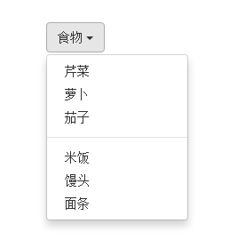
<!DOCTYPE HTML>
<html>
<head>
<meta http-equiv="Content-Type" content="text/html; charset=utf-8">
<title>下拉分隔线</title>
<link rel="stylesheet" href="//maxcdn.bootstrapcdn.com/bootstrap/3.2.0/css/bootstrap.min.css">
<link rel="stylesheet" href="style.css">
</head>

<body>
 <div class="dropdown">
 <button class="btn btn-default dropdown-toggle" type="button" id="dropdownMenu1" data-toggle="dropdown">
 食物
 <span class="caret"></span>
 </button>
 <ul class="dropdown-menu" role="menu" aria-labelledby="dropdownMenu1">

 <li role="presentation"><a role="menuitem" tabindex="-1" href="#">芹菜</a></li>
 <li role="presentation"><a role="menuitem" tabindex="-1" href="#">萝卜</a></li>
 <li role="presentation"><a role="menuitem" tabindex="-1" href="#">茄子</a></li>
  <li role="presentation" class ="divider"></li>
 <li role="presentation"><a role="menuitem" tabindex="-1" href="#">米饭</a></li>
 <li role="presentation"><a role="menuitem" tabindex="-1" href="#">馒头</a></li>
 <li role="presentation"><a role="menuitem" tabindex="-1" href="#">面条</a></li>
 </ul>
</div>
 <script src="http://libs.baidu.com/jquery/1.9.0/jquery.js"></script>
 <script src="//maxcdn.bootstrapcdn.com/bootstrap/3.2.0/js/bootstrap.min.js"></script>
</body>
</html>
效果如下:
四、下拉菜单(菜单标题)
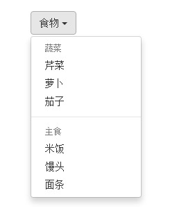
上一小节讲解通过添加“divider”可以将下拉菜单分组,为了让这个分组更明显,还可以给每个组添加一个头部(标题)。如下:
对应的样式如下:
/查看bootstrap.css文件第3090行~第3096行/
.dropdown-header {
 display: block;
 padding: 3px 20px;
 font-size: 12px;
 line-height: 1.42857143;
 color: #999;
}
示例
<div class="dropdown">
 <button class="btn btn-default dropdown-toggle" type="button" id="dropdownMenu1" data-toggle="dropdown">
 食物
 <span class="caret"></span>
 </button>
 <ul class="dropdown-menu" role="menu" aria-labelledby="dropdownMenu1">
 <li role="presentation" class="dropdown-header">蔬菜</li>
 <li role="presentation"><a role="menuitem" tabindex="-1" href="#">芹菜</a></li>
 <li role="presentation"><a role="menuitem" tabindex="-1" href="#">萝卜</a></li>
 <li role="presentation"><a role="menuitem" tabindex="-1" href="#">茄子</a></li>
 <li role="presentation" class="divider"></li>
 <li role="presentation" class="dropdown-header">主食</li>
 <li role="presentation"><a role="menuitem" tabindex="-1" href="#">米饭</a></li>
 <li role="presentation"><a role="menuitem" tabindex="-1" href="#">馒头</a></li>
 <li role="presentation"><a role="menuitem" tabindex="-1" href="#">面条</a></li>
 </ul>
</div>
运行效果如下:
五、下拉菜单(对齐方式)
实现右对齐方法:
Bootstrap框架中下拉菜单默认是左对齐,如果你想让下拉菜单相对于父容器右对齐时,可以在“dropdown-menu”上添加一个“pull-right”或者“dropdown-menu-right”类名,如下所示:
上面代码中的“pull-right”类可以用“dropdown-menu-right”代替,两个类的作用是一样的,可从下面的源代码中看出。
实现原理:
对应的样式如下:
/源码请查看bootstrap.css文件第3030行~第3033行和3082行~第3085行/
.dropdown-menu.pull-right {
 right: 0;
 left: auto;
}
.dropdown-menu-right {
 right: 0;
 left: auto;
}
同时一定要为.dropdown添加float:leftcss样式。
.dropdown{
 float: left;
}
运行效果如下所示:
下拉菜单与父容器左边对齐:
与此同时,还有一个类名刚好与“dropdown-menu-right”相反的类名“dropdown-menu-left”,其效果就是让下拉菜单与父容器左边对齐,其实就是默认效果。
/请查看bootstrap.css文件第3086行~第3089行/
.dropdown-menu-left {
 right: auto;
 left: 0;
}
六、下拉菜单(菜单项状态)
下拉菜单项的默认的状态(不用设置)有悬浮状态(:hover)和焦点状态(:focus):
/查看bootstrap.css文件第3049行~第3054行/
.dropdown-menu > li > a:hover,
.dropdown-menu > li > a:focus {
 color: #262626;
 text-decoration: none;
 background-color: #f5f5f5;
}
下拉菜单项除了上面两种状态,还有当前状态(.active)和禁用状态(.disabled)。这两种状态使用方法只需要在对应的菜单项上添加对应的类名:
<div class="dropdown">
 <button class="btn btn-default dropdown-toggle" type="button" id="dropdownMenu1" data-toggle="dropdown">
 下拉菜单
 <span class="caret"></span>
 </button>
 <ul class="dropdown-menu" role="menu" aria-labelledby="dropdownMenu1">
 <li role="presentation" class="active"><a role="menuitem" tabindex="-1" href="#">下拉菜单项</a></li>
 ….
 <li role="presentation" class="disabled"><a role="menuitem" tabindex="-1" href="#">下拉菜单项</a></li>
 </ul>
</div>
运行效果如下:
 对应的样式代码也非常简单:
/请查看bootstrap.css文件第3055行~第3075行/

.dropdown-menu > .active > a,
.dropdown-menu > .active > a:hover,
.dropdown-menu > .active > a:focus {
 color: #fff;
 text-decoration: none;
 background-color: #428bca;
 outline: 0;
}
.dropdown-menu > .disabled > a,
.dropdown-menu > .disabled > a:hover,
.dropdown-menu > .disabled > a:focus {
 color: #999;
}
.dropdown-menu > .disabled > a:hover,
.dropdown-menu > .disabled > a:focus {
 text-decoration: none;
 cursor: not-allowed;
 background-color: transparent;
 background-image: none;
 filter: progid:DXImageTransform.Microsoft.gradient(enabled = false);
}
以上就是本文的全部内容,希望对大家的学习有所帮助。

Hot AI Tools

Undresser.AI Undress
AI-powered app for creating realistic nude photos

AI Clothes Remover
Online AI tool for removing clothes from photos.

Undress AI Tool
Undress images for free

Clothoff.io
AI clothes remover

AI Hentai Generator
Generate AI Hentai for free.

Hot Article
Hot Tools

Notepad++7.3.1
Easy-to-use and free code editor

SublimeText3 Chinese version
Chinese version, very easy to use

Zend Studio 13.0.1
Powerful PHP integrated development environment

Dreamweaver CS6
Visual web development tools

SublimeText3 Mac version
God-level code editing software (SublimeText3)
Hot Topics
 1377
1377
 52
52

 How to do vertical centering of bootstrap
Apr 07, 2025 pm 03:21 PM
How to do vertical centering of bootstrap
Apr 07, 2025 pm 03:21 PM
Use Bootstrap to implement vertical centering: flexbox method: Use the d-flex, justify-content-center, and align-items-center classes to place elements in the flexbox container. align-items-center class method: For browsers that do not support flexbox, use the align-items-center class, provided that the parent element has a defined height.
 How to get the bootstrap search bar
Apr 07, 2025 pm 03:33 PM
How to get the bootstrap search bar
Apr 07, 2025 pm 03:33 PM
How to use Bootstrap to get the value of the search bar: Determines the ID or name of the search bar. Use JavaScript to get DOM elements. Gets the value of the element. Perform the required actions.
 How to use bootstrap button
Apr 07, 2025 pm 03:09 PM
How to use bootstrap button
Apr 07, 2025 pm 03:09 PM
How to use the Bootstrap button? Introduce Bootstrap CSS to create button elements and add Bootstrap button class to add button text
 How to resize bootstrap
Apr 07, 2025 pm 03:18 PM
How to resize bootstrap
Apr 07, 2025 pm 03:18 PM
To adjust the size of elements in Bootstrap, you can use the dimension class, which includes: adjusting width: .col-, .w-, .mw-adjust height: .h-, .min-h-, .max-h-
 How to view the date of bootstrap
Apr 07, 2025 pm 03:03 PM
How to view the date of bootstrap
Apr 07, 2025 pm 03:03 PM
Answer: You can use the date picker component of Bootstrap to view dates in the page. Steps: Introduce the Bootstrap framework. Create a date selector input box in HTML. Bootstrap will automatically add styles to the selector. Use JavaScript to get the selected date.
 How to write split lines on bootstrap
Apr 07, 2025 pm 03:12 PM
How to write split lines on bootstrap
Apr 07, 2025 pm 03:12 PM
There are two ways to create a Bootstrap split line: using the tag, which creates a horizontal split line. Use the CSS border property to create custom style split lines.
 How to insert pictures on bootstrap
Apr 07, 2025 pm 03:30 PM
How to insert pictures on bootstrap
Apr 07, 2025 pm 03:30 PM
There are several ways to insert images in Bootstrap: insert images directly, using the HTML img tag. With the Bootstrap image component, you can provide responsive images and more styles. Set the image size, use the img-fluid class to make the image adaptable. Set the border, using the img-bordered class. Set the rounded corners and use the img-rounded class. Set the shadow, use the shadow class. Resize and position the image, using CSS style. Using the background image, use the background-image CSS property.
 How to set up the framework for bootstrap
Apr 07, 2025 pm 03:27 PM
How to set up the framework for bootstrap
Apr 07, 2025 pm 03:27 PM
To set up the Bootstrap framework, you need to follow these steps: 1. Reference the Bootstrap file via CDN; 2. Download and host the file on your own server; 3. Include the Bootstrap file in HTML; 4. Compile Sass/Less as needed; 5. Import a custom file (optional). Once setup is complete, you can use Bootstrap's grid systems, components, and styles to create responsive websites and applications.
