How to understand BFC-block formatting context (picture and text)
The content shared with you in this article is about how to understand the BFC-block formatting context (pictures and texts). The content is very detailed. Next, let’s take a look at the specific content. I hope it can help everyone.
BFC concept
BFC (block formatting context) block formatting context is the area where the block-level element layout and floating elements of the Web page interact with each other. BFC is an independent layout environment, (invisible when the actual page is rendered). The layout of internal elements in the area built by BFC is not affected by the outside world. This feature can be used to eliminate floating The effect an element has on its non-floated siblings and children. In BFC, elements are arranged vertically one after another starting from the top, and the vertical gap between two elements is determined by their margin value. In a BFC, the vertical margins of two adjacent block-level elements collapse. (Explained in detail later)
Conditions for forming BFC:
1. Floating, absolute positioning, fixed positioning, these methods can make elements Separate from the document flow to form an independent BFC.
2.display:inline-block/table-cells/table-captions/inline-flex (block container element of non-block-level elements)
3.overflow:auto/hidden/scroll
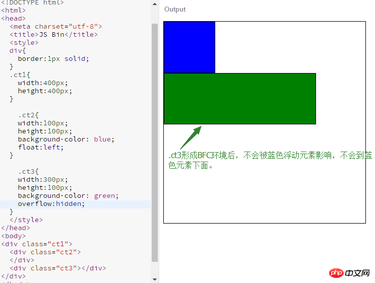
overflow attribute itself There is nothing special, but it will generate BFC to create an independent layout environment so that the elements are not affected by floating elements.
Example of using BFC to clear floating effects:

The role of BFC:
1. Clear the side effects caused by floating (limit the floating to the BFC area)
2. Spread the parent element (enclose the floating element) Clearing the float is to stretch the parent element
3. Prevent the merging of margins
4.BFC independence can be used for layout
About margin merging
Three scenarios where margin merging occurs:
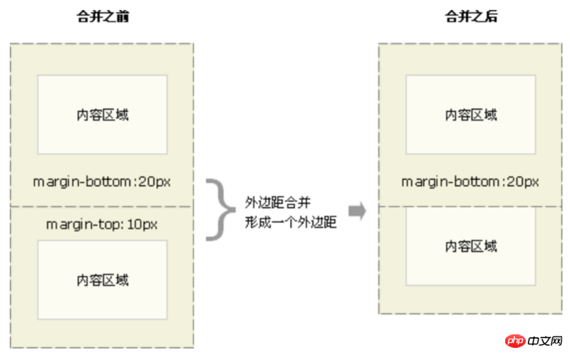
1. In the same BFC environment, the margins of vertically adjacent elements in the ordinary document flow are merged. 
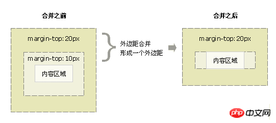
#2. Merge the margins of parent and child elements.

#3. Merge the margins of empty elements themselves. 
If this margin encounters the margin of another element, it will also be merged

margin merging rules:
1. When both margins are positive, take the maximum value of the two;
2. When both margins are negative, take the The one with the larger absolute value will then move in the negative direction from the 0 position;
3. When there are positive and negative values, first take out the largest absolute value among the negative margins, and then compare it with the largest margin among the positive margin values. add.
All adjacent margins must participate in the operation together and cannot be performed step by step.
Methods to prevent the margins of adjacent elements from merging:
1. Separated by non-empty content, padding, border or clear.
2. Not in a common stream or separated by BFC.
3. Let the margin not be adjacent in the vertical direction.
Related recommendations:
css analysis of browser compatibility issues
About css responsive implementation code and effects
The above is the detailed content of How to understand BFC-block formatting context (picture and text). For more information, please follow other related articles on the PHP Chinese website!

Hot AI Tools

Undresser.AI Undress
AI-powered app for creating realistic nude photos

AI Clothes Remover
Online AI tool for removing clothes from photos.

Undress AI Tool
Undress images for free

Clothoff.io
AI clothes remover

AI Hentai Generator
Generate AI Hentai for free.

Hot Article

Hot Tools

Notepad++7.3.1
Easy-to-use and free code editor

SublimeText3 Chinese version
Chinese version, very easy to use

Zend Studio 13.0.1
Powerful PHP integrated development environment

Dreamweaver CS6
Visual web development tools

SublimeText3 Mac version
God-level code editing software (SublimeText3)

Hot Topics
 1378
1378
 52
52
 How to write split lines on bootstrap
Apr 07, 2025 pm 03:12 PM
There are two ways to create a Bootstrap split line: using the tag, which creates a horizontal split line. Use the CSS border property to create custom style split lines.
 The Roles of HTML, CSS, and JavaScript: Core Responsibilities
Apr 08, 2025 pm 07:05 PM
HTML defines the web structure, CSS is responsible for style and layout, and JavaScript gives dynamic interaction. The three perform their duties in web development and jointly build a colorful website.
 How to insert pictures on bootstrap
Apr 07, 2025 pm 03:30 PM
There are several ways to insert images in Bootstrap: insert images directly, using the HTML img tag. With the Bootstrap image component, you can provide responsive images and more styles. Set the image size, use the img-fluid class to make the image adaptable. Set the border, using the img-bordered class. Set the rounded corners and use the img-rounded class. Set the shadow, use the shadow class. Resize and position the image, using CSS style. Using the background image, use the background-image CSS property.
 How to use bootstrap in vue
Apr 07, 2025 pm 11:33 PM
Using Bootstrap in Vue.js is divided into five steps: Install Bootstrap. Import Bootstrap in main.js. Use the Bootstrap component directly in the template. Optional: Custom style. Optional: Use plug-ins.
 How to resize bootstrap
Apr 07, 2025 pm 03:18 PM
To adjust the size of elements in Bootstrap, you can use the dimension class, which includes: adjusting width: .col-, .w-, .mw-adjust height: .h-, .min-h-, .max-h-
 How to set up the framework for bootstrap
Apr 07, 2025 pm 03:27 PM
To set up the Bootstrap framework, you need to follow these steps: 1. Reference the Bootstrap file via CDN; 2. Download and host the file on your own server; 3. Include the Bootstrap file in HTML; 4. Compile Sass/Less as needed; 5. Import a custom file (optional). Once setup is complete, you can use Bootstrap's grid systems, components, and styles to create responsive websites and applications.
 How to use bootstrap button
Apr 07, 2025 pm 03:09 PM
How to use the Bootstrap button? Introduce Bootstrap CSS to create button elements and add Bootstrap button class to add button text
 How to view the date of bootstrap
Apr 07, 2025 pm 03:03 PM
Answer: You can use the date picker component of Bootstrap to view dates in the page. Steps: Introduce the Bootstrap framework. Create a date selector input box in HTML. Bootstrap will automatically add styles to the selector. Use JavaScript to get the selected date.


