The role of svg path: How to use svg path in web development
This article introduces you to the article about the role of SVG Path in web development. It has a good reference value. I hope it can help friends in need.
SVG is a vector graphics representation. One of its powerful features is that the path tag can represent any vector shape. By making good use of this path, you can create many effects that traditional HTML/CSS cannot. Here are a few examples.
1. Make path animation
I added this implementation in the article "SVG Navigation Underline Cursor Following Effect". The final effect is like this:

The implementation code is as follows:
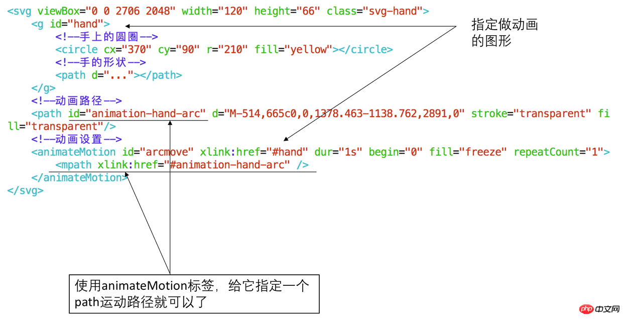
Using animateMotion combined with path to create animations, specific instructions can be found above.
2. To achieve irregular-shaped clicks
As shown in the figure below, you need to achieve the effect of entering which continent you click on. For example, clicking on Africa will enter Africa:
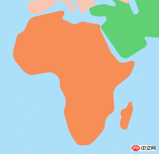
We can use div to define a frame on top of Africa, but using div can only be a regular square shape. There is no way to enter when you click on the African continent, but the continent The outline is irregular, so traditional HTML cannot solve this problem. However, this problem can be solved with SVG path. Method 1 is to listen to the click event of the path, as shown in the following figure:
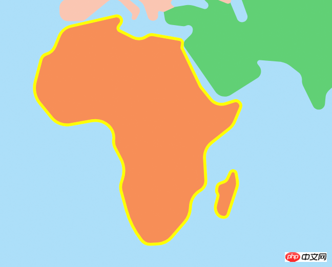
Because this outline can be obtained from the UI, They are usually drawn using vector software such as AI/PS. Just ask them to import an SVG for you.
Method 2 is to adjust the isPointInFill API of SVG to determine whether the clicked point is in the fill area of Path. This can also be implemented, but it is more troublesome than method 1 because it also needs to adjust the position of the mouse. Convert to position of svg view.
3. Interaction of dragging along the path
The animation along the path at the first point is an automatic process. Is there a way for the user to drag it by himself to achieve the following effect:
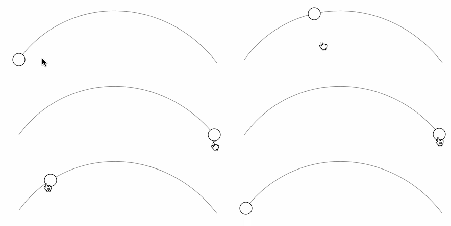
This kind of scenario requires percentage control such as volume control. You can first use an SVG online tool to draw a graphic like this:
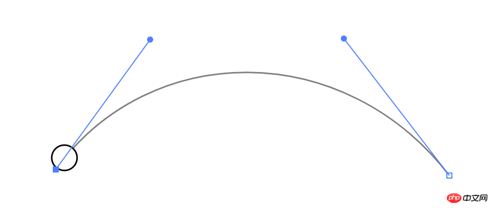
Then you can get the SVG code:
<svg class="volumn-controller" width="580" height="400" xmlns="http://www.w3.org/2000/svg">
    <path class="volumn-path" stroke="#000" d="m100,247c93,-128 284,-129 388,6" opacity="0.5" stroke-width="1" fill="#fff"/>
    <circle class="drag-button" r="12" cy="247" cx="100" stroke-width="1" stroke="#000" fill="#fff"/>
 </g>
</svg>The key thing here is The d attribute in the path tag, d is the abbreviation of data, defines the shape of this path. Many attributes can be used to control the change of the shape, as shown in the following figure:

In order to realize this interaction, it is necessary to dynamically change the center position (cx, cy) of the circle to the corresponding place on the path. SVG does not directly provide related APIs, but it provides an API that can be used indirectly called getPointAtLength, passing a length parameter, as shown in the following code:
let volumnPath = document.querySelector('.volumn-path');
// 输出path在长度为100的位置的点坐标
console.log(volumnPath.getPointAtLength(100));
// 输出当前path的总长度
console.log(volumnPath.getTotalLength());
Console output:

Change the cx/cy of circle to the x/y coordinates above, and the circle will go to the corresponding position:

Here The problem is that the length parameter passed by this API is relative to the length of the curve, but the position of the mouse movement is linear, and there is no way to directly know how far the current mouse is from the starting position on the curve.
So we need to do some calculations. In this scene, we can just take the corresponding position of the x-coordinate of the mouse on the curve, as shown in the following figure:
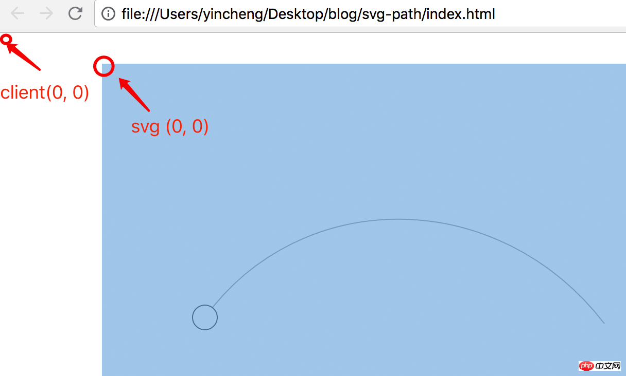
Here you have an idea. You can calculate the coordinates of every pixel on this path and store it in an array. Since the x coordinate is known when the mouse moves, you can check the y coordinate of the corresponding x coordinate in this array to get the desired center position of the circle.
So calculate it first and save it to an array:
let $volumnController = document.querySelector('.volumn-controller'),
    $volumnPath = $volumnController.querySelector('.volumn-path');
// 得到当前路径的总长度
let pathTotalLength = $volumnPath.getTotalLength() >> 0;
let points = [];
// 起始位置为长度为0的位置
let startX = Math.round($volumnPath.getPointAtLength(0).x);
// 每隔一个像素距离就保存一下路径上点的坐标
for (let i = 0; i < pathTotalLength; i++) {
    let p = $volumnPath.getPointAtLength(i);
    // 保存的坐标用四舍五入,可以平衡误差
    points[Math.round(p.x) - startX] = Math.round(p.y);
}Here a p0ints array is used to save it. Its index index is the x coordinate and the value is the y coordinate. In this example, the total length is 451.5px, and the resulting points array length is 388. You can save coordinates every 0.5px, but in this example 1px is enough.
然后监听鼠标事件,得到x坐标,查询y坐标,动态地改变circle的圆心位置,如下代码所示:
let $dragButton = $volumnController.querySelector('.drag-button'),
// 得到起始位置相对当前视窗的位置,相当于jQuery.fn.offset
dragButtonPos = $dragButton.getBoundingClientRect();
function movePoint (event) {
// 当前鼠标的位置减去圆心起始位置就得到移位偏差,12是半径值,这里先直接写死
let diffX = event.clientX - Math.round(dragButtonPos.left + 12);
// 需要做个边界判断
diffX < 0 && (diffX = 0);
diffX >= points.length && (diffX = points.length - 1);
// startX是在上面的代码得到的长度为0的位置
$dragButton.setAttribute('cx', diffX + startX);
// 使用points数组得到y坐标
$dragButton.setAttribute('cy', points[diffX]);
}
$dragButton.addEventListener('mousedown', function (event) {
document.addEventListener('mousemove', movePoint);
});
document.addEventListener('mouseup', function () {
document.removeEventListener('mousemove', movePoint);
}); 这个实现的代码也是比较简单,需要注意的地方是起始位置的选取,这里有两个坐标系,一个是相对页面的视窗的,它的原点(0, 0)坐标点是当前页面可视区域(client)的左上角,第二个坐标系是SVG的坐标系,它的原点(0, 0)位置是SVG画布的左上角,如下图所示:

鼠标的位置是相对于视图client的,所以需要得到圆圈在client的位置,可以通过原生的getBoundingClient获取,然后用鼠标的clientX减掉圆圈的clientX就得到正确的位移偏差diff了,这个diff值加上圆圏的在svg坐标的起始位置就能得到svg里的x坐标了,然后去查一下points数组就能得到y坐标,然后去设置circle的cx/cy值。
这个的实现已经算是十分简单的,大概30行代码。需要注意的是如果svg缩放了,那么坐标也要相应比例地改一下。所以最好是不要缩放,1:1显示就简单多了。
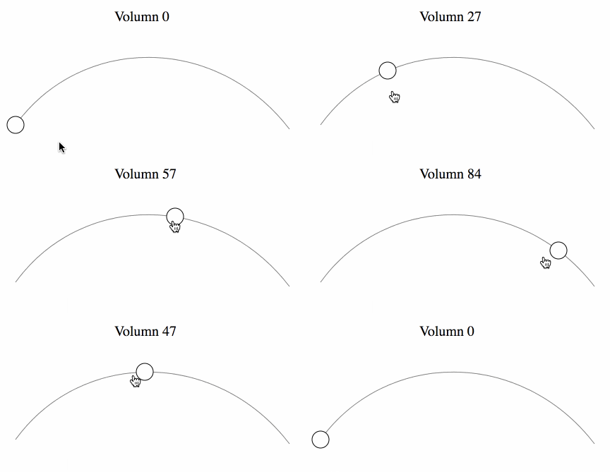
如果要显示具体的音量值呢?这个也好办,只需要在第一步保存点坐标的时候把在路径上的长度也保存下来就好了,最后效果如下:
如果路径比较复杂怎么办呢,一个x坐标可能会对应两个点,如下图所示:
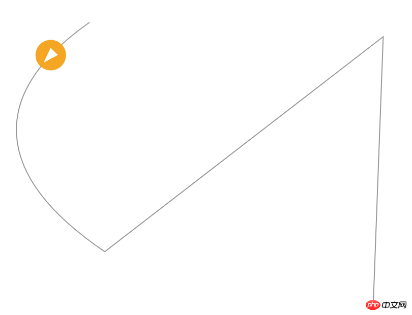
这个也是有办法的,计算的方法类似,也是需要把路径上所有每隔1px的点坐标都取出来,然后计算一下鼠标的位置距离哪个点的坐标最接近,然后就取那个点就好了。当然在判断哪个点最优时,算法需要优化,不能直接一个for循环,具体可见这个codepen。
4. 路径的变形动画
路径结合关键帧可以做出一些有趣的效果,如这个codepen的示例:
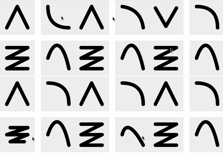
它的实现是hover的时候改变path的d值,然后做d的transition动画,如下代码:
<svg viewBox="0 0 10 10" class="svg-1">
  <path d="M2,2 L8,8" />
</svg>
<style>
.svg-1:hover path {
  d: path("M8,2 L2,8");
}
path {
    transition: d 0.5s linear;
}
</style>这种变形过渡动画是有条件的,就是它的路径数据格式是要一致的,有多少个M/L/C属性都要保持一致,否则无法做变形动画。
5. 结合clip-path做遮罩效果
使用CSS通常只能用border-radius做一些圆角的遮罩,即用border-radius结合overflow: hidden实现,但是使用clip-path + svg的路径能够做出任意形状遮罩,如下做一个心形的:

如下代码所示:
<div   style="max-width:90%">
    <img src="/static/imghw/default1.png"  data-src="photo.png"  class="lazy"   alt   style="max-width:90%">
</div>
<style>
img {
    clip-path: url("#heart");
}
</style>style里面的id: #heart是指向了一个SVG的的clipPath,如下所示:
<svg xmlns="http://www.w3.org/2000/svg" width="0" height="0">
    <clipPath id="heart" clipPathUnits="objectBoundingBox">
        <path transform="scale(0.0081967, 0.0101010)" d="m61.18795,24.08746c24.91828,-57.29309 122.5489,0 0,73.66254c-122.5489,-73.66254 -24.91828,-130.95562 0,-73.66254z"/>
    </clipPath>
</svg> 为了让这个path刚好能撑起div容器宽度的100%,需要设置:
clipPathUnits="objectBoundingBox"
这样会导致d属性里面的单位变成比例的0到1,所以需要把它缩小一下,原本的width是122,height是99,需要需要scale的值为(1 / 122, 1 / 99)。这样就达到100%占满的目的,如果一开始d属性坐标比例就是0到1,就不用这么搞了。
另外clip-path使用svg的path不支持变形动画。
本篇介绍了使用svg路径path做的几种效果:做一个路径动画、不规则形状的点击、沿着路径拖拽、路径的变形动画以及和clip-path做一些遮罩效果。可以说svg的path效果还是很强大的,当你有些效果用html/css无法实现的时候,不妨往svg的方向思考。
相关推荐:
The above is the detailed content of The role of svg path: How to use svg path in web development. For more information, please follow other related articles on the PHP Chinese website!

Hot AI Tools

Undresser.AI Undress
AI-powered app for creating realistic nude photos

AI Clothes Remover
Online AI tool for removing clothes from photos.

Undress AI Tool
Undress images for free

Clothoff.io
AI clothes remover

Video Face Swap
Swap faces in any video effortlessly with our completely free AI face swap tool!

Hot Article

Hot Tools

Notepad++7.3.1
Easy-to-use and free code editor

SublimeText3 Chinese version
Chinese version, very easy to use

Zend Studio 13.0.1
Powerful PHP integrated development environment

Dreamweaver CS6
Visual web development tools

SublimeText3 Mac version
God-level code editing software (SublimeText3)

Hot Topics
 1387
1387
 52
52
 How to run the h5 project
Apr 06, 2025 pm 12:21 PM
Running the H5 project requires the following steps: installing necessary tools such as web server, Node.js, development tools, etc. Build a development environment, create project folders, initialize projects, and write code. Start the development server and run the command using the command line. Preview the project in your browser and enter the development server URL. Publish projects, optimize code, deploy projects, and set up web server configuration.
 What exactly does H5 page production mean?
Apr 06, 2025 am 07:18 AM
H5 page production refers to the creation of cross-platform compatible web pages using technologies such as HTML5, CSS3 and JavaScript. Its core lies in the browser's parsing code, rendering structure, style and interactive functions. Common technologies include animation effects, responsive design, and data interaction. To avoid errors, developers should be debugged; performance optimization and best practices include image format optimization, request reduction and code specifications, etc. to improve loading speed and code quality.
 How to make h5 click icon
Apr 06, 2025 pm 12:15 PM
The steps to create an H5 click icon include: preparing a square source image in the image editing software. Add interactivity in the H5 editor and set the click event. Create a hotspot that covers the entire icon. Set the action of click events, such as jumping to the page or triggering animation. Export H5 documents as HTML, CSS, and JavaScript files. Deploy the exported files to a website or other platform.
 What is the H5 programming language?
Apr 03, 2025 am 12:16 AM
H5 is not a standalone programming language, but a collection of HTML5, CSS3 and JavaScript for building modern web applications. 1. HTML5 defines the web page structure and content, and provides new tags and APIs. 2. CSS3 controls style and layout, and introduces new features such as animation. 3. JavaScript implements dynamic interaction and enhances functions through DOM operations and asynchronous requests.
 Is H5 page production a front-end development?
Apr 05, 2025 pm 11:42 PM
Yes, H5 page production is an important implementation method for front-end development, involving core technologies such as HTML, CSS and JavaScript. Developers build dynamic and powerful H5 pages by cleverly combining these technologies, such as using the <canvas> tag to draw graphics or using JavaScript to control interaction behavior.
 How to make pop-up windows with h5
Apr 06, 2025 pm 12:12 PM
H5 pop-up window creation steps: 1. Determine the triggering method (click, time, exit, scroll); 2. Design content (title, text, action button); 3. Set style (size, color, font, background); 4. Implement code (HTML, CSS, JavaScript); 5. Test and deployment.
 What application scenarios are suitable for H5 page production
Apr 05, 2025 pm 11:36 PM
H5 (HTML5) is suitable for lightweight applications, such as marketing campaign pages, product display pages and corporate promotion micro-websites. Its advantages lie in cross-platformity and rich interactivity, but its limitations lie in complex interactions and animations, local resource access and offline capabilities.
 What Does H5 Refer To? Exploring the Context
Apr 12, 2025 am 12:03 AM
H5referstoHTML5,apivotaltechnologyinwebdevelopment.1)HTML5introducesnewelementsandAPIsforrich,dynamicwebapplications.2)Itsupportsmultimediawithoutplugins,enhancinguserexperienceacrossdevices.3)SemanticelementsimprovecontentstructureandSEO.4)H5'srespo


