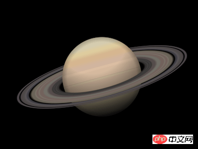
How to use pure CSS to achieve the effect of a Saturn
This article introduces you to the article about how to use pure CSS to achieve the effect of a Saturn. It has a good reference value and I hope it can help friends in need.
Effect preview

Code interpretation
Define dom, the container itself represents the planet Saturn, and the ring Element represents the rings of Saturn:
<p>
        <span></span>
    </p>
Centered display:
body {
    margin: 0;
    height: 100vh;
    display: flex;
    align-items: center;
    justify-content: center;
    background-color: black;
}Define container size:
.saturn {
    width: 20em;
    height: 20em;
    font-size: 20px;
}Draw the planet Saturn (this is a draft, it will be refined later) :
.saturn {
    position: relative;
}

.saturn::before,
.saturn::after {
    content: '';
    position: absolute;
    width: 9em;
    height: 9em;
    background: linear-gradient(
        palegoldenrod 0%,
        tan 10%,
        burlywood 30%,
        palegoldenrod 60%,
        darkgray 100%
    );
    border-radius: 50%;
    left: calc((20em - 9em) / 2);
    top: calc((20em - 9em) / 2);
}Draw the rings of Saturn (this is a draft and will be refined later):
.rings {
    position: absolute;
    width: inherit;
    height: inherit;
    background: radial-gradient(
        transparent 35%,
        dimgray 40%,
        slategray 50%,
        transparent 60%,
        dimgray 60%,
        slategray 70%,
        transparent 70%
    );
}Change the perspective of observing the rings of Saturn:
.rings {
    transform: rotateX(75deg);
}In order to make Saturn appear as it is The effect of the rings of Saturn is to divide Saturn into upper and lower halves, so that the layer order of them and the rings of Saturn is from bottom to top: the lower half of the planet, the rings of Saturn, the upper half of the planet:
.saturn::before {
    clip-path: inset(50% 0 0 0);
}

.saturn::after {
    clip-path: inset(0 0 50% 0);
}At this point, the overall structure of Saturn has been drawn, and then the details are refined.
Paint the rings of Saturn with rich gradient colors:
.rings {
    background: radial-gradient(
        rgba(24,19,25,0) 0%,
        rgba(53,52,51,0) 34%,
        rgba(55,54,52,1) 36%,
        rgba(56,55,53,1) 37%,
        rgba(68,67,66,1) 38%,
        rgba(56,55,53,1) 39%,
        rgba(68,67,66,1) 40%,
        rgba(56,55,53,1) 41%,
        rgba(87,77,76,1) 42%,
        rgba(87,77,76,1) 44%,
        rgba(113,110,103,1) 46%,
        rgba(113,110,103,1) 48%,
        rgba(113,98,93,1) 49%,
        rgba(113,98,93,1) 51%,
        rgba(122,115,105,1) 52%,
        rgba(113,98,93,1) 53%,
        rgba(113,98,93,1) 54%,
        rgba(122,115,105,1) 55%,
        rgba(106,99,89,1) 56%,
        rgba(106,99,89,1) 58%,
        rgba(79,76,76,0) 60%,
        rgba(65,64,70,1) 61%,
        rgba(65,64,70,1) 62%,
        rgba(90,85,89,1) 63%,
        rgba(78,74,73,1) 65%,
        rgba(78,73,74,1) 67%,
        rgba(78,73,74,0) 68%,
        rgba(78,73,75,1) 69%,
        rgba(78,73,75,1) 70%,
        rgba(78,73,76,0) 71%,
        rgba(77,72,76,0) 72%,
        rgba(24,19,25,0) 100%
    );
}Paint the planet with rich gradient colors:
.saturn::before,
.saturn::after {
    background:
        linear-gradient(
            rgba(212,203,174,1) 0%,
            rgba(212,203,174,1) 10%,
            rgba(221,203,157,1) 15%,
            rgba(221,203,157,1) 17%,
            rgba(213,181,143,1) 22%,
            rgba(213,181,143,1) 26%,
            rgba(208,180,158,1) 32%,
            rgba(208,180,158,1) 36%,
            rgba(218,188,162,1) 37%,
            rgba(218,188,162,1) 39%,
            rgba(211,184,157,1) 41%,
            rgba(211,184,157,1) 49%,
            rgba(205,186,156,1) 51%,
            rgba(205,186,156,1) 52%,
            rgba(202,176,153,1) 53%,
            rgba(202,176,153,1) 65%,
            rgba(190,177,145,1) 68%,
            rgba(190,177,145,1) 80%,
            rgba(150,144,130,1) 91%,
            rgba(150,144,130,1) 95%,
            rgba(131,129,117,1) 97%,
            rgba(131,129,117,1) 100%
        );
}Then add lighting effects to the planet:
.saturn::before,
.saturn::after {
    background:
        radial-gradient(
            circle at top,
            transparent 40%,
            black
        ),
        radial-gradient(
            transparent 62%,
            black
        ),
        linear-gradient(
            rgba(212,203,174,1) 0%,
            rgba(212,203,174,1) 10%,
            rgba(221,203,157,1) 15%,
            rgba(221,203,157,1) 17%,
            rgba(213,181,143,1) 22%,
            rgba(213,181,143,1) 26%,
            rgba(208,180,158,1) 32%,
            rgba(208,180,158,1) 36%,
            rgba(218,188,162,1) 37%,
            rgba(218,188,162,1) 39%,
            rgba(211,184,157,1) 41%,
            rgba(211,184,157,1) 49%,
            rgba(205,186,156,1) 51%,
            rgba(205,186,156,1) 52%,
            rgba(202,176,153,1) 53%,
            rgba(202,176,153,1) 65%,
            rgba(190,177,145,1) 68%,
            rgba(190,177,145,1) 80%,
            rgba(150,144,130,1) 91%,
            rgba(150,144,130,1) 95%,
            rgba(131,129,117,1) 97%,
            rgba(131,129,117,1) 100%
        );
}Finally, rotate the picture a little:
.saturn {
    transform: rotate(-15deg);
}You’re done!
Related recommendations:
How to use CSS and D3 to achieve the effect of endless hexagonal space
How to use css to draw a Bird(code)
The above is the detailed content of How to use pure CSS to achieve the effect of a Saturn. For more information, please follow other related articles on the PHP Chinese website!

Hot AI Tools

Undresser.AI Undress
AI-powered app for creating realistic nude photos

AI Clothes Remover
Online AI tool for removing clothes from photos.

Undress AI Tool
Undress images for free

Clothoff.io
AI clothes remover

AI Hentai Generator
Generate AI Hentai for free.

Hot Article

Hot Tools

Notepad++7.3.1
Easy-to-use and free code editor

SublimeText3 Chinese version
Chinese version, very easy to use

Zend Studio 13.0.1
Powerful PHP integrated development environment

Dreamweaver CS6
Visual web development tools

SublimeText3 Mac version
God-level code editing software (SublimeText3)

Hot Topics
 How to play picture sequences smoothly with CSS animation?
Apr 04, 2025 pm 05:57 PM
How to achieve the playback of pictures like videos? Many times, we need to implement similar video player functions, but the playback content is a sequence of images. direct...
 How do you make sure that some operations are performed only once when using the useEffect hook in React's App.tsx?
Apr 04, 2025 pm 06:33 PM
In React projects, we often encounter problems with the use of lifecycle functions, especially when it comes to page refresh, how to ensure that certain operations only...
 The width of emsp spaces in HTML is inconsistent. How to reliably implement text indentation?
Apr 04, 2025 pm 11:57 PM
Regarding the problem of inconsistent width of emsp spaces in HTML and Chinese characters in many web tutorials, it is mentioned that occupying the width of a Chinese character, but the actual situation is not...
 How to use Vue 3 to implement up scrolling loading function similar to WeChat chat records?
Apr 04, 2025 pm 03:51 PM
How to achieve upward scrolling loading similar to WeChat chat records? When developing applications similar to WeChat chat records, a common question is how to...
 How to use CSS to achieve smooth playback effect of image sequences?
Apr 04, 2025 pm 04:57 PM
How to realize the function of playing pictures like videos? Many times, we need to achieve similar video playback effects in the application, but the playback content is not...
 How to implement a tight transition animation in React using react-transition-group?
Apr 04, 2025 pm 11:27 PM
Using react-transition-group in React to achieve confusion about closely following transition animations. In React projects, many developers will choose to use react-transition-group library to...
 【Rust Self-study】Introduction
Apr 04, 2025 am 08:03 AM
1.0.1 Preface This project (including code and comments) was recorded during my self-taught Rust. There may be inaccurate or unclear statements, please apologize. If you benefit from it, it's even better. 1.0.2 Why is RustRust reliable and efficient? Rust can replace C and C, with similar performance but higher security, and does not require frequent recompilation to check for errors like C and C. The main advantages include: memory security (preventing null pointers from dereferences, dangling pointers, and data contention). Thread-safe (make sure multi-threaded code is safe before execution). Avoid undefined behavior (e.g., array out of bounds, uninitialized variables, or access to freed memory). Rust provides modern language features such as generics
 How to quickly build a foreground page in a React Vite project using AI tools?
Apr 04, 2025 pm 01:45 PM
How to quickly build a front-end page in back-end development? As a backend developer with three or four years of experience, he has mastered the basic JavaScript, CSS and HTML...


