Usage of css-border attribute: Use the css border attribute to create a triangle

不言
Release: 2018-07-28 15:19:18
Original
2253 people have browsed it

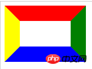
The outer margin of the element is the border of the element. An element's border is one or more lines that surround the element's content and inner borders. Each border will have three properties: width, style, and color. In the following article, we will introduce different examples from these three aspects and use the CSS border property to create a triangle.

Let’s first take a look at the effect achieved by the css border attribute:

 <style>
div{
    width: 100px; height: 50px;
    border: 30px solid red;
    border-right-color: green;
    border-bottom-color: blue;
    border-left-color:yellow;
    }
</style>
Copy after login
<div></div>
Copy after login
Copy after login
Copy after login
Copy after login
Copy after login

The effect is as follows:

Usage of css-border attribute: Use the css border attribute to create a triangle

When we When reducing the width of the box, the code is as follows:

<style>
div{
    width: 20px; height: 50px;
    border: 20px solid red;
    border-right-color: green;
    border-bottom-color: blue;
    border-left-color: yellow;
    }
</style>
Copy after login
<div></div>
Copy after login
Copy after login
Copy after login
Copy after login
Copy after login

The effect is as follows:

Usage of css-border attribute: Use the css border attribute to create a triangle

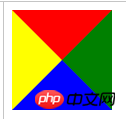
When we remove the width and height of the element , the code is as follows:

<style>
div{
    width: 0; 
    border: 50px solid red;
    border-right-color: green;
    border-bottom-color: blue;
    border-left-color: yellow;
    }
</style>
Copy after login
<div></div>
Copy after login
Copy after login
Copy after login
Copy after login
Copy after login

The effect is as follows:

Usage of css-border attribute: Use the css border attribute to create a triangle

At this time we find that when the width and height of the element are 0, it will become four squeezed together. triangle. Therefore, if the color of three of the borders is defined as transparent, then we will get a triangle!

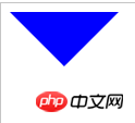
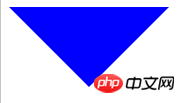
Set the color of the three borders to transparent color:

<style>
p{
    width: 0;
    border: 20px solid transparent;
    border-top-color: blue;
}
</style>
Copy after login
<p></p>
Copy after login

The running effect is as follows:

Usage of css-border attribute: Use the css border attribute to create a triangle

##We find the orientation of the small triangle through the code Is in the opposite direction to the edge name with the opaque color set. <p></p>For example, we set border-top-color: blue; The direction of the small triangle is downward. <p></p>

Tips:

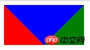
When we use the small triangle, because the four borders form a rectangle, we just set the other three sides to transparent colors. It still occupies a position in the document. In order to facilitate layout, we can set the opposite side of the small triangle to none; the specific principle is as follows:

<style>
div{
   width: 0; height: 0;
   border-top: 20px solid blue;
   border-left: 20px solid red;
   border-right: 20px solid green;
   border-bottom: none;
  }
</style>
Copy after login
<div></div>
Copy after login
Copy after login
Copy after login
Copy after login
Copy after login

The operation effect is as follows: <p></p>

Usage of css-border attribute: Use the css border attribute to create a triangle

div{
  width: 0; 
   border:20px solid transparent;
   border-top: 20px solid blue;
   border-bottom: none;
}
Copy after login
<div></div>
Copy after login
Copy after login
Copy after login
Copy after login
Copy after login

The operation effect is as follows:<p></p>

Usage of css-border attribute: Use the css border attribute to create a triangle

Application:


When we want to make this kind of layout, we can use this method To make small triangles, you no longer need to use img or background to achieve it.

<style>
       ul {
           overflow: hidden;
       }
       
       li {
           list-style: none;
           line-height: 60px;
           text-align: center;
           float: left;
           width: 120px;
           background: #f1f1f1;
           margin-right: 1px
       }
       
       li p {
           width: 0;
           border: 8px solid transparent;
           border-bottom-color: #666;
           border-top: none;
           float: right;
           margin: 26px 10px 0 0
       }
   </style>
Copy after login
rrree

The running effect is as follows: <p></p>

Usage of css-border attribute: Use the css border attribute to create a triangle

Expand it:


  • 我的课程<p></p>
  • 我的老师<p></p>
  • 学习时长<p></p>
Copy after login
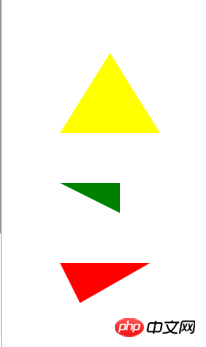
<style>
   div{
       margin: 50px
   }
   div:nth-child(1){
       width: 0;
       border: 30px solid transparent;
       border-bottom: 80px solid red;
       /* border-top: none; */
   }
   div:nth-child(2){
       width: 0;
       border-top: 30px solid blue;
       border-right:none;
       border-left: 90px solid transparent;
       border-bottom: none;
   }
   div:nth-child(3){
       width: 0;
       border-top: 30px solid blue;
       border-right:90px solid transparent;
       border-left: 10px solid transparent;
       border-bottom: none;
   }
</style>
Copy after login
The running effect is as follows: <p></p>

Usage of css-border attribute: Use the css border attribute to create a triangle

Recommended related articles: <p></p>

CSS border-left-color property_html/css_WEB-ITnose

##CSS border property tutorial (color style)

Recommended related courses:

<p></p>CSS in-depth understanding of border video tutorial

The above is the detailed content of Usage of css-border attribute: Use the css border attribute to create a triangle. For more information, please follow other related articles on the PHP Chinese website!

Related labels:
source:php.cn
Statement of this Website
The content of this article is voluntarily contributed by netizens, and the copyright belongs to the original author. This site does not assume corresponding legal responsibility. If you find any content suspected of plagiarism or infringement, please contact admin@php.cn
Popular Tutorials
More>
Latest Downloads
More>
Web Effects
Website Source Code
Website Materials
Front End Template
About us Disclaimer Sitemap
php.cn:Public welfare online PHP training,Help PHP learners grow quickly!