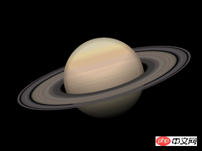

Press the "Click to Preview" button on the right to preview on the current page, and click on the link to preview in full screen.
https://codepen.io/comehope/pen/EpbaQX
This video is interactive, you can pause the video at any time and edit the video code.
Please use chrome, safari, edge to open and watch.
https://scrimba.com/p/pEgDAM/cBdyeTw
Define dom, the container itself represents the planet Saturn, and the ring Element represents the rings of Saturn:
<p class="saturn">
        <span class="rings"></span>
</p>Centered display:
body {
    margin: 0;
    height: 100vh;
    display: flex;
    align-items: center;
    justify-content: center;
    background-color: black;
}Define container size:
.saturn {
    width: 20em;
    height: 20em;
    font-size: 20px;
}Draw the planet Saturn (this is a draft, it will be refined later):
.saturn {
    position: relative;
}

.saturn::before,
.saturn::after {
    content: '';
    position: absolute;
    width: 9em;
    height: 9em;
    background: linear-gradient(
        palegoldenrod 0%,
        tan 10%,
        burlywood 30%,
        palegoldenrod 60%,
        darkgray 100%
    );
    border-radius: 50%;
    left: calc((20em - 9em) / 2);
    top: calc((20em - 9em) / 2);
}Draw the rings of Saturn (this is a draft and will be refined later):
.rings {
    position: absolute;
    width: inherit;
    height: inherit;
    background: radial-gradient(
        transparent 35%,
        dimgray 40%,
        slategray 50%,
        transparent 60%,
        dimgray 60%,
        slategray 70%,
        transparent 70%
    );
}Change the perspective of observing the rings of Saturn:
.rings {
    transform: rotateX(75deg);
}In order to make Saturn appear to be surrounded by Saturn The ring-circling effect divides Saturn into upper and lower halves, so that the layer order of them and the rings of Saturn is from bottom to top: the lower half of the planet, the rings of Saturn, the upper half of the planet:
.saturn::before {
    clip-path: inset(50% 0 0 0);
}

.saturn::after {
    clip-path: inset(0 0 50% 0);
} At this point, the overall structure of Saturn has been drawn, and then the details are refined.
Paint the rings of Saturn with rich gradient colors:
.rings {
    background: radial-gradient(
        rgba(24,19,25,0) 0%,
        rgba(53,52,51,0) 34%,
        rgba(55,54,52,1) 36%,
        rgba(56,55,53,1) 37%,
        rgba(68,67,66,1) 38%,
        rgba(56,55,53,1) 39%,
        rgba(68,67,66,1) 40%,
        rgba(56,55,53,1) 41%,
        rgba(87,77,76,1) 42%,
        rgba(87,77,76,1) 44%,
        rgba(113,110,103,1) 46%,
        rgba(113,110,103,1) 48%,
        rgba(113,98,93,1) 49%,
        rgba(113,98,93,1) 51%,
        rgba(122,115,105,1) 52%,
        rgba(113,98,93,1) 53%,
        rgba(113,98,93,1) 54%,
        rgba(122,115,105,1) 55%,
        rgba(106,99,89,1) 56%,
        rgba(106,99,89,1) 58%,
        rgba(79,76,76,0) 60%,
        rgba(65,64,70,1) 61%,
        rgba(65,64,70,1) 62%,
        rgba(90,85,89,1) 63%,
        rgba(78,74,73,1) 65%,
        rgba(78,73,74,1) 67%,
        rgba(78,73,74,0) 68%,
        rgba(78,73,75,1) 69%,
        rgba(78,73,75,1) 70%,
        rgba(78,73,76,0) 71%,
        rgba(77,72,76,0) 72%,
        rgba(24,19,25,0) 100%
    );
}Paint the planet with rich gradient colors:
.saturn::before,
.saturn::after {
    background:
        linear-gradient(
            rgba(212,203,174,1) 0%,
            rgba(212,203,174,1) 10%,
            rgba(221,203,157,1) 15%,
            rgba(221,203,157,1) 17%,
            rgba(213,181,143,1) 22%,
            rgba(213,181,143,1) 26%,
            rgba(208,180,158,1) 32%,
            rgba(208,180,158,1) 36%,
            rgba(218,188,162,1) 37%,
            rgba(218,188,162,1) 39%,
            rgba(211,184,157,1) 41%,
            rgba(211,184,157,1) 49%,
            rgba(205,186,156,1) 51%,
            rgba(205,186,156,1) 52%,
            rgba(202,176,153,1) 53%,
            rgba(202,176,153,1) 65%,
            rgba(190,177,145,1) 68%,
            rgba(190,177,145,1) 80%,
            rgba(150,144,130,1) 91%,
            rgba(150,144,130,1) 95%,
            rgba(131,129,117,1) 97%,
            rgba(131,129,117,1) 100%
        );
}Then add lighting effects to the planet:
.saturn::before,
.saturn::after {
    background:
        radial-gradient(
            circle at top,
            transparent 40%,
            black
        ),
        radial-gradient(
            transparent 62%,
            black
        ),
        linear-gradient(
            rgba(212,203,174,1) 0%,
            rgba(212,203,174,1) 10%,
            rgba(221,203,157,1) 15%,
            rgba(221,203,157,1) 17%,
            rgba(213,181,143,1) 22%,
            rgba(213,181,143,1) 26%,
            rgba(208,180,158,1) 32%,
            rgba(208,180,158,1) 36%,
            rgba(218,188,162,1) 37%,
            rgba(218,188,162,1) 39%,
            rgba(211,184,157,1) 41%,
            rgba(211,184,157,1) 49%,
            rgba(205,186,156,1) 51%,
            rgba(205,186,156,1) 52%,
            rgba(202,176,153,1) 53%,
            rgba(202,176,153,1) 65%,
            rgba(190,177,145,1) 68%,
            rgba(190,177,145,1) 80%,
            rgba(150,144,130,1) 91%,
            rgba(150,144,130,1) 95%,
            rgba(131,129,117,1) 97%,
            rgba(131,129,117,1) 100%
        );
}Finally, rotate the picture a little:
.saturn {
    transform: rotate(-15deg);
}You’re done!
Related articles:
CSS Secret Garden: Realistic text effects
##Use css to create star ratings_Experience exchange
Related videos:CSS navigation bar production tutorial
The above is the detailed content of Video demonstration: How to create a realistic Saturn with CSS? (with code). For more information, please follow other related articles on the PHP Chinese website!


