 Web Front-end
 HTML Tutorial
 What is Flexible Layout? Basic application of flexible layout flex (with code)
What is Flexible Layout? Basic application of flexible layout flex (with code)
What is elastic layout? Flexible layout (flex), as the name suggests, is a layout method. Nowadays, basically all browsers support flexible layout. So, what this article will share with you next is the basic application of flexible layout flex.
How to apply elastic layout, the code is as follows:
<!DOCTYPE html>
<html>
<head>
    <meta charset="UTF-8">
    <meta name="viewport" content="width=device-width, initial-scale=1.0">
    <meta http-equiv="X-UA-Compatible" content="ie=edge">
    <title>Document</title>
    <style>
        *{
            margin: 0;
            padding: 0;
        }
        div{
            border: 1px solid #ccc;
            box-sizing: border-box;
        }
        .box{
            height:20vh;
            display: flex;
        }
        .box div{
            flex: 1;
        }
        .box div:last-child{
            flex: 2;
        }
    </style>
</head>
<body>
    <div>
        <div>Document1</div>
        <div>Document2</div>
        <div>Document3</div>
        <div>Document4</div>
        <div>Document5</div>
    </div>
</body>
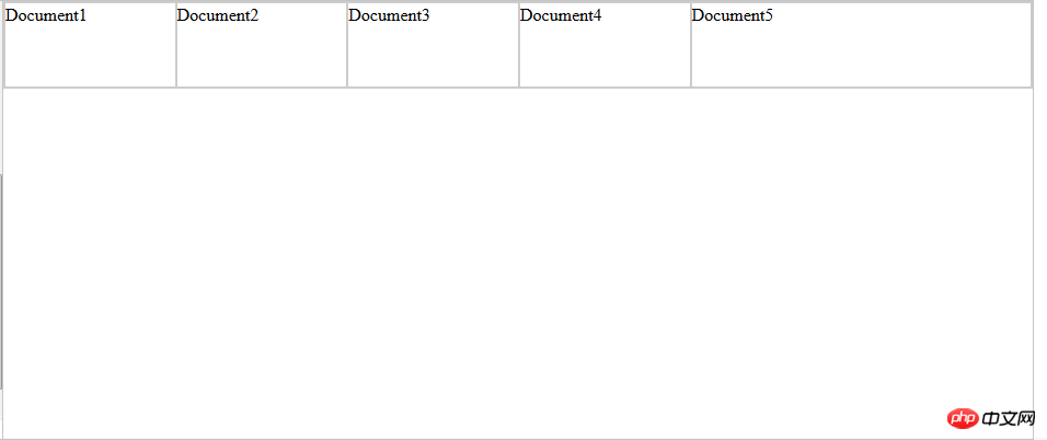
</html>The running results are as follows:

Container settings
flex has 6 properties that can be set:
flex-direction:row (main axis from left to right, default) / row-reverse ( Main axis from right to left) / column (main axis from top to bottom) / column-reverse (main axis from bottom to top) Determine the direction of the main axis
flex-wrap:nowrap (default, no line wrap) / wrap (line wrap) ) / wrap-reverse (line wrap, first line below) determines the wrapping method when the items cannot be arranged on one axis
flex-flow: It is the abbreviation mode of the above two properties. The default value: flex-flow :row nowrap.
justify-content: flex-start (default, left-aligned) / flex-end (right-aligned) / center (center) / space-between (justified at both ends, equal spacing between items) /
space-around (the space between each item is equal, so the space between items is twice as large as the price between the item and the border); determines the alignment of the items on the main axis. space-between/around is useful when adaptively adjusting spacing
align-items: flex-start (alignment of the starting point of the cross axis) / flex-end (alignment of the end point of the cross axis) / center (alignment of the end point of the cross axis) Midpoint alignment)/baseline (baseline alignment of the first line of text of the item)/stretch (default value, if the item does not set a height or is set to auto, the item will fill the height of the entire container). Define the alignment of items on the cross axis
align-content: flex-start (aligned with the starting point of the cross axis) / flex-end (aligned with the end point of the cross axis) / center (aligned with the center of the cross axis) Point alignment) /
space-between (aligned with both ends of the cross axis, the intervals between the axes are evenly distributed) /space-around (the intervals on both sides of the axis are equal, so the spacing between the axes is ratio The distance between the axis and the border is doubled)
/ stretch (default value, the axis occupies the entire cross axis). Define the alignment of multiple axes. If the project has its own axis, this property will not work.
Project property settings
order: Define the order of items, The smaller the number, the higher it is arranged. The default is 0.
flex-grow: Defines the magnification ratio of the item. The default is 0. By default, the item will not be enlarged even if there is remaining space. The direction of scaling is the direction of flex-direction.
flex-shrink: Define the shrinkage ratio of the item. The default is 1. When there is insufficient space, the item will shrink. A value of 0 means no scaling. The direction of scaling is the direction of flex-direction.
flex-basis: Defines the main axis space (main size) occupied by the project before allocating excess space. The browser does not calculate whether there is excess space on the main axis based on this attribute. The default value is auto, which is the original size of the project. size. flex-basis: 80px; the width (direction is row) is set to 80px;
flex: is the abbreviation of the above three properties, the default value is 0 1 auto. There are two shortcut values: auto (1 1 auto ) and none (0 0 auto)
align-self: This attribute allows the alignment of delayed items to be different from other items, and overrides the attribute value of align-items. The default value is auto, which means inheriting the align-items attribute of the parent element, or stretch if there is no parent element.
align-self: auto/flex-start/flex-end/center/baseline/stretch flex-basis: The difference between the value 0 and auto (default): the former does not calculate the entire item, and then The other is calculated ignoring the content, so if the layout requires the percentage configuration of each item, flex-basis should be set to 0.
Related recommendations:
Introduction to flexible layout (Flex) in HTML (with code)
The above is the detailed content of What is Flexible Layout? Basic application of flexible layout flex (with code). For more information, please follow other related articles on the PHP Chinese website!

Hot AI Tools

Undresser.AI Undress
AI-powered app for creating realistic nude photos

AI Clothes Remover
Online AI tool for removing clothes from photos.

Undress AI Tool
Undress images for free

Clothoff.io
AI clothes remover

AI Hentai Generator
Generate AI Hentai for free.

Hot Article

Hot Tools

Notepad++7.3.1
Easy-to-use and free code editor

SublimeText3 Chinese version
Chinese version, very easy to use

Zend Studio 13.0.1
Powerful PHP integrated development environment

Dreamweaver CS6
Visual web development tools

SublimeText3 Mac version
God-level code editing software (SublimeText3)

Hot Topics
 How to implement flexible layout and responsive design through vue and Element-plus
Jul 18, 2023 am 11:09 AM
How to implement flexible layout and responsive design through vue and Element-plus. In modern web development, flexible layout and responsive design have become a trend. Flexible layout allows page elements to automatically adjust their size and position according to different screen sizes, while responsive design ensures that the page displays well on different devices and provides a good user experience. This article will introduce how to implement flexible layout and responsive design through vue and Element-plus. To begin our work, we
 How to achieve horizontal scrolling effect through CSS Flex layout
Sep 27, 2023 pm 02:05 PM
Summary of how to achieve horizontal scrolling effect through CssFlex elastic layout: In web development, sometimes we need to display a series of items in a container and hope that these items can scroll horizontally. At this time, you can use CSSFlex elastic layout to achieve the horizontal scrolling effect. We can easily achieve this effect by adjusting the properties of the container with simple CSS code. In this article, I will introduce how to use CSSFlex to achieve a horizontal scrolling effect and provide specific code examples. CSSFl
 How to use CSS Flex layout to implement responsive design
Sep 26, 2023 am 08:07 AM
How to use CSSFlex elastic layout to implement responsive design. In today's era of widespread mobile devices, responsive design has become an important task in front-end development. Among them, using CSSFlex elastic layout has become one of the popular choices for implementing responsive design. CSSFlex elastic layout has strong scalability and adaptability, and can quickly implement screen layouts of different sizes. This article will introduce how to use CSSFlex elastic layout to implement responsive design, and give specific code examples.
 How to implement two-column layout through CSS Flex layout
Sep 26, 2023 am 10:54 AM
How to implement two-column layout through CSSFlex flexible layout CSSFlex flexible layout is a modern layout technology that can simplify the process of web page layout, allowing designers and developers to easily create layouts that are flexible and adaptable to various screen sizes. Among them, implementing a two-column layout is one of the common requirements in Flex layout. In this article, we will introduce how to use CSSFlex elastic layout to implement a simple two-column layout and provide specific code examples. Using Flex containers and projects
 Detailed explanation of spacing and white space processing methods in CSS Flex flexible layout
Sep 26, 2023 pm 08:22 PM
Detailed explanation of spacing and white space processing methods in CSSFlex flexible layout Introduction: CSSFlex flexible layout is a very convenient and flexible layout method, which can help us easily create responsive web page layout. When using Flex layout, you often encounter problems with setting spacing and dealing with whitespace. This article will detail how to handle spacing and whitespace in Flex layout and provide specific code examples. 1. Set spacing In Flex layout, we can set spacing in several ways. These are introduced below
 Detailed explanation of absolute positioning and cascading effects in CSS Flex flexible layout
Sep 27, 2023 pm 01:58 PM
Detailed explanation of absolute positioning and cascading effects in CSSFlex flexible layout Introduction: In CSS, flexible layout (Flex) is a very powerful layout model. It provides flexibility both vertically and horizontally, adapting to different screen sizes and devices. Flexible layouts also support various features, including absolute positioning and cascading effects. This article will delve into the use and implementation of absolute positioning and cascading effects in CSSFlex elastic layout, and provide detailed code examples. 1. Absolute positioning (AbsoluteP
 How to center a div in html
Apr 05, 2024 am 09:00 AM
There are two ways to center a div in HTML: Use the text-align attribute (text-align: center): For simpler layouts. Use flexible layout (Flexbox): Provide more flexible layout control. The steps include: enabling Flexbox (display: flex) in the parent element. Set the div as a Flex item (flex: 1). Use the align-items and justify-content properties for vertical and horizontal centering.
 How to implement irregular grid layout through CSS Flex layout
Sep 28, 2023 pm 09:49 PM
How to implement irregular grid layout through CSSFlex elastic layout. In web design, it is often necessary to use grid layout to achieve page segmentation and layout. Usually grid layout is regular, and each grid is the same size. Sometimes we may need to implement some irregular grid layout. CSSFlex elastic layout is a powerful layout method that can easily implement various grid layouts, including irregular grid layouts. Below we will introduce how to use CSSFlex elastic layout to achieve different


