Introduction to two methods of CSS grid layout (Grid) (with code)
CSS Grid layout (Grid) can divide web pages into rows and columns with simple attributes. You can directly use CSS to position and adjust each element in the grid, and there is no need to perform multi-layer embedding in order to achieve a certain layout. Set, in short, css grid layout is very easy to use. Let’s take a look at the content of css grid layout described in this article.
1. CSS Grid Layout (Grid)
CSS Grid layout consists of two core components: parent element and child element. The parent element is the actual grid (grid). Child elements are the content within the grid.
The following is a parent element and six child elements
   <div>
        <div>1</div>
        <div>2</div>
        <div>3</div>
        <div>4</div>
        <div>5</div>
        <div>6</div>
    </div>
To turn the parent element into a grid (grid), simply set its display attribute to grid
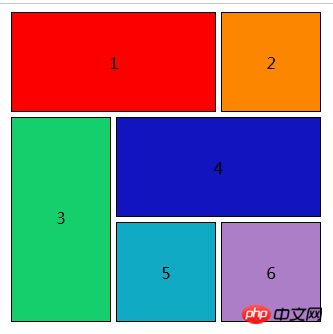
Effect Picture:

The following is the grid layout:
 .box {
            width: 350px;
            height: 350px;
            /* background: #ccc; */
            margin: 0 auto;
            grid-gap: 5px;
            display: grid;
            grid-template-columns: 100px 100px 100px;
            grid-template-rows: 100px 100px 100px;
        }

        .item {
            border: 1px solid black;
            box-sizing: border-box;
        }

        .div1 {
            grid-column-start: 1;
            grid-column-end: 3;
            /*(div1从占据从第一条网格线开始,到第三条网格线结束)*/
            line-height: 100px;
            text-align: center;
            background: rgb(252, 0, 0);
            /* grid-column: 1/3;(这是缩写的形式) */
        }

        .div2 {
            line-height: 100px;
            text-align: center;
            background: rgb(252, 134, 0);
        }

        .div3 {
            grid-row-start: 2;
            grid-row-end: 4;
            /* grid-row: 2/4;(这是缩写的形式) */
            line-height: 200px;
            text-align: center;
            background: rgb(21, 207, 108);
        }

        .div4 {
            grid-column-start: 2;
            grid-column-end: 4;
            line-height: 100px;
            text-align: center;
            background: rgb(18, 21, 189);
            /* grid-column: 2/4;(这是缩写的形式) */
        }

        .div5 {
            line-height: 100px;
            text-align: center;
            background: rgb(16, 170, 197);
        }

        .div6 {
            line-height: 100px;
            text-align: center;
            background: rgb(172, 126, 199);
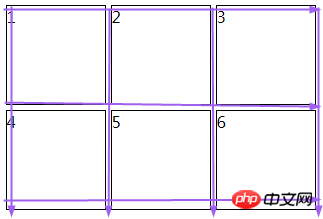
}The grid lines in the above code (arrows in the figure) The place pointed to is a grid line):

2. Responsive grid layout
Similar to the above (with the following content added)
Use the grid-template-columns property to create a 12-column grid, each column is a unit width (1/12 of the total width)
Create 3 rows using the grid-template-rows property
Use the grid-gap property to add a gap between grid items in the grid.
The code is as follows:
       <div class="container">
        <div class="header">顶部(一个点表示一个空白的格子),所以距离左边和右边各有一个格子的距离。</div>
        <div class="menu">中间1</div>
        <div class="content">中间2所以可以利用空白的格子来对你所要拍的网页来进行布局</div>
        <div class="footer">底部(一个点表示一个空白的格子),所以距离右边有三个格子的距离。</div>
</div>Add grid-template-areas
This attribute is called the grid area, also called the template area, which allows us to easily conduct layout experiments.
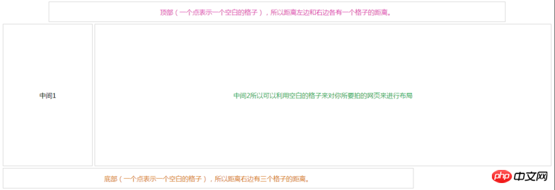
Rendering: 
        .container {
            display: grid;
            grid-template-columns: repeat(12, 1fr);
            grid-template-rows: 50px 350px 50px;
            grid-gap: 5px;
            grid-template-areas: ". h h h h h h h h h h ." " m m c c c c c c c c c c" "f f f f f f f f f . . .";
        }

        .container>p {
            border: 1px solid #ccc;
            box-sizing: border-box;
        }

        .header {
            text-align: center;
            line-height:50px;
            grid-area: h;
            color:rgb(219, 52, 169);
        }

        .menu {
            grid-area: m;
            text-align: center;
            line-height:350px;
        }

        .content {
            text-align: center;
            line-height:350px;
            grid-area: c;
            color:rgb(25, 158, 69);
        }

        .footer {
            color:rgb(212, 112, 18);
            text-align: center;
            line-height:50px;
            grid-area: f;
}Detailed explanation of Grid layout in CSS
Basic knowledge of CSS3 grid layout
The above is the detailed content of Introduction to two methods of CSS grid layout (Grid) (with code). For more information, please follow other related articles on the PHP Chinese website!

Hot AI Tools

Undresser.AI Undress
AI-powered app for creating realistic nude photos

AI Clothes Remover
Online AI tool for removing clothes from photos.

Undress AI Tool
Undress images for free

Clothoff.io
AI clothes remover

Video Face Swap
Swap faces in any video effortlessly with our completely free AI face swap tool!

Hot Article

Hot Tools

Notepad++7.3.1
Easy-to-use and free code editor

SublimeText3 Chinese version
Chinese version, very easy to use

Zend Studio 13.0.1
Powerful PHP integrated development environment

Dreamweaver CS6
Visual web development tools

SublimeText3 Mac version
God-level code editing software (SublimeText3)

Hot Topics
 1387
1387
 52
52
 How to use bootstrap in vue
Apr 07, 2025 pm 11:33 PM
Using Bootstrap in Vue.js is divided into five steps: Install Bootstrap. Import Bootstrap in main.js. Use the Bootstrap component directly in the template. Optional: Custom style. Optional: Use plug-ins.
 The Roles of HTML, CSS, and JavaScript: Core Responsibilities
Apr 08, 2025 pm 07:05 PM
HTML defines the web structure, CSS is responsible for style and layout, and JavaScript gives dynamic interaction. The three perform their duties in web development and jointly build a colorful website.
 How to write split lines on bootstrap
Apr 07, 2025 pm 03:12 PM
There are two ways to create a Bootstrap split line: using the tag, which creates a horizontal split line. Use the CSS border property to create custom style split lines.
 Understanding HTML, CSS, and JavaScript: A Beginner's Guide
Apr 12, 2025 am 12:02 AM
WebdevelopmentreliesonHTML,CSS,andJavaScript:1)HTMLstructurescontent,2)CSSstylesit,and3)JavaScriptaddsinteractivity,formingthebasisofmodernwebexperiences.
 How to resize bootstrap
Apr 07, 2025 pm 03:18 PM
To adjust the size of elements in Bootstrap, you can use the dimension class, which includes: adjusting width: .col-, .w-, .mw-adjust height: .h-, .min-h-, .max-h-
 How to use bootstrap button
Apr 07, 2025 pm 03:09 PM
How to use the Bootstrap button? Introduce Bootstrap CSS to create button elements and add Bootstrap button class to add button text
 React's Role in HTML: Enhancing User Experience
Apr 09, 2025 am 12:11 AM
React combines JSX and HTML to improve user experience. 1) JSX embeds HTML to make development more intuitive. 2) The virtual DOM mechanism optimizes performance and reduces DOM operations. 3) Component-based management UI to improve maintainability. 4) State management and event processing enhance interactivity.
 How to set up the framework for bootstrap
Apr 07, 2025 pm 03:27 PM
To set up the Bootstrap framework, you need to follow these steps: 1. Reference the Bootstrap file via CDN; 2. Download and host the file on your own server; 3. Include the Bootstrap file in HTML; 4. Compile Sass/Less as needed; 5. Import a custom file (optional). Once setup is complete, you can use Bootstrap's grid systems, components, and styles to create responsive websites and applications.


