 Web Front-end
 CSS Tutorial
 What does css float mean? The principle of css floating and the method of css clearing floating (with code)
What does css float mean? The principle of css floating and the method of css clearing floating (with code)
What does css float mean? The so-called CSS floating means that the floating element will break away from the normal flow of the document and move left or right according to the value of float until its outer boundary touches the inner boundary of the parent element or the outer boundary of another floating element. until. Because the floated box is not in the document's normal flow, block-level elements in the document's normal flow behave as if the floated element does not exist. Next, this article will tell you about the principle of CSS floating and the method of clearing floating in CSS.
Floating effect
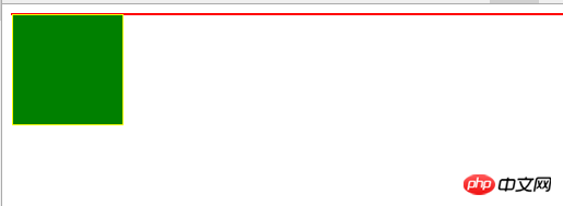
Floating elements will cause the parent element to collapse
When float is set to an element, the element leaves the document flow and the parent element does not set height. , causing collapse.
<div>
    <div></div>
</div>
.super{
    border:1px solid red;
}

.sub{
  float: left;
  background: green;
  border: 1px solid yellow;
  width: 100px;
  height: 100px;
}
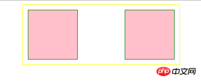
The left (right) outer boundary of a floating element cannot exceed the left (right) inner boundary of its parent element.
When the margin is not set to a negative value and the parent element still has remaining space, the outer boundary (margin) of the floating element will not exceed the inner boundary (padding) of the parent element.
<div>
    <div></div>
    <div></div>
</div>
.super{
    margin: 0 auto;
    padding: 10px;
    border:1px solid yellow;
     width: 300px;
}

.super:after{
  clear: both;
  content: '';
  display: block;
}

.sub1{
  float: left;
  background: pink;
  border: 1px solid green;
  width: 100px;
  height: 100px;
}

.sub2{
  float: right;
  background: pink;
  border: 1px solid green;
  width: 100px;
  height: 100px;
}
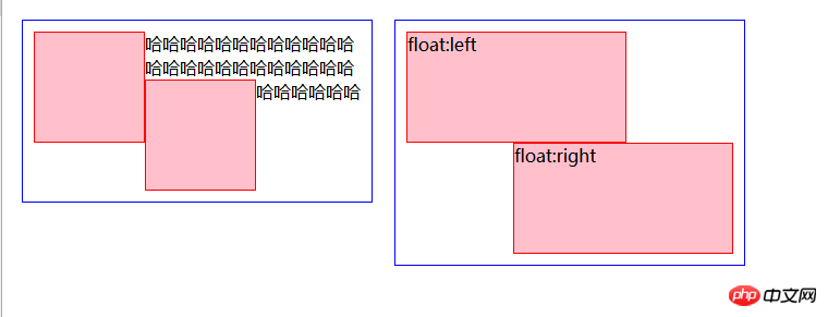
Floated elements will not overlap.
This is also applicable under the condition that margin will not be negative and the parent element has remaining space.
This is my understanding of Rules 2 and 3 in the Floating chapter of the "CSS Definitive Guide". The following is the original text.
2. The left (or right) outer edge of a floated element must be to the right (or left) of the right (left) outer edge of a left-floating (or right-floating) element that occurs earlier in the document’s source, unless the top of the later element is below the bottom of the former.
Youdao Translation:
2. The left (or right) outer edge of the floating element must be located on the right (left) of the right (left) floating (or right) The right outer edge of a left-floating element that appears earlier in the document's source code, unless the top of a later element is below element may not be to the right of the left outer edge of any right-floating element to its right. The left outer edge of a right- floating element may not be to the left of the right outer edge of any left-floating element to its left.
Youdao Translation:
3. The right outer edge of the left-floating element may not be to the right of the left outer edge of the right-floating element. The left outer edge of a right-floated element may not be to the left of the right outer edge of any left-floated element to the left.
These two rules are the basis for ensuring that two floating elements do not overlap.
The performance is that when a floating element moves to the left (right), there is already a floating element to the left (right) of the element. They will not overlap, and the later ones are arranged next to the first ones. If the total width of the floating elements exceeds the width of the parent element, the floating elements will not overlap. According to the order of the
HTML structure, floating elements that cannot be arranged on one line will be moved to the next line. <div class="code" style="position:relative; padding:0px; margin:0px;"><pre class='brush:php;toolbar:false;'><div class="super super1">
<div class="sub1"></div>哈哈哈哈哈哈哈哈哈哈哈哈哈哈哈哈哈哈哈哈哈哈哈哈哈哈哈哈哈哈
<div class="sub2"></div>
</div>
<div class="super super2">
<div class="sub1">float:left</div>
<div class="sub2">float:right</div>
</div>
.super {
float: left;
margin: 10px;
padding: 10px;
border: 1px solid blue;
width: 300px;
}
.super1 .sub1{
float: left;
background: pink;
border: 1px solid red;
width: 100px;
height: 100px;
}
.super1 .sub2{
float: left;
background: pink;
border: 1px solid red;
width: 100px;
height: 100px;
}
.super2 .sub1{
float: left;
background: pink;
border: 1px solid red;
width: 200px;
height: 100px;
}
.super2 .sub2{
float: right;
background: pink;
border: 1px solid red;
width: 200px;
height: 100px;
}</pre><div class="contentsignin">Copy after login</div></div>The effect is as follows:
 The top of a floating element cannot be higher than the inner top of its parent element. Higher than the top of the previously floated element.
This rule is also true when margin-top is not negative.
The top of the parent element will limit the floating element to prevent it from floating to the top of the page.
For the example on the right side of the picture below, sub2 is below sub1. The space on the right side of sub1 is not enough to accommodate sub2, but it is enough to accommodate sub3. However, sub3 does not float up. That is because its top cannot exceed the top of sub2. This The example is enough to prove that the top of the floating element cannot be higher than the top of the floating element that appeared before.<div class="super">
<div class="sub sub0"></div>
</div>
<div class="super">
<div class="sub sub1">sub1</div>
<div class="sub sub2">sub2</div>
<div class="sub sub3">sub3</div>
</div>
.super {
float: left;
margin: 10px;
padding: 10px;
border: 1px solid blue;
width: 320px;
}
.sub {
background: pink;
border: 1px solid red;
height: 100px;
}
.sub0 {
float: left;
width: 100px;
}
.sub1 {
float: left;
width: 200px;
}
.sub2 {
float: left;
width: 150px;
}
.sub3{
float: right;
width: 50px;
}The effect is as follows:
 ##Clear float
Clear float The purpose is to solve the problem of height collapse and expand the floating parent element. There are several commonly used methods:
Add an empty tag with the style clear:both
<p style="max-width:90%"></p>
Principle: clear will add a clearing area (clearance) above the margin-top of the element. This area will add extra space to the margin-top of the element and will not allow floating elements to enter this area. area.
Advantages: Convenience and strong compatibility.
Disadvantages: There are many meaningless tags, which increases maintenance costs, and if you are not careful, there will be a blank height if there is an extra space in the middle.The parent element is set to float
Advantages: simple, less code, and good browser support. Disadvantages: After the parent uses float, the impact of floating still exists, and it is impossible for the parent to use float all the way up.
Use overflow and zoom attributes
.fix{
    overflow:hidden(auto、scroll);
    zoom:1;
}优点:代码简洁,兼容性好,不产生多余标签。
缺点:设置该fix类的标签的内容超出该标签的时候会被隐藏(或产生滚动条)。
父元素设置浮动
优点:简单,代码少,浏览器支持好。
缺点:父级使用浮动之后,浮动造成的影响仍旧存在,并且不可能父级往上一级级都使用浮动。
父元素设置position
原理:在position的值不为relative或static的情况下,会形成BFC。
这种方式在父元素原本就需要设置position为fixed或者absolute的时候可以优先采用。
优点:简单,代码少,浏览器支持好。
缺点:改变父元素布局,影响整体布局。
使用:after
.fix:after{
    display:block;
    content:'';
    clear:both;
}原理类似添加新的标签然后设置clear:both;,但使用伪类的方法没有多余标签。
优点:代码简洁,兼容性好,不产生多余标签。
以上方法中,第一种增加一个样式为clear:both的空标签的方法不建议使用,会增加无意义标签,其他设置父元素浮动,改变父元素position、overflow的方法依情况而定,如果父元素本身就有这方面的样式需求,那很合适,如果没有的话还是采用最后一种伪元素的:after的方式最为常见。
相关文章推荐:
CSS清除浮动_清除float浮动_html/css_WEB-ITnose
Css3之基础-8 Css 浮动(定位,浮动定位)_html/css_WEB-ITnose
The above is the detailed content of What does css float mean? The principle of css floating and the method of css clearing floating (with code). For more information, please follow other related articles on the PHP Chinese website!

Hot AI Tools

Undresser.AI Undress
AI-powered app for creating realistic nude photos

AI Clothes Remover
Online AI tool for removing clothes from photos.

Undress AI Tool
Undress images for free

Clothoff.io
AI clothes remover

AI Hentai Generator
Generate AI Hentai for free.

Hot Article

Hot Tools

Notepad++7.3.1
Easy-to-use and free code editor

SublimeText3 Chinese version
Chinese version, very easy to use

Zend Studio 13.0.1
Powerful PHP integrated development environment

Dreamweaver CS6
Visual web development tools

SublimeText3 Mac version
God-level code editing software (SublimeText3)

Hot Topics
 1371
1371
 52
52
 How to use bootstrap button
Apr 07, 2025 pm 03:09 PM
How to use the Bootstrap button? Introduce Bootstrap CSS to create button elements and add Bootstrap button class to add button text
 How to resize bootstrap
Apr 07, 2025 pm 03:18 PM
To adjust the size of elements in Bootstrap, you can use the dimension class, which includes: adjusting width: .col-, .w-, .mw-adjust height: .h-, .min-h-, .max-h-
 How to insert pictures on bootstrap
Apr 07, 2025 pm 03:30 PM
There are several ways to insert images in Bootstrap: insert images directly, using the HTML img tag. With the Bootstrap image component, you can provide responsive images and more styles. Set the image size, use the img-fluid class to make the image adaptable. Set the border, using the img-bordered class. Set the rounded corners and use the img-rounded class. Set the shadow, use the shadow class. Resize and position the image, using CSS style. Using the background image, use the background-image CSS property.
 How to upload files on bootstrap
Apr 07, 2025 pm 01:09 PM
The file upload function can be implemented through Bootstrap. The steps are as follows: introduce Bootstrap CSS and JavaScript files; create file input fields; create file upload buttons; handle file uploads (using FormData to collect data and then send to the server); custom style (optional).
 How to remove the default style in Bootstrap list?
Apr 07, 2025 am 10:18 AM
The default style of the Bootstrap list can be removed with CSS override. Use more specific CSS rules and selectors, follow the "proximity principle" and "weight principle", overriding the Bootstrap default style. To avoid style conflicts, more targeted selectors can be used. If the override is unsuccessful, adjust the weight of the custom CSS. At the same time, pay attention to performance optimization, avoid overuse of !important, and write concise and efficient CSS code.
 How to change the size of a Bootstrap list?
Apr 07, 2025 am 10:45 AM
The size of a Bootstrap list depends on the size of the container that contains the list, not the list itself. Using Bootstrap's grid system or Flexbox can control the size of the container, thereby indirectly resizing the list items.
 How to set the bootstrap navigation bar
Apr 07, 2025 pm 01:51 PM
Bootstrap provides a simple guide to setting up navigation bars: Introducing the Bootstrap library to create navigation bar containers Add brand identity Create navigation links Add other elements (optional) Adjust styles (optional)
 How to layout bootstrap
Apr 07, 2025 pm 02:24 PM
To use Bootstrap to layout a website, you need to use a grid system to divide the page into containers, rows, and columns. First add the container, then add the rows in it, add the columns within the row, and finally add the content in the column. Bootstrap's responsive layout function automatically adjusts the layout according to breakpoints (xs, sm, md, lg, xl). Different layouts under different screen sizes can be achieved by using responsive classes.


