CSS3 animation properties: Introduction to the Animation property
The content of this article is about how to use CSS3 to create animation attributes: The introduction of the Animation attribute has certain reference value. Friends in need can refer to it. I hope it will be helpful to you.
There are three properties related to animation in the CSS3 properties: Transform, Transition, Animation; we have finished learning Transform and Transition together. Let us implement some basic animation effects on elements. I think these are enough to excite everyone for a while. Today we take advantage of this enthusiasm to continue learning the third animation attribute Animation. From the literal meaning of Animation, we will I know what "animation" means. But Animation in CSS3 is different from Canvas drawing animation in HTML5. Animation is only applied to DOM elements that already exist on the page, and it is different from the animation effects produced by Flash, JavaScript and jQuery, because we use CSS3 Animation can save us from complex js and jquery codes when making animations (which is very happy for people like me who don’t understand js). There is just one shortcoming. We can use Animation to create what we want. There are some animation effects, but they are a bit rough. If you want to make better animations, I think you should use flash or js. Although the animation produced by Animation is simple and rough, I think it still cannot reduce our enthusiasm for learning it.
Before we start introducing Animation, we need to first understand a special thing, that is "Keyframes", we call it "Keyframes", friends who have played flash may be familiar with this thing . Let's take a look at what this "Keyframes" is. When we used transition to create a simple transition effect earlier, we included initial attributes and final attributes, a start action time and a continuation action time as well as the transformation rate of the action. In fact, these values are all intermediate values. If we want The control is more detailed, for example, what actions do I want to perform in the first time period, and what actions do I want to perform in the second time period (switching to flash, it means what actions I want to perform in the first frame, and what actions I want to perform in the second frame What action), it is difficult for us to use Transition to achieve this. At this time, we also need such a "key frame" to control. Then CSS3 Animation uses the "keyframes" attribute to achieve this effect. Let's take a look at Keyframes first:
Keyframes have their own syntax rules. Their naming starts with "@keyframes", followed by the "name of the animation" plus a pair of curly braces. "{}", in brackets are some style rules for different time periods, a bit like our CSS style writing. For a style rule in "@keyframes" that is composed of multiple percentages, such as between "0%" and "100%", we can create multiple percentages in this rule, and we give each percentage a Elements with animation effects need to be added with different attributes, so that the elements can achieve a constantly changing effect, such as moving, changing element color, position, size, shape, etc. However, one thing to note is that we can use "fromt" and "to" represent where an animation starts and ends. In other words, "from" is equivalent to "0%" and "to" is equivalent to "100%". It is worth mentioning that, Among them, "0%" cannot omit the percent sign like other attribute values. We must add the percent sign ("%") here. If not, our keyframes will be invalid and will have no effect. Because the unit of keyframes only accepts percentage values.
Keyframes can be specified in any order to determine the key position of the Animation animation change. The specific grammar rules are as follows:
 keyframes-rule: '@keyframes' IDENT '{' keyframes-blocks '}';
 keyframes-blocks: [ keyframe-selectors block ]* ;
keyframe-selectors: [ 'from' | 'to' | PERCENTAGE ] [ ',' [ 'from' | 'to' | PERCENTAGE ] ]*;I combined the above grammar
  @keyframes IDENT {
     from {
       Properties:Properties value;
     }
     Percentage {
       Properties:Properties value;
     }
     to {
       Properties:Properties value;
     }
   }
   或者全部写成百分比的形式:
   @keyframes IDENT {
      0% {
         Properties:Properties value;
      }
      Percentage {
         Properties:Properties value;
      }
      100% {
         Properties:Properties value;
      }
}Among them, IDENT is an animation name. You can choose it casually. Of course, it is better to be more semantic. Percentage is the percentage value. , we can add many such percentages. Properties is the property name of css, such as left, background, etc., and value is the attribute value of the corresponding property. It is worth mentioning that our from and to correspond to 0% and 100% respectively. We have mentioned this before. So far, only browsers with webkit core support animation animation, so I need to add the -webkit prefix to the above. It is said that Firefox5 can support the animation animation property of CSS3.
Let's take a look at an example from the W3C official website
  @-webkit-keyframes 'wobble' {
     0% {
        margin-left: 100px;
        background: green;
     }
     40% {
        margin-left: 150px;
        background: orange;
     }
     60% {
        margin-left: 75px;
        background: blue;
     }
     100% {
        margin-left: 100px;
        background: red;
     }
}Here we define an animation called "wobble". His animation starts from 0% and ends at 100%, and there are still experiences from it There are two processes of 40% and 60%. The specific meaning of the above code is: when the wobble animation is at 0%, the element is positioned at the left position of 100px, the background color is green, and then at 40%, the element transitions to the left position of 150px and the background color is green. The color is orange. At 60%, the element transitions to the position where the left is 75px, and the background color is blue. Finally, when the animation ends at 100%, the element returns to the starting point where the left is 100px, and the background color becomes red. Assume that we only give this animation 10s of execution time, then the execution status of each segment is as shown in the figure below:

Keyframes定义好了以后,我们需要怎么去调用刚才定义好的动画“wobble”
CSS3的animation类似于transition属性,他们都是随着时间改变元素的属性值。他们主要区别是transition需要触发一个事件(hover事件或click事件等)才会随时间改变其css属性;而animation在不需要触发任何事件的情况下也可以显式的随着时间变化来改变元素css的属性值,从而达到一种动画的效果。这样我们就可以直接在一个元素中调用animation的动画属性,基于这一点,css3的animation就需要明确的动画属性值,这也就是回到我们上面所说的,我们需要keyframes来定义不同时间的css属性值,达到元素在不同时间段变化的效果。
下面我们来看看怎么给一个元素调用animation属性
  .demo1 {
     width: 50px;
     height: 50px;
     margin-left: 100px;
     background: blue;
     -webkit-animation-name:'wobble';/*动画属性名,也就是我们前面keyframes定义的动画名*/
     -webkit-animation-duration: 10s;/*动画持续时间*/
     -webkit-animation-timing-function: ease-in-out; /*动画频率,和transition-timing-function是一样的*/
     -webkit-animation-delay: 2s;/*动画延迟时间*/
     -webkit-animation-iteration-count: 10;/*定义循环资料,infinite为无限次*/
     -webkit-animation-direction: alternate;/*定义动画方式*/
}CSS Animation动画效果将会影响元素相对应的css值,在整个动画过程中,元素的变化属性值完全是由animation来控制,动画后面的会覆盖前面的属性值。如上面例子:因为我们这个demo只是在不同的时间段改变了demo1的背景色和左边距,其默认值是:margin-left:100px;background: blue;但当我们在执行动画0%时,margin-left:100px,background:green;当执行到40%时,属性变成了:margin-left:150px;background:orange;当执行到60%时margin-left:75px;background:blue;当动画 执行到100%时:margin-left:100px;background: red;此时动画将完成,那么margin-left和background两个属性值将是以100%时的为主,他不会产生叠加效果,只是一次一次覆盖前一次出将的css属性。就如我们平时的css一样,最后出现的权根是最大的。当动画结束后,样式回到默认效果。
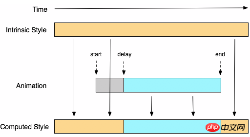
我们可以看一张来自w3c官网有关于css3的animation对属性变化的过程示意图

从上面的Demo中我们可以看出animation和transition一样有自己相对应的属性,那么在animation主要有以下几种:animation-name;animation-duration;animation-timing-function;animation-delay;animation-iteration-count;animation-direction;animation-play-state。下面我们分别来看看这几个属性的使用
一、animation-name:
语法:
animation-name: none | IDENT[,none | IDENT]*;
取值说明:
animation-name:是用来定义一个动画的名称,其主要有两个值:IDENT是由Keyframes创建的动画名,换句话说此处的IDENT要和Keyframes中的IDENT一致,如果不一致,将不能实现任何动画效果;none为默认值,当值为none时,将没有任何动画效果。另外我们这个属性跟前面所讲的transition一样,我们可以同时附几个animation给一个元素,我们只需要用逗号“,”隔开。
二、animation-duration:
语法:
animation-duration: <time>[,<time>]*
取值说明:
animation-duration是用来指定元素播放动画所持续的时间长,取值:
三、animation-timing-function:
语法:
animation-timing-function:ease | linear | ease-in | ease-out | ease-in-out | cubic-bezier(<number>, <number>, <number>, <number>) [, ease | linear | ease-in | ease-out | ease-in-out | cubic-bezier(<number>, <number>, <number>, <number>)]*
取值说明:
animation-timing-function:是指元素根据时间的推进来改变属性值的变换速率,说得简单点就是动画的播放方式。他和transition中的transition-timing-function一样,具有以下六种变换方式:ease;ease-in;ease-in-out;linear;cubic-bezier。具体的使用方法大家可以点这里,查看其中transition-timing-function的使用方法。
四、animation-delay:
语法:
animation-delay: <time>[,<time>]*
取值说明:
animation-delay:是用来指定元素动画开始时间。取值为
五、animation-iteration-count
语法:
animation-iteration-count:infinite | <number> [, infinite | <number>]*
取值说明:
animation-iteration-count是用来指定元素播放动画的循环次数,其可以取值
六、animation-direction
语法:
animation-direction: normal | alternate [, normal | alternate]*
取值说明:
animation-direction是用来指定元素动画播放的方向,其只有两个值,默认值为normal,如果设置为normal时,动画的每次循环都是向前播放;另一个值是alternate,他的作用是,动画播放在第偶数次向前播放,第奇数次向反方向播放。
七、animation-play-state
语法:
animation-play-state:running | paused [, running | paused]*
取值说明:
animation-play-state主要是用来控制元素动画的播放状态。其主要有两个值,running和paused其中running为默认值。他们的作用就类似于我们的音乐播放器一样,可以通过paused将正在播放的动画停下了,也可以通过running将暂停的动画重新播放,我们这里的重新播放不一定是从元素动画的开始播放,而是从你暂停的那个位置开始播放。另外如果暂时了动画的播放,元素的样式将回到最原始设置状态。这个属性目前很少内核支持,所以只是稍微提一下。
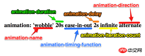
上面我们分别介绍了animation中的各个属性的语法和取值,那么我们综合上面的内容可以给animation属性一个速记法:
animation:[<animation-name> || <animation-duration> || <animation-timing-function> || <animation-delay> || <animation-iteration-count> || <animation-direction>] [, [<animation-name> || <animation-duration> || <animation-timing-function> || <animation-delay> || <animation-iteration-count> || <animation-direction>] ]*
如下图所示

兼容的浏览器
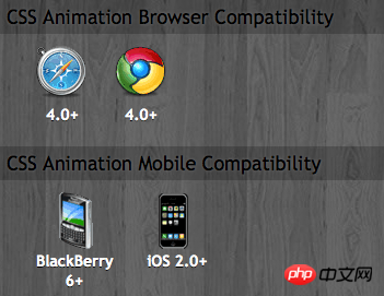
前面我也简单的提过,CSS3的animation到目前为止只支持webkit内核的浏览器,因为最早提出这个属性的就是safari公司,据说Firefox5.0+将支持Animation。如图所示

那么到此为止,我们主要一起学习了有关animation的理论知识,下面我们一起来看两个实例制作过程,来加强对animation的实践能力
DEMO一:发光变色的button
我们这个demo主要是通过在keyframes中改变元素的background;color;box-shadow三个属性,来达到一种发光变色的button效果,我们来看看其实现代码
HTML Code:
<a href="" class="btn">发光的button</a>
CSS Code
  /*给这个按钮创建一个动名名称:buttonLight,然后在每个时间段设置不同的background,color来达到变色效果,改变box-shadow来达到发光效果*/
  @-webkit-keyframes 'buttonLight' {
     from {
       background: rgba(96, 203, 27,0.5);
       -webkit-box-shadow: 0 0 5px rgba(255, 255, 255, 0.3) inset, 0 0 3px rgba(220, 120, 200, 0.5);
       color: red;
     }
     25% {
       background: rgba(196, 203, 27,0.8);
       -webkit-box-shadow: 0 0 10px rgba(255, 155, 255, 0.5) inset, 0 0 8px rgba(120, 120, 200, 0.8);
       color: blue;
    }
    50% {
      background: rgba(196, 203, 127,1);
      -webkit-box-shadow: 0 0 5px rgba(155, 255, 255, 0.3) inset, 0 0 3px rgba(220, 120, 100, 1);
      color: orange;
    }
    75% {
      background: rgba(196, 203, 27,0.8);
      -webkit-box-shadow: 0 0 10px rgba(255, 155, 255, 0.5) inset, 0 0 8px rgba(120, 120, 200, 0.8);
      color: black;
    }
   to {
     background: rgba(96, 203, 27,0.5);
     -webkit-box-shadow: 0 0 5px rgba(255, 255, 255, 0.3) inset, 0 0 3px rgba(220, 120, 200, 0.5);
     color: green;
    }
  }
  a.btn {
    /*按钮的基本属性*/
    background: #60cb1b;
    font-size: 16px;
    padding: 10px 15px;
    color: #fff;
    text-align: center;
    text-decoration: none;
    font-weight: bold;
    text-shadow: 0 -1px 1px rgba(0,0,0,0.3);
    -moz-border-radius: 5px;
    -webkit-border-radius: 5px;
    border-radius: 5px;
    -moz-box-shadow: 0 0 5px rgba(255, 255, 255, 0.6) inset, 0 0 3px rgba(220, 120, 200, 0.8);
    -webkit-box-shadow: 0 0 5px rgba(255, 255, 255, 0.6) inset, 0 0 3px rgba(220, 120, 200, 0.8);
    box-shadow: 0 0 5px rgba(255, 255, 255, 0.6) inset, 0 0 3px rgba(220, 120, 200, 0.8);
    /*调用animation属性,从而让按钮在载入页面时就具有动画效果*/
    -webkit-animation-name: "buttonLight"; /*动画名称,需要跟@keyframes定义的名称一致*/
    -webkit-animation-duration: 5s;/*动画持续的时间长*/
    -webkit-animation-iteration-count: infinite;/*动画循环播放的次数*/
}效果:
 效果一
效果一 变化中效果二
为了更好的看出这个demo的效果,你可以把上面的代码复制到你本过的页面上,并使用safari和chrome,你会觉得很有意思,整个按钮好像在不停的呼吸一样。
Demo二:方形旋转变成圆型
我们这个demo是通过transform的rotate和border-radius不同值,把一个方型图片随着时间的推移,慢慢的转换成了个圆型效果,下面我们来看看其具体实现的效果
HTML Code:
   <a href="#" class="box"></a>
   <span class="click-btn">Click</span>
CSS Code:
  /*定义方型转化为圆型的动画round*/
  @-webkit-keyframes 'round' {
     from{
       -webkit-transform: rotate(36deg);
       -webkit-border-radius: 2px;
     }
  10%{
      -webkit-transform: rotate(72deg);
      -webkit-border-radius: 4px;
     }
  20% {
      -webkit-transform: rotate(108deg);
      -webkit-border-radius: 6px;
    }
  30% {
      -webkit-transform: rotate(144deg);
      -webkit-border-radius: 9px;
    }
  40%{
     -webkit-transform: rotate(180deg);
     -webkit-border-radius: 12px;
  }
  50%{
     -webkit-transform: rotate(216deg);
     -webkit-border-radius: 14px;
  }
  60% {
     -webkit-transform: rotate(252deg);
     -webkit-border-radius: 16px;
  }
  70% {
     -webkit-transform: rotate(288deg);
     -webkit-border-radius: 19px;
  }
  80%{
     -webkit-transform: rotate(324deg);
     -webkit-border-radius: 22px;
  }
  to {
     -webkit-transform: rotate(360deg);
     -webkit-border-radius: 25px;
  }
}
   /*给方型box一个初步样式*/
   a.box {
      display: block;
      width: 50px;
      height: 50px;
      background: red;
      margin-bottom: 20px;
   }
   /*圆型box的样式,并在这里应用animation*/
   a.round {
      -webkit-border-radius: 25px;
      -moz-border-radius: 25px;
      border-radius: 25px;
      background: green;
      -webkit-animation-name: 'round'; /*动画名称*/
      -webkit-animation-duration: 60s;/*播放一次所持续时间*/
      -webkit-animation-timing-function: ease;/*动画播放频率*/
      -webkit-animation-iteration-count: infinite;/*动画播放次涒为无限次*/
    }

   /*click button效果*/
   .click-btn {
       background: rgba(125,220,80,0.8);
       -moz-border-radius: 5px;
      -webkit-border-radius: 5px;
       border-radius: 5px;
       -webkit-box-shadow: inset 0 0 8px rgba(255,255,255,0.8),0 0 10px rgba(10,255,120,0.3);
       -moz-box-shadow: inset 0 0 8px rgba(255,255,255,0.8),0 0 10px rgba(10,255,120,0.3);
       box-shadow: inset 0 0 8px rgba(255,255,255,0.8),0 0 10px rgba(10,255,120,0.3);
       padding: 5px 10px;
       color: #369;
       font-size: 16px;
       font-weight: bold;
       text-align: center;
       text-shadow: 0 -1px 0 rgba(0,0,0,0.5);
       cursor: pointer;
}jQuery Code:
  <script type="text/javascript">
      $(document).ready(function(){
         $(".click-btn").click(function(){
             $(this).siblings().addClass("round");
          });
       });
</script>我们载入时box是没有任何动画效果的,当我们点击了click button看给原box上加上一个round的class名,从而触发了一个round的动作。请看效果:
未点击按钮时效果(未触发动画效果) 点击click按钮开始播放动画
我们这里简单的介绍了两个demo的应用,其实大家可以发挥自己的想像制作出更好更多的动画效果,如果你对animation制作动画很感兴趣,你可以参考这几个网站:webdesignersblog、slope、impressivewebs这上面有许多特别有意的动画demo。
相关推荐:
The above is the detailed content of CSS3 animation properties: Introduction to the Animation property. For more information, please follow other related articles on the PHP Chinese website!

Hot AI Tools

Undresser.AI Undress
AI-powered app for creating realistic nude photos

AI Clothes Remover
Online AI tool for removing clothes from photos.

Undress AI Tool
Undress images for free

Clothoff.io
AI clothes remover

Video Face Swap
Swap faces in any video effortlessly with our completely free AI face swap tool!

Hot Article

Hot Tools

Notepad++7.3.1
Easy-to-use and free code editor

SublimeText3 Chinese version
Chinese version, very easy to use

Zend Studio 13.0.1
Powerful PHP integrated development environment

Dreamweaver CS6
Visual web development tools

SublimeText3 Mac version
God-level code editing software (SublimeText3)

Hot Topics
 1386
1386
 52
52
 Building an Ethereum app using Redwood.js and Fauna
Mar 28, 2025 am 09:18 AM
With the recent climb of Bitcoin’s price over 20k $USD, and to it recently breaking 30k, I thought it’s worth taking a deep dive back into creating Ethereum
 Vue 3
Apr 02, 2025 pm 06:32 PM
It's out! Congrats to the Vue team for getting it done, I know it was a massive effort and a long time coming. All new docs, as well.
 Can you get valid CSS property values from the browser?
Apr 02, 2025 pm 06:17 PM
I had someone write in with this very legit question. Lea just blogged about how you can get valid CSS properties themselves from the browser. That's like this.
 A bit on ci/cd
Apr 02, 2025 pm 06:21 PM
I'd say "website" fits better than "mobile app" but I like this framing from Max Lynch:
 Using Markdown and Localization in the WordPress Block Editor
Apr 02, 2025 am 04:27 AM
If we need to show documentation to the user directly in the WordPress editor, what is the best way to do it?
 Comparing Browsers for Responsive Design
Apr 02, 2025 pm 06:25 PM
There are a number of these desktop apps where the goal is showing your site at different dimensions all at the same time. So you can, for example, be writing
 Stacked Cards with Sticky Positioning and a Dash of Sass
Apr 03, 2025 am 10:30 AM
The other day, I spotted this particularly lovely bit from Corey Ginnivan’s website where a collection of cards stack on top of one another as you scroll.
 Let's use (X, X, X, X) for talking about specificity
Mar 24, 2025 am 10:37 AM
I was just chatting with Eric Meyer the other day and I remembered an Eric Meyer story from my formative years. I wrote a blog post about CSS specificity, and


