

The content of this article is about how to implement check marks on the menu with CSS? (code), it has certain reference value. Friends in need can refer to it. I hope it will be helpful to you.
<!DOCTYPE html>
<html lang="en">
<head>
<meta charset="UTF-8">
<title>:after :before</title>
<style>
li {
list-style-type: none;
position: relative;
margin: 2px;
padding: 0.5em 0.5em 0.5em 2em;
background: lightgrey;
font-family: sans-serif;
}
li.done {
background: #CCFF99;
}
li.done::before {
    content: '';
    position: absolute;
    border-color: #009933;
    border-style: solid;
    border-width: 0 0.3em 0.25em 0;
    height: 1em;
    top: 1.3em;
    left: 0.6em;
    margin-top: -1em;
    transform: rotate(45deg);
    width: 0.5em;
}
</style>
</head>
<body>
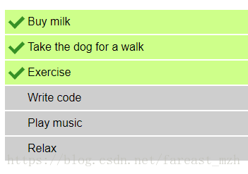
<ul>
<li>Buy milk</li>
<li>Take the dog for a walk</li>
<li>Exercise</li>
<li>Write code</li>
<li>Play music</li>
<li>Relax</li>
</ul>
</body>
<script>
var list = document.querySelector('ul');
list.addEventListener('click', function(ev) {
if (ev.target.tagName === 'LI') {
ev.target.classList.toggle('done');
}
}, false);
</script>
</html>The effect is as follows:
li.done::before {
content: '';
position: absolute;
border-color: #009933;
border-style: solid;
border-width: 0 0.3em 0.25em 0;
height: 1em;
top: 1.3em;
left: 0.6em;
margin-top: -1em;
transform: rotate(45deg);
width: 0.5em;
}.caret {
border-left: 4px solid transparent;
border-right: 4px solid transparent;
border-top: 4px dashed;
display: inline-block;
height: 0;
margin-left: 2px;
vertical-align: middle;
width: 0;
}CSS3 property: How to use text-shadow text shadow
How to use css to make images have a three-dimensional effect on the page? (Code actual test)
The above is the detailed content of How to implement check mark on menu with css? (code). For more information, please follow other related articles on the PHP Chinese website!


![[Web front-end] Node.js quick start](https://img.php.cn/upload/course/000/000/067/662b5d34ba7c0227.png)


