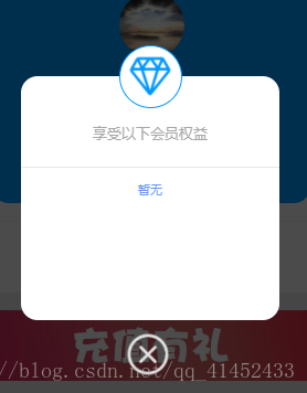
The content of this article is about how to customize the showmodal pop-up box (with code) in the WeChat applet. It has certain reference value. Friends in need can refer to it. I hope it will be helpful to you.
I have been busy fixing bugs and adding new features recently. I haven’t summarized it for a long time, and I don’t know what to summarize. Let’s write a custom showmodal box first

No nonsense and go straight to the code
wxml part
<view class="mask" catchtouchmove="preventTouchMove" wx:if="{{showModal}}"></view>
<view class="modalDlg" wx:if="{{showModal}}">
<view class='img_wrap'>
<image src='http://pbqyqto63.bkt.clouddn.com/%E9%92%BB%E7%9F%B3.png'></image>
</view>
<view class='useralert_huiyuan'>{{uservip}}</view>
<view class='useralert_quanyi'>享受以下会员权益</view>
<view class='fenggexian'></view>
<view class='vipinfo'>{{vipinfo}}</view>
<view class='shutalert' bindtap="go">
<image src='http://pbqyqto63.bkt.clouddn.com/%E9%94%99%E5%8F%B7.png'></image>
</view>
</view>wxss part
.mask{
width: 100%;
height: 100%;
position: fixed;
top: 0;
left: 0;
background: #000;
z-index: 9000;
opacity: 0.7;
}
.modalDlg{
width: 550rpx;
height: 520rpx;
position: fixed;
top: 25%;
z-index: 9999;
margin: 0rpx 100rpx 185rpx 100rpx;
background-color: #fff;
border-radius: 36rpx;
display: flex;
flex-direction: column;
align-items: center;
}where mask is the mask layer style
modalDlg is the container that pops up Style
Others are very casual, you can write whatever you want.
.img_wrap{
width: 130rpx;
height: 130rpx;
background: white;
border-radius:50%;
border:1px solid #0097ff;
margin: 0rpx auto;
position: absolute;
top: -65rpx;
margin-bottom: 30rpx;
}
.img_wrap image{
width: 100rpx;
height: 100rpx;
padding-top:15rpx;
padding-left:15rpx;
margin: 0rpx auto;
}
.useralert_huiyuan
{
font-size: 13px;
margin-top: 100rpx;
}
.useralert_quanyi
{
font-size: 13px;
color: darkgray;
}
.fenggexian{
width: 100%;
margin-top: 50rpx;
border-bottom:1px solid #e8e8e8;
}
.vipinfo{
margin-top: 30rpx;
color: #6698ff;
font-size: 11px;
}

.shutalert{
width: 110rpx;
margin: 0rpx auto
}
.shutalert image{
width: 100rpx;
height: 100rpx;
position: absolute;
bottom: -120rpx;
}Among them, mask is the mask layer style
modalDlg is the pop-up container style
Others are very casual, you can write whatever you want.
js part
Define a showModal in data[]: false The initial value must be false
I wrote two methods separately to control the switch because it is relatively rigid. , such
submit: function() {
this.setData({
showModal: true
})
},
go: function() {
this.setData({
showModal: false
})
},There is a more direct
You can control the switch in one method, and it can also be used for the mask layer. Click on the mask layer to close
Here I am Feel free to write
and define a showalert in data: false
Method:
alert: function() {
var that= this;
this.setData({
showalert: !that.data.showalert
})
},Customize the pop-up box how you want to use it
Related recommendations:
How to implement list rendering multi-layer nested loop in WeChat applet
Use Canvas API in WeChat applet to synthesize poster generation component package
Three methods for WeChat applet to update webview page
The above is the detailed content of How to customize the showmodal pop-up box in WeChat applet (with code). For more information, please follow other related articles on the PHP Chinese website!
 Features of ruby language
 What to do if the web page cannot be accessed
 How to add css style to html
 Why is my phone not turned off but when someone calls me it prompts me to turn it off?
 Detailed process of upgrading win7 system to win10 system
 How to open csv format file
 The difference between threads and processes
 Delete exif information


