 Web Front-end
 CSS Tutorial
 How to use pure CSS to achieve an animation effect without DOM elements
How to use pure CSS to achieve an animation effect without DOM elements
The content of this article is about how to use pure CSS to achieve an animation effect without DOM elements. It has certain reference value. Friends in need can refer to it. I hope it will be helpful to you.
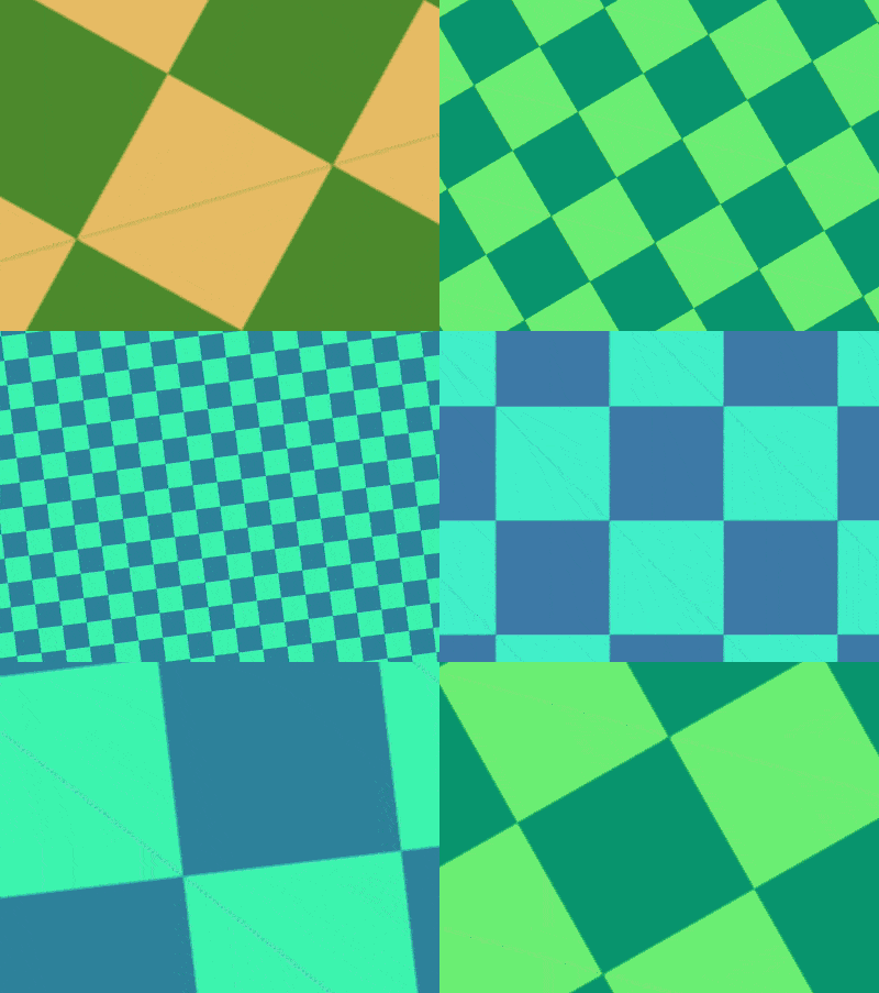
Effect preview

Code interpretation
There is no dom element, just write css directly.
Set the page space:
body {
    position: fixed;
    margin: 0;
    width: 100vw;
    height: 100vh;
}Set the background pattern with pseudo elements:
body::before {
    content: '';
    position: fixed;
    width: 200vmax;
    height: 200vmax;
    background-color: steelblue;
    color: turquoise;
    background-image:
        linear-gradient(
            45deg,
            currentColor 25%,
            transparent 25%, transparent 75%,
            currentColor 75%),
        linear-gradient(
            45deg,
            currentColor 25%,
            transparent 25%, transparent 75%,
            currentColor 75%);
    background-position: 0 0, 5vmax 5vmax;
background-size: 10vmax 10vmax;Translate the background pattern:
body::before {
    top: 50%;
    left: 50%;
    animation:
        9s move infinite ease-in-out alternate;
}

@keyframes move {
    from {
        left: -40%;
        top: -40%;
    }

    to {
        left: -60%;
        top: -60%;
    }
}Let the background pattern rotate:
body::before {
    animation:
        9s move infinite ease-in-out alternate,
        9s -1.5s rotating infinite ease-in-out alternate;
}

@keyframes rotating {
    to {
        transform: rotate(180deg);
    }
}Pan the page:
body {
    top: 50%;
    left: 50%;
    animation:
        3s move infinite ease-in-out alternate;
}Zoom the page:
body {
    animation:
        3s move infinite ease-in-out alternate,
        3s zoom infinite ease-in-out alternate;
}

@keyframes zoom {
    to {
        transform: scale(10);
    }
}Finally, add the color change effect:
@keyframes rotating {
    to {
        transform: rotate(180deg);
        filter: hue-rotate(1turn);
    }
}You’re done!
Related recommendations:
How to use pure CSS to realize a moving white rabbit animation effect
The above is the detailed content of How to use pure CSS to achieve an animation effect without DOM elements. For more information, please follow other related articles on the PHP Chinese website!

Hot AI Tools

Undresser.AI Undress
AI-powered app for creating realistic nude photos

AI Clothes Remover
Online AI tool for removing clothes from photos.

Undress AI Tool
Undress images for free

Clothoff.io
AI clothes remover

AI Hentai Generator
Generate AI Hentai for free.

Hot Article

Hot Tools

Notepad++7.3.1
Easy-to-use and free code editor

SublimeText3 Chinese version
Chinese version, very easy to use

Zend Studio 13.0.1
Powerful PHP integrated development environment

Dreamweaver CS6
Visual web development tools

SublimeText3 Mac version
God-level code editing software (SublimeText3)

Hot Topics
 HTML Table Layout
Sep 04, 2024 pm 04:54 PM
Guide to HTML Table Layout. Here we discuss the Values of HTML Table Layout along with the examples and outputs n detail.
 HTML Input Placeholder
Sep 04, 2024 pm 04:54 PM
Guide to HTML Input Placeholder. Here we discuss the Examples of HTML Input Placeholder along with the codes and outputs.
 HTML5 Interview Questions
Sep 04, 2024 pm 04:55 PM
HTML5 Interview Questions 1. What are HTML5 multimedia elements 2. What is canvas element 3. What is geolocation API 4. What are Web Workers
 Jsoup Example
Sep 04, 2024 pm 04:55 PM
Guide to Jsoup Example. Here we discuss the definition, overview, examples with code implementation & examples respectively.
 How to implement the custom table function of clicking to add data in dcat admin?
Apr 01, 2025 am 07:09 AM
How to implement the table function of custom click to add data in dcatadmin (laravel-admin) When using dcat...
 HTML font
Sep 04, 2024 pm 04:53 PM
This is a guide to HTML Schriftart. Here we discuss the intrduction to Html Schriftart with appropriate syntax and respective examples.
 HTML special characters
Sep 04, 2024 pm 04:55 PM
Guide to HTML Sonderzeichen. Here we discuss the introduction to HTML Sonderzeichen, along with how does it works, and resective examples.
 The latest ranking list of virtual currency trading platform APP (inventory of top 10 virtual currency trading platforms)
Mar 04, 2025 pm 03:51 PM
This article lists the top ten leading cryptocurrency exchanges in the world, including OKX, Binance, Gate.io, Huobi, Kraken, Coinbase, KuCoin, Crypto.com, Bitfinex and Bitstamp. With their strong technical strength, rich product lines, strict compliance operations and innovative ecological construction, these exchanges have taken the lead in the global cryptocurrency market. The article will introduce their special functions, technical architecture, security measures, compliance qualifications and ecosystem construction respectively, providing reference for investors to choose a suitable trading platform.


