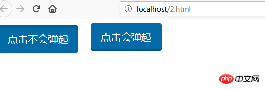
This article mainly introduces you to the various states of css button buttons. Hope it helps friends in need.
First of all, I will give you an example of the status code of the button button as follows:
<!DOCTYPE html>
<html>
<head lang="en">
    <meta charset="UTF-8">
    <title>button按钮的状态代码不同效果示例</title>
    <style>
        .btn{
            appearance: none;
            background: #026aa7;
            color: #fff;
            font-size: 20px;
            padding: 0.65em 1em;
            border-radius: 4px;
            box-shadow: inset 0 -4px 0 0 rgba(0,0,0,0.2);
            margin-right: 1em;
            cursor: pointer;
            border:0;
        }
        .btn1:hover{
            box-shadow: inset 0 -4px 0 0 rgba(0,0,0,0.6), 0 0 8px 0 rgba(0,0,0,0.5);
        }
        .btn1:focus{
            position: relative;
            top: 4px;
            box-shadow: inset 0 3px 5px 0 rgba(0,0,0, 0.2);
            outline: 0;
        }
        .btn2:hover{
            box-shadow: inset 0 -4px 0 0 rgba(0,0,0,0.6), 0 0 8px 0 rgba(0,0,0,0.5);
        }
        .btn2:active{
            position: relative;
            top: 4px;
            box-shadow: inset 0 3px 5px 0 rgba(0,0,0,0.2);
            outline: 0;
        }
        .btn2:focus{
            outline: 0;
        }
    </style>
</head>
<body>
<button class="btn btn1">点击不会弹起</button>
<button class="btn btn2">点击会弹起</button>
</body></html>The above code can be directly copied and pasted for local testing, and the effect is as follows:

To sum up, let me summarize the several states of button buttons:
Normal state
hover mouse hover state
active click state
focus Get the focus state
Note: .btn:focus{outline:0;} can remove the blue border after clicking the button or a label
The cursor attribute specifies the type (shape) of the cursor to be displayed. This attribute defines the cursor shape used when the mouse pointer is placed within the bounds of an element.
: The active selector is used to select active links. When you click on a link, it becomes active (activated).
I hope this article’s introduction to different situations of button status will be helpful to friends in need.
The above is the detailed content of What are the states of button buttons in css?. For more information, please follow other related articles on the PHP Chinese website!


