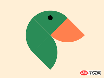
The content of this article is about how to use CSS to realize a duck head (with code). It has certain reference value. Friends in need can refer to it. I hope it will be helpful to you. .

https://github.com/comehope/front- end-daily-challenges
Define dom, the container contains 4 elements:
<figure>
    <span></span>
    <span></span>
    <span></span>
    <span></span>
</figure>
Centered display:
body {
    margin: 0;
    height: 100vh;
    display: flex;
    align-items: center;
    justify-content: center;
    background-color: papayawhip;
}Define container size:
.duck {
    width: 10em;
    height: 10em;
}Use grid to lay out the 4 squares in 2*2 format:
.duck {
    display: grid;
    grid-template-columns: repeat(2, 1fr);
}

.duck span {
    background-color: seagreen;
}Rotate the container 45 degrees:
.duck {
    transform: rotate(-45deg);
}Set the rounded corners of each square and combine it into a Abstract shape of a duck:
.duck span:nth-child(1) {
    border-top-left-radius: 100%;
}

.duck span:nth-child(2) {
    border-top-right-radius: 100%;
}

.duck span:nth-child(3) {
    border-bottom-right-radius: 100%;
}

.duck span:nth-child(4) {
    border-bottom-left-radius: 100%;
}Give the last square a different color to make it look like a duck’s beak:
.duck span:nth-child(4) {
    background-color: coral;
}Draw a circle with a radial gradient on the second square Dots represent the duck’s eyes:
.duck span:nth-child(2) {
    background-image: radial-gradient(black 0.5em, transparent 0.5em);
}Done!
Related recommendations:
How to use pure CSS to implement a black Angry Birds (with code)
How to use CSS and D3 realizes the animation effect of black and white overlapping
The above is the detailed content of How to use CSS to implement a duck head (with code). For more information, please follow other related articles on the PHP Chinese website!


