 WeChat Applet
 Mini Program Development
 WeChat Mini Program Example: Code Implementation of Custom Dialog Box
WeChat Mini Program Example: Code Implementation of Custom Dialog Box
This article brings you an example of a WeChat applet: the code implementation of a custom dialog box. It has certain reference value. Friends in need can refer to it. I hope it will be helpful to you.
Custom modal dialog example
Because the display modal pop-up window provided by the official API can only simply display text content, the dialog content cannot be customized. It lacks flexibility, so I implemented a custom modal dialog box based on the principle of modal pop-up windows.
wx.showModal(OBJECT)
Customization
Modal dialog box
Involving files
Interface wxml
Style wxcss
Events and methods js
Rendering
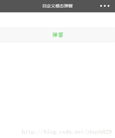
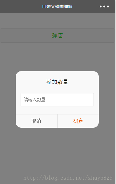
Interface code.wxml
<button class="show-btn" bindtap="showDialogBtn">弹窗</button>

<!--弹窗-->
<view class="modal-mask" bindtap="hideModal" catchtouchmove="preventTouchMove" wx:if="{{showModal}}"></view>
<view class="modal-dialog" wx:if="{{showModal}}">
  <view class="modal-title">添加数量</view>
  <view class="modal-content">
    <view class="modal-input">
      <input placeholder-class="input-holder" type="number" maxlength="10" bindinput="inputChange" class="input" placeholder="请输入数量"></input>
    </view>
  </view>
  <view class="modal-footer">
    <view class="btn-cancel" bindtap="onCancel" data-status="cancel">取消</view>
    <view class="btn-confirm" bindtap="onConfirm" data-status="confirm">确定</view>
  </view>
</view>Style.wxss
.show-btn {
  margin-top: 100rpx;
  color: #22cc22;
}

.modal-mask {
  width: 100%;
  height: 100%;
  position: fixed;
  top: 0;
  left: 0;
  background: #000;
  opacity: 0.5;
  overflow: hidden;
  z-index: 9000;
  color: #fff;
}

.modal-dialog {
  width: 540rpx;
  overflow: hidden;
  position: fixed;
  top: 50%;
  left: 0;
  z-index: 9999;
  background: #f9f9f9;
  margin: -180rpx 105rpx;
  border-radius: 36rpx;
}

.modal-title {
  padding-top: 50rpx;
  font-size: 36rpx;
  color: #030303;
  text-align: center;
}

.modal-content {
  padding: 50rpx 32rpx;
}

.modal-input {
  display: flex;
  background: #fff;
  border: 2rpx solid #ddd;
  border-radius: 4rpx;
  font-size: 28rpx;
}


.input {
  width: 100%;
  height: 82rpx;
  font-size: 28rpx;
  line-height: 28rpx;
  padding: 0 20rpx;
  box-sizing: border-box;
  color: #333;
}

input-holder {
  color: #666;
  font-size: 28rpx;
}

.modal-footer {
  display: flex;
  flex-direction: row;
  height: 86rpx;
  border-top: 1px solid #dedede;
  font-size: 34rpx;
  line-height: 86rpx;
}

.btn-cancel {
  width: 50%;
  color: #666;
  text-align: center;
  border-right: 1px solid #dedede;
}

.btn-confirm {
  width: 50%;
  color: #ec5300;
  text-align: center;
}Events and methods.js
Page({
    data: {
      showModal: false,
    },
    onLoad: function () {
    },
    /**
     * 弹窗
     */
    showDialogBtn: function() {
      this.setData({
        showModal: true
      })
    },
    /**
     * 弹出框蒙层截断touchmove事件
     */
    preventTouchMove: function () {
    },
    /**
     * 隐藏模态对话框
     */
    hideModal: function () {
      this.setData({
        showModal: false
      });
    },
    /**
     * 对话框取消按钮点击事件
     */
    onCancel: function () {
      this.hideModal();
    },
    /**
     * 对话框确认按钮点击事件
     */
    onConfirm: function () {
      this.hideModal();
    }
})Interpretation of implementation ideas and principles
Interface interpretation:
It is composed of a masked pop-up window, and the bound data {{showModal}} is used to control the display and hiding of the pop-up window
Interpretation of events and methods:
How to display the pop-up window:
    showDialogBtn: function() {
      this.setData({
        showModal: true
      })
}How to make the pop-up window disappear:
    hideModal: function () {
      this.setData({
        showModal: false
      });
}There is something to pay special attention to here, which is the following method:
    preventTouchMove: function () {
}Why is it an empty method? Because it needs to be viewed in conjunction with the interface wxml, there is an event binding catchtouchmove="preventTouchMove" in the masked view. The reason for this is to block the downward transmission of events and avoid being able to click or slide the interface under the mask after the pop-up window. If you don't write it like this, if the main interface is a scrollable interface, think about it, the user can also operate the scrolling list when the pop-up window pops up, I think your product manager will come to you.
3. 样式解读:(这个标题没加代码块标识,但还是像代码块一样被显示了,这是个bug!!!- -)
The writing of .modal-mask and .modal-dialog styles requires special attention.
Mainly due to the hierarchical relationship, the pop-up window must be on the top layer and not blocked by the interface, and the masking layer must block the interface, but the pop-up window cannot be blocked. Therefore, the z-index values of .modal-mask and .modal-dialog should be paid attention to.
Related recommendations:
How to reference the ivew weapp control in WeChat Mini Program
WeChat Mini Program Example: Implementation of Custom Navigation Bar method
The above is the detailed content of WeChat Mini Program Example: Code Implementation of Custom Dialog Box. For more information, please follow other related articles on the PHP Chinese website!

Hot AI Tools

Undresser.AI Undress
AI-powered app for creating realistic nude photos

AI Clothes Remover
Online AI tool for removing clothes from photos.

Undress AI Tool
Undress images for free

Clothoff.io
AI clothes remover

AI Hentai Generator
Generate AI Hentai for free.

Hot Article

Hot Tools

Notepad++7.3.1
Easy-to-use and free code editor

SublimeText3 Chinese version
Chinese version, very easy to use

Zend Studio 13.0.1
Powerful PHP integrated development environment

Dreamweaver CS6
Visual web development tools

SublimeText3 Mac version
God-level code editing software (SublimeText3)

Hot Topics
 1382
1382
 52
52
 Xianyu WeChat mini program officially launched
Feb 10, 2024 pm 10:39 PM
Xianyu's official WeChat mini program has quietly been launched. In the mini program, you can post private messages to communicate with buyers/sellers, view personal information and orders, search for items, etc. If you are curious about what the Xianyu WeChat mini program is called, take a look now. What is the name of the Xianyu WeChat applet? Answer: Xianyu, idle transactions, second-hand sales, valuations and recycling. 1. In the mini program, you can post idle messages, communicate with buyers/sellers via private messages, view personal information and orders, search for specified items, etc.; 2. On the mini program page, there are homepage, nearby, post idle, messages, and mine. 5 functions; 3. If you want to use it, you must activate WeChat payment before you can purchase it;
 WeChat applet implements image upload function
Nov 21, 2023 am 09:08 AM
WeChat applet implements picture upload function With the development of mobile Internet, WeChat applet has become an indispensable part of people's lives. WeChat mini programs not only provide a wealth of application scenarios, but also support developer-defined functions, including image upload functions. This article will introduce how to implement the image upload function in the WeChat applet and provide specific code examples. 1. Preparatory work Before starting to write code, we need to download and install the WeChat developer tools and register as a WeChat developer. At the same time, you also need to understand WeChat
 Implement the drop-down menu effect in WeChat applet
Nov 21, 2023 pm 03:03 PM
To implement the drop-down menu effect in WeChat Mini Programs, specific code examples are required. With the popularity of mobile Internet, WeChat Mini Programs have become an important part of Internet development, and more and more people have begun to pay attention to and use WeChat Mini Programs. The development of WeChat mini programs is simpler and faster than traditional APP development, but it also requires mastering certain development skills. In the development of WeChat mini programs, drop-down menus are a common UI component, achieving a better user experience. This article will introduce in detail how to implement the drop-down menu effect in the WeChat applet and provide practical
 Implement image filter effects in WeChat mini programs
Nov 21, 2023 pm 06:22 PM
Implementing picture filter effects in WeChat mini programs With the popularity of social media applications, people are increasingly fond of applying filter effects to photos to enhance the artistic effect and attractiveness of the photos. Picture filter effects can also be implemented in WeChat mini programs, providing users with more interesting and creative photo editing functions. This article will introduce how to implement image filter effects in WeChat mini programs and provide specific code examples. First, we need to use the canvas component in the WeChat applet to load and edit images. The canvas component can be used on the page
 Use WeChat applet to achieve carousel switching effect
Nov 21, 2023 pm 05:59 PM
Use the WeChat applet to achieve the carousel switching effect. The WeChat applet is a lightweight application that is simple and efficient to develop and use. In WeChat mini programs, it is a common requirement to achieve carousel switching effects. This article will introduce how to use the WeChat applet to achieve the carousel switching effect, and give specific code examples. First, add a carousel component to the page file of the WeChat applet. For example, you can use the <swiper> tag to achieve the switching effect of the carousel. In this component, you can pass b
 Implement image rotation effect in WeChat applet
Nov 21, 2023 am 08:26 AM
To implement the picture rotation effect in WeChat Mini Program, specific code examples are required. WeChat Mini Program is a lightweight application that provides users with rich functions and a good user experience. In mini programs, developers can use various components and APIs to achieve various effects. Among them, the picture rotation effect is a common animation effect that can add interest and visual effects to the mini program. To achieve image rotation effects in WeChat mini programs, you need to use the animation API provided by the mini program. The following is a specific code example that shows how to
 Implement the sliding delete function in WeChat mini program
Nov 21, 2023 pm 06:22 PM
Implementing the sliding delete function in WeChat mini programs requires specific code examples. With the popularity of WeChat mini programs, developers often encounter problems in implementing some common functions during the development process. Among them, the sliding delete function is a common and commonly used functional requirement. This article will introduce in detail how to implement the sliding delete function in the WeChat applet and give specific code examples. 1. Requirements analysis In the WeChat mini program, the implementation of the sliding deletion function involves the following points: List display: To display a list that can be slid and deleted, each list item needs to include
 What is the name of Xianyu WeChat applet?
Feb 27, 2024 pm 01:11 PM
The official WeChat mini program of Xianyu has been quietly launched. It provides users with a convenient platform that allows you to easily publish and trade idle items. In the mini program, you can communicate with buyers or sellers via private messages, view personal information and orders, and search for the items you want. So what exactly is Xianyu called in the WeChat mini program? This tutorial guide will introduce it to you in detail. Users who want to know, please follow this article and continue reading! What is the name of the Xianyu WeChat applet? Answer: Xianyu, idle transactions, second-hand sales, valuations and recycling. 1. In the mini program, you can post idle messages, communicate with buyers/sellers via private messages, view personal information and orders, search for specified items, etc.; 2. On the mini program page, there are homepage, nearby, post idle, messages, and mine. 5 functions; 3.


