

Buttons that Bootstrap must learn every day (1)_javascript skills

This article mainly explains the style of buttons.
1.Option
2. Size
3.Activity status
4. Disabled state
5. Html tags that can be used as buttons
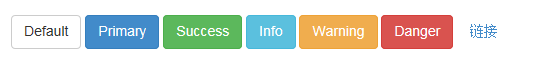
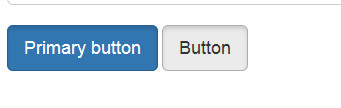
Options
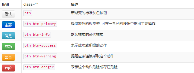
Use the classes listed above to quickly create a styled button.
 <button type="button" class="btn btn-default">Default</button>
 <button type="button" class="btn btn-primary">Primary</button>
 <button type="button" class="btn btn-success">Success</button>
 <button type="button" class="btn btn-info">Info</button>
 <button type="button" class="btn btn-warning">Warning</button>
 <button type="button" class="btn btn-danger">Danger</button>
 <button type="button" class="btn btn-link">链接</button>
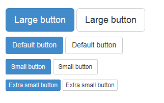
Size
Need the buttons to be different sizes? Use .btn-lg, .btn-sm, .btn-xs to get buttons of different sizes.
<p>
 <button type="button" class="btn btn-primary btn-lg">Large button</button>
 <button type="button" class="btn btn-default btn-lg">Large button</button>
</p>
<p>
 <button type="button" class="btn btn-primary">Default button</button>
 <button type="button" class="btn btn-default">Default button</button>
</p>
<p>
 <button type="button" class="btn btn-primary btn-sm">Small button</button>
 <button type="button" class="btn btn-default btn-sm">Small button</button>
</p>
<p>
 <button type="button" class="btn btn-primary btn-xs">Extra small button</button>
 <button type="button" class="btn btn-default btn-xs">Extra small button</button>
</p>
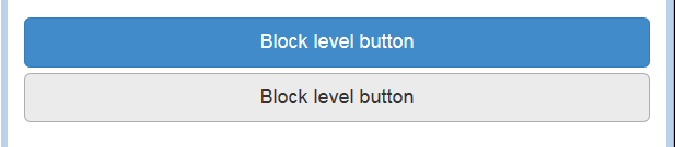
By adding .btn-block to the button, it can fill 100% of the width of the parent node, and the button also becomes a block element.
<button type="button" class="btn btn-primary btn-lg btn-block">Block level button</button>
<button type="button" class="btn btn-default btn-lg btn-block">Block level button</button>
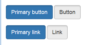
Activity status
When a button is active, it appears to be pressed (darker background, darker border, built-in shadow). For the B
<button type="button" class="btn btn-primary btn-lg active">Primary button</button>
<button type="button" class="btn btn-default btn-lg active">Button</button>
Link element
You can add .active class for .
<a href="#" class="btn btn-primary btn-lg active" role="button">Primary link</a>
<a href="#" class="btn btn-default btn-lg active" role="button">Link</a>
You can compare it with the button above.
Disabled status
By fading the button’s background color by 50%, you can create an unclickable effect.
Button element
Add disabled attribute to
<button type="button" class="btn btn-lg btn-primary" disabled="disabled">Primary button</button>
<button type="button" class="btn btn-default btn-lg" disabled="disabled">Button</button>
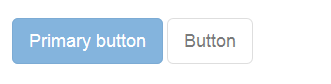
You can put the mouse on the button and click to see the effect.
Cross-browser compatibility
If you add the disabled attribute to
<a href="#" class="btn btn-primary btn-lg disabled" role="button">Primary link</a>
<a href="#" class="btn btn-default btn-lg disabled" role="button">Link</a>
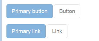
This is a comparison with the button above.
We use .disabled as a tool class, just like .active class, so there is no need to add a prefix.
Link functions are not affected
The classes mentioned above only change the appearance of and do not affect the functionality. In this document, we have disabled the default functionality of links via JavaScript code.
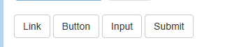
Html tags that can be used as buttons
You can add button classes to ,
 <a class="btn btn-default" href="#" role="button">Link</a>
 <button class="btn btn-default" type="submit">Button</button>
 <input class="btn btn-default" type="button" value="Input">
 <input class="btn btn-default" type="submit" value="Submit">
Cross-browser performance
As a best practice, we strongly recommend using the
For other reasons, this Firefox bug prevents us from setting line-height for buttons based on the tag, which results in their height being inconsistent with other buttons on Firefox.
This section mainly explains the styles of button buttons. You can flexibly run these styles for control. I hope it will be helpful to your learning.

Hot AI Tools

Undresser.AI Undress
AI-powered app for creating realistic nude photos

AI Clothes Remover
Online AI tool for removing clothes from photos.

Undress AI Tool
Undress images for free

Clothoff.io
AI clothes remover

AI Hentai Generator
Generate AI Hentai for free.

Hot Article
Hot Tools

Notepad++7.3.1
Easy-to-use and free code editor

SublimeText3 Chinese version
Chinese version, very easy to use

Zend Studio 13.0.1
Powerful PHP integrated development environment

Dreamweaver CS6
Visual web development tools

SublimeText3 Mac version
God-level code editing software (SublimeText3)
Hot Topics
 1378
1378
 52
52

 How to get the bootstrap search bar
Apr 07, 2025 pm 03:33 PM
How to get the bootstrap search bar
Apr 07, 2025 pm 03:33 PM
How to use Bootstrap to get the value of the search bar: Determines the ID or name of the search bar. Use JavaScript to get DOM elements. Gets the value of the element. Perform the required actions.
 How to do vertical centering of bootstrap
Apr 07, 2025 pm 03:21 PM
How to do vertical centering of bootstrap
Apr 07, 2025 pm 03:21 PM
Use Bootstrap to implement vertical centering: flexbox method: Use the d-flex, justify-content-center, and align-items-center classes to place elements in the flexbox container. align-items-center class method: For browsers that do not support flexbox, use the align-items-center class, provided that the parent element has a defined height.
 How to resize bootstrap
Apr 07, 2025 pm 03:18 PM
How to resize bootstrap
Apr 07, 2025 pm 03:18 PM
To adjust the size of elements in Bootstrap, you can use the dimension class, which includes: adjusting width: .col-, .w-, .mw-adjust height: .h-, .min-h-, .max-h-
 How to insert pictures on bootstrap
Apr 07, 2025 pm 03:30 PM
How to insert pictures on bootstrap
Apr 07, 2025 pm 03:30 PM
There are several ways to insert images in Bootstrap: insert images directly, using the HTML img tag. With the Bootstrap image component, you can provide responsive images and more styles. Set the image size, use the img-fluid class to make the image adaptable. Set the border, using the img-bordered class. Set the rounded corners and use the img-rounded class. Set the shadow, use the shadow class. Resize and position the image, using CSS style. Using the background image, use the background-image CSS property.
 How to set up the framework for bootstrap
Apr 07, 2025 pm 03:27 PM
How to set up the framework for bootstrap
Apr 07, 2025 pm 03:27 PM
To set up the Bootstrap framework, you need to follow these steps: 1. Reference the Bootstrap file via CDN; 2. Download and host the file on your own server; 3. Include the Bootstrap file in HTML; 4. Compile Sass/Less as needed; 5. Import a custom file (optional). Once setup is complete, you can use Bootstrap's grid systems, components, and styles to create responsive websites and applications.
 How to use bootstrap button
Apr 07, 2025 pm 03:09 PM
How to use bootstrap button
Apr 07, 2025 pm 03:09 PM
How to use the Bootstrap button? Introduce Bootstrap CSS to create button elements and add Bootstrap button class to add button text
 How to write split lines on bootstrap
Apr 07, 2025 pm 03:12 PM
How to write split lines on bootstrap
Apr 07, 2025 pm 03:12 PM
There are two ways to create a Bootstrap split line: using the tag, which creates a horizontal split line. Use the CSS border property to create custom style split lines.
 How to view the date of bootstrap
Apr 07, 2025 pm 03:03 PM
How to view the date of bootstrap
Apr 07, 2025 pm 03:03 PM
Answer: You can use the date picker component of Bootstrap to view dates in the page. Steps: Introduce the Bootstrap framework. Create a date selector input box in HTML. Bootstrap will automatically add styles to the selector. Use JavaScript to get the selected date.
