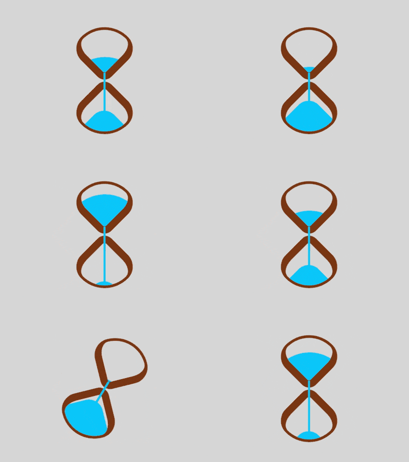
This article brings you a page about how to use css to monitor network connection status. It has certain reference value. Friends in need can refer to it. I hope it will be helpful to you.

https://github.com/comehope/front-end-daily -challenges
Define dom, the container contains 2 elements, representing the upper and lower half of the hourglass respectively:
<div>
    <span></span>
    <span></span>
</div>
Centered display:
body {
    margin: 0;
    height: 100vh;
    display: flex;
    align-items: center;
    justify-content: center;
    background-color: gainsboro;
}Define the container size and set the overall layout of the child elements:
.loader {
    width: 4.3em;
    height: 9.8em;
    font-size: 10px;
    position: relative;
    display: flex;
    flex-direction: column;
    align-items: center;
    justify-content: space-between;
}Draw 2 squares:
.top,
.bottom {
    width: 3.5em;
    height: 3.5em;
    border-style: solid;
    border-color: saddlebrown;
}Use borders, rounded corners and rotation to turn the 2 squares into Hourglass shape:
.top,
.bottom {
    border-width: 0.2em 0.2em 0.6em 0.6em;
    border-radius: 50% 100% 50% 30%;
}

.top {
    transform: rotate(-45deg);
}

.bottom {
    transform: rotate(135deg);
}Use pseudo elements to draw sand. The top of the upper sand is a large arc, and the top of the lower sand is a small arc:
.top::before,
.bottom::before {
    content: '';
    position: absolute;
    width: inherit;
    height: inherit;
    background-color: deepskyblue;
}

.top::before {
    border-radius: 0 100% 0 0;
}

.bottom::before {
    border-radius: 0 0 0 35%;
}Define the animation properties of the sand:
.top::before,
.bottom::before {
    animation: 2s linear infinite;
}Increase the animation effect of sand falling from the upper half of the hourglass:
.top::before {
    animation-name: drop-sand;
}

@keyframes drop-sand {
    to {
        transform: translate(-2.5em, 2.5em);
    }
}Increase the animation effect of sand accumulating in the lower half of the hourglass:
.bottom::before {
    transform: translate(2.5em, -2.5em);
    animation-name: fill-sand;
}

@keyframes fill-sand {
    to {
        transform: translate(0, 0);
    }
}Hide the upper half of the hourglass The upper part and the part outside the lower half of the container. At this time, the superposition effect of the above two animations is that the sand leaks from the upper half and slowly accumulates in the lower half:
.top,
.bottom {
    overflow: hidden;
}Made with pseudo elements of the outer container A narrow strip to simulate flowing sand:
.loader::after {
    content: '';
    position: absolute;
    width: 0.2em;
    height: 4.8em;
    background-color: deepskyblue;
    top: 1em;
}Add the animation effect of sand flow:
.loader::after {
    animation: flow 2s linear infinite;
}

@keyframes flow {
    10%, 100% {
        transform: translateY(3.2em);
    }
}Finally, add the flip animation of the hourglass:
.loader {
    animation: rotating 2s linear infinite;
}

@keyframes rotating {
    0%, 90% {
        transform: rotate(0);
    }

    100% {
        transform: rotate(0.5turn);
    }
}You’re done!
Related recommendations:
How to use CSS and D3 to implement a set of lanterns (with code)
How to use pure CSS to implement a red lantern Angry Birds (with code)The above is the detailed content of How to use pure CSS to achieve an hourglass animation effect. For more information, please follow other related articles on the PHP Chinese website!