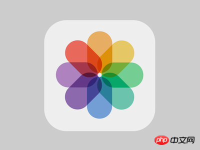
The content of this article is about how to use CSS to implement the album icon (code) of the Apple system. It has certain reference value. Friends in need can refer to it. I hope it will be helpful to you. .

https://github.com/comehope/front-end-daily -challenges
Define dom, the container contains 8 elements, each element represents a rectangular color block:
<div>
    <span></span>
    <span></span>
    <span></span>
    <span></span>
    <span></span>
    <span></span>
    <span></span>
    <span></span>
</div>
Centered display:
body {
    margin: 0;
    height: 100vh;
    display: flex;
    align-items: center;
    justify-content: center;
    background-color: #ccc;
}Define the size of the container:
.icon {
    width: 10em;
    height: 10em;
    font-size: 30px;
    background-color: #eee;
    border-radius: 20%;
}Draw the outline of the rectangle (the border is an auxiliary line, which will eventually be deleted), and place it in the middle and upper part of the container:
.icon {
    position: relative;
    display: flex;
    justify-content: center;
    box-sizing: border-box;
    padding: 1em;
}

.icon span {
    position: absolute;
    width: 22.5%;
    height: 37.5%;
    border: 1px dashed black;
    border-radius: 50% / 30%;
}Set the subscript for the rectangle Variable --n:
.icon span:nth-child(1) {
    --n: 1;
}

.icon span:nth-child(2) {
    --n: 2;
}

.icon span:nth-child(3) {
    --n: 3;
}

.icon span:nth-child(4) {
    --n: 4;
}

.icon span:nth-child(5) {
    --n: 5;
}

.icon span:nth-child(6) {
    --n: 6;
}

.icon span:nth-child(7) {
    --n: 7;
}

.icon span:nth-child(8) {
    --n: 8;
}Let the 8 rectangles rotate at fixed angles in sequence and form a circle:
.icon span {
    transform-origin: center 105%;
    transform: rotate(calc((var(--n) - 1) * 45deg));
}Set the color variable for the rectangle- -c:
.icon span:nth-child(1) {
    --c: rgba(243, 156, 18, 0.7);
}

.icon span:nth-child(2) {
    --c: rgba(241, 196, 15, 0.7);
}

.icon span:nth-child(3) {
    --c: rgba(46, 204, 113, 0.7);
}

.icon span:nth-child(4) {
    --c: rgba(27, 188, 155, 0.7);
}

.icon span:nth-child(5) {
    --c: rgba(65, 131, 215, 0.7);
}

.icon span:nth-child(6) {
    --c: rgba(102, 51, 153, 0.7);
}

.icon span:nth-child(7) {
    --c: rgba(155, 89, 182, 0.7);
}

.icon span:nth-child(8) {
    --c: rgba(242, 38, 19, 0.7);
}Color 8 rectangles and delete the borders that serve as auxiliary lines:
.icon span {
    /* border: 1px dashed black; */
    background-color: var(--c);
}Set the color mixing mode so that overlapping colors can be superimposed:
.icon span {
    mix-blend-mode: multiply;
}Add the mouse hover effect and run the animation of the rectangular color block expansion when hovering:
.icon:hover span {
    animation: rotating 2s ease-in-out forwards;
}

@keyframes rotating {
    from {
        transform: rotate(0deg);
    }

    to {
        transform: rotate(calc((var(--n) - 1) * 45deg));
    }
}Note that the first rectangle does not rotate during the animation because it starts from 0 degrees Go to 0 degrees. In order to make it rotate, you need to set its end angle to 360 degrees. This is achieved by modifying its subscript variable:
.icon span:nth-child(1) {
    --n: 9;
}You're done!
Related recommendations:
How to use pure CSS to achieve the text effect of tearing tinfoil (with code)
How to use css to monitor network connection status PageThe above is the detailed content of How to use pure CSS to implement the album icon of the Apple system (code). For more information, please follow other related articles on the PHP Chinese website!