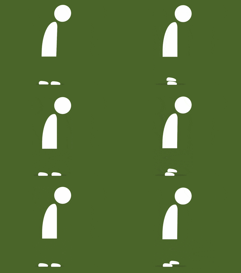
The content of this article is about how to use pure CSS to achieve the animation effect of a person walking alone (source code attached). It has certain reference value. Friends in need can refer to it. I hope it will help You helped.

https://github.com/comehope/front-end-daily-challenges
Define dom, the container contains 3 elements, representing the head, body and feet respectively:
<div>
    <span></span>
    <span></span>
    <span></span>
</div>
Centered display:
body {
    margin: 0;
    height: 100vh;
    display: flex;
    align-items: center;
    justify-content: center;
    background: radial-gradient(lightgray 20%, whitesmoke);
}Define container size:
.man {
    width: 12em;
    height: 33em;
    font-size: 10px;
    position: relative;
}Define the main color:
.man {
    color: white;
}Draw the head:
.head {
    position: absolute;
    width: 7em;
    height: 7em;
    background-color: currentColor;
    border-radius: 50%;
    right: 0;
}Draw the body:
.body {
    position: absolute;
    width: 6.2em;
    height: 14.4em;
    background-color: currentColor;
    top: 7em;
    border-radius: 100% 20% 0 0;
}Draw the feet, now only one can be seen Only one foot, because the two feet overlap each other, and you can see the two feet when you move:
.feet::before,
.feet::after {
    content: '';
    position: absolute;
    width: 4em;
    height: 1.4em;
    background-color: white;
    bottom: 0;
    left: -1.6em;
    border-radius: 1em 80% 0.4em 0.4em;
}Use pseudo elements to draw shadows:
.man::before {
    content: '';
    position: absolute;
    width: 12em;
    height: 0.8em;
    background-color: rgba(0, 0, 0, 0.1);
    bottom: -0.2em;
    left: -3em;
    border-radius: 50%;
}Next, add animation Effect.
Add the animation effect of walking, and make the animation time of the two feet staggered:
.feet::before,
.feet::after {
    animation: feet-animation 2s ease-in-out infinite;
}

.feet::after {
    animation-delay: 1s;
}

@keyframes feet-animation {
    20% {
        transform: translateX(3.4em) translateY(-1.6em) rotate(4deg);
    }

    30% {
        transform: translateX(4.6em) translateY(-1em) rotate(0deg);
    }

    40% {
        transform: translateX(5.6em) translateY(-0.6em) rotate(4deg);
    }

    44% {
        transform: translateX(5.6em) translateY(0) rotate(0deg);
    }
}Add the animation effect of the undulating head and body:
.head,
.body {
    animation: body-animation 4s ease-in-out infinite;
}

@keyframes body-animation {
    0%, 100% {
        transform: translateY(0) skewX(-2deg);
    }

    25%, 75% {
        transform: translateY(0.5em) skewX(0deg);
    }

    50% {
        transform: translateY(0) skewX(0deg);
    }
}Increase the shadow area with the body Animation effects that change due to movement:
.man::before {
    animation: shadow-animate 4s ease-in-out infinite;
}

@keyframes shadow-animate {
    0%, 50%, 100% {
        transform: scale(1);
    }

    25%, 75% {
        transform: scale(1.15);
    }
}Done!
Related recommendations:
How to use pure CSS to implement a paper crane (with source code)
How to use pure CSS to implement an Apple system Album icon (code)
The above is the detailed content of How to use pure CSS to achieve the animation effect of a person walking alone (source code attached). For more information, please follow other related articles on the PHP Chinese website!