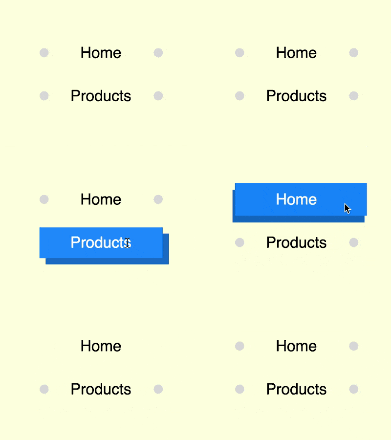
The content of this article is about how to use pure CSS to realize the button hover effect of the ball changing into a rectangular background (source code attached). It has certain reference value. Friends in need can refer to it. , hope it helps you.

https://github.com/comehope/front-end-daily -challenges
Define dom, the navigation contains an unordered list, and there is a list item in the list:
<nav>
    <ul>
        <li>home</li>
    </ul>
</nav>
Centered display:
body {
    margin: 0;
    height: 100vh;
    display: flex;
    align-items: center;
    justify-content: center;
    background-color: lightyellow;
}Hide the guide symbol on the front end of the list item:
nav ul {
    padding: 0;
    list-style-type: none;
}Set the container size:
nav li {
    width: 8em;
    height: 2em;
    font-size: 25px;
}Set the text style:
nav li {
    font-size: 25px;
    text-align: center;
    line-height: 2em;
    font-family: sans-serif;
    text-transform: capitalize;
}Add pseudo elements, which are 2 small balls:
nav li {
    position: relative;
}

nav li::before,
nav li::after {
    content: '';
    position: absolute;
    width: 0.6em;
    height: 0.6em;
    background-color: gainsboro;
    border-radius: 50%;
}Position the ball at the left and right ends:
nav li::before {
    top: calc(50% - 0.6em / 2);
    left: 0;
}

nav li::after {
    bottom: calc(50% - 0.6em / 2);
    right: 0;
}Next, set the button hover effect.
When the mouse hovers over the button, let the ball change into a rectangle equal to the size of the container:
nav li:hover::before,
nav li:hover::after {
    width: 100%;
    height: 100%;
    border-radius: 0;
}The first rectangle is slightly shifted to the lower right corner, and deepens its color, Form a shadow effect:
nav li:hover::before {
    z-index: -1;
    top: 0;
}

nav li:hover::after {
    z-index: -2;
    bottom: -0.4em;
    right: -0.4em;
    filter: brightness(0.8);
}Set the hover color, the rectangular background of the pseudo element turns blue, and the text turns white:
nav li:hover {
    color: white;
}

nav li:hover::before,
nav li:hover::after {
    background-color: dodgerblue;
}Set the easing time, in which the easing of the pseudo element Use anthropomorphic animation effects for the time function:
nav li {
    transition: 0.5s;
}

nav li::before,
nav li::after {
    transition: 0.5s cubic-bezier(0.5, -0.5, 0.25, 1.5);
}Add a few more buttons:
<nav>
    <ul>
        <li>home</li>
        <li>products</li>
        <li>services</li>
        <li>contact</li>
    </ul>
</nav>
Finally, increase the spacing between buttons:
nav li {
    margin: 0.8em;
}You’re done!
Related recommendations:
How to use pure CSS to implement a wandering jelly monster (source code attached)
How to use pure CSS to implement a person Animation effect of walking alone (source code attached)
The above is the detailed content of How to use pure CSS to achieve the button hover effect of the ball changing into a rectangular background (source code attached). For more information, please follow other related articles on the PHP Chinese website!