 Web Front-end
 CSS Tutorial
 What are the css inline elements? The difference between css block-level elements and inline elements
What are the css inline elements? The difference between css block-level elements and inline elements
Many CSS beginners may be easily confused when learning about CSS inline elements and CSS block-level elements. So, this article will explain to you what are CSS inline elements and block-level elements? And the difference between css block-level elements and css inline elements.
In the previous articleWhat is the definition of css block-level elements? What are the css block-level elements? In , we introduce the block-level (block) elements of CSS separately, so I won’t go into details here~ Let’s directly explain the CSS inline elements.
css inline element
css inline element is also called inline element. Inline elements are generally basic elements based on semantic level (semantic). They only Can accommodate text or other inline elements, the common inline element "a". For example, SPAN elements, IFRAME elements and element style display: inline are all inline elements. For example, elements such as text are arranged horizontally between letters and automatically wrap to the right end.
Characteristics of css inline elements:
1. It can be on the same line as other elements without having to start a new line.
2. The height, width, top and bottom margins of the element cannot be set.
3. The width of an element is the width of the text and pictures it contains and cannot be changed.
After introducing the css inline elements, let’s take a look at what the css inline elements are?
What are the css inline elements?
Common css inline elements:
| a: anchor point abbr: abbreviation acronym: first word b: bold (not recommended) bdo: bidi override big: big font br: line break cite: quote code: computer code (required when citing source code) dfn: Definition field em: Emphasis font: Font setting (not recommended) i: Italic img: Image input: Input box |
kbd : Define keyboard text label : Table label q : Short quote s : Underline (not recommended) samp : Define sample computer code select : Project selection small : Small font text span: Commonly used inline container, defining blocks within text strike: Underline strong: Bold emphasis sub: Subscript sup: Superscript textarea: multi-line text input box tt: telex text u: underline |
Next, let’s take a look at the differences between CSS block-level elements and CSS inline elements?
The difference between css block-level elements and css inline elements
One of the differences between css block-level elements and inline elements:
Block-level elements: Block-level elements will occupy an exclusive line, and the width will automatically fill the width of its parent element by default.
Inline elements: Inline elements will not occupy a single line, and adjacent inline elements will be arranged on the same line. Its width changes with the content.
<html>
<head>
    <title>区别</title>
    <style type="text/css">
     .div1{background-color: #090;}
     .span1{background-color: yellow;}
    </style>
</head>
<body>
<div class="div1">块级元素1</div>
<div class="div1">块级元素2</div>
<span class="span1">行级元素1</span>
<span class="span1">行级元素2</span>
</body>
</html>The effect is as follows:

The second difference between css block-level elements and inline elements:
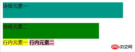
Block Level elements: Block-level elements can set width and height.
Inline elements: The width and height of inline elements cannot be set.
Example:
<html>
<head>
    <meta charset="UTF-8">
    <title>区别</title>
    <style type="text/css">
    p{background-color: #098;height: 50px;width: 50%;}
    div{background-color: green;height: 50px;width: 40%;}
    span{background-color: yellow;height: 70px;}
    strong{background-color: pink;height: 70px;}
    </style>
</head>
<body>
        <p>块级元素一</p>
        <div>块级元素二</div>
        <span>行内元素一</span>
        <strong>行内元素二</strong>
</body>
</html>The effect is as follows:

Note: Block-level elements still occupy one line even if the width is set.
The third difference between css block-level elements and inline elements:
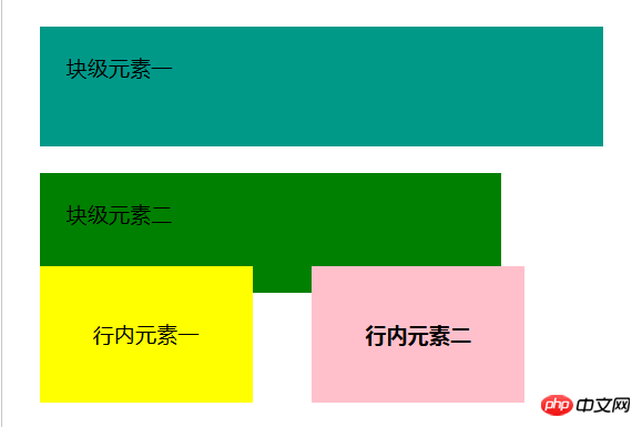
Block-level elements: Block-level elements can be set with margin and padding.
Inline elements: Horizontal margins and padding on inline elements such as margin-left and padding-right can produce margin effects.
Example:
<head>
    <meta charset="UTF-8">
    <title>区别</title>
    <style type="text/css">
    p{background-color: #098;height: 50px;width: 50%;padding: 20px;margin: 20px;}
    div{background-color: green;height: 50px;width: 40%;;padding: 20px;margin: 20px;}
    span{background-color: yellow;height: 70px;padding: 40px;margin: 20px;}
    strong{background-color: pink;height: 70px;padding: 40px;margin: 20px;}
    </style>
</head>
<body>
        <p>块级元素一</p>
        <div>块级元素二</div>
        <span>行内元素一</span>
        <strong>行内元素二</strong>
</body>The effect is as follows:

Note: Inline elements in the vertical direction such as padding-top and margin -bottom will not produce margin effects.
The fourth difference between css block-level elements and inline elements:
Block-level elements: Block-level elements correspond to display:block.
Inline elements: Inline elements correspond to display:inline.
Finally, let’s talk about one attribute: display: inline-block; it allows the element to have the characteristics of block-level elements and inline elements: it can set the length and width, enable padding and margin, and can be placed side by side with other inline elements. . It is a very practical attribute.
Note: You can switch between inline elements and block-level elements by modifying the display attribute of the element.
The article ends here. If you want to know more about the difference between CSS block-level elements and inline elements, you can go to the css video tutorial column on the php Chinese website to watch the video.
Related recommendations:
The difference between inline elements and block-level elements
htmlBlock-level elements and inline elements_html /css_WEB-ITnose
The above is the detailed content of What are the css inline elements? The difference between css block-level elements and inline elements. For more information, please follow other related articles on the PHP Chinese website!

Hot AI Tools

Undresser.AI Undress
AI-powered app for creating realistic nude photos

AI Clothes Remover
Online AI tool for removing clothes from photos.

Undress AI Tool
Undress images for free

Clothoff.io
AI clothes remover

Video Face Swap
Swap faces in any video effortlessly with our completely free AI face swap tool!

Hot Article

Hot Tools

Notepad++7.3.1
Easy-to-use and free code editor

SublimeText3 Chinese version
Chinese version, very easy to use

Zend Studio 13.0.1
Powerful PHP integrated development environment

Dreamweaver CS6
Visual web development tools

SublimeText3 Mac version
God-level code editing software (SublimeText3)

Hot Topics
 1392
1392
 52
52
 36
36
 110
110
 How to use bootstrap in vue
Apr 07, 2025 pm 11:33 PM
Using Bootstrap in Vue.js is divided into five steps: Install Bootstrap. Import Bootstrap in main.js. Use the Bootstrap component directly in the template. Optional: Custom style. Optional: Use plug-ins.
 The Roles of HTML, CSS, and JavaScript: Core Responsibilities
Apr 08, 2025 pm 07:05 PM
HTML defines the web structure, CSS is responsible for style and layout, and JavaScript gives dynamic interaction. The three perform their duties in web development and jointly build a colorful website.
 How to write split lines on bootstrap
Apr 07, 2025 pm 03:12 PM
There are two ways to create a Bootstrap split line: using the tag, which creates a horizontal split line. Use the CSS border property to create custom style split lines.
 Understanding HTML, CSS, and JavaScript: A Beginner's Guide
Apr 12, 2025 am 12:02 AM
WebdevelopmentreliesonHTML,CSS,andJavaScript:1)HTMLstructurescontent,2)CSSstylesit,and3)JavaScriptaddsinteractivity,formingthebasisofmodernwebexperiences.
 How to use bootstrap button
Apr 07, 2025 pm 03:09 PM
How to use the Bootstrap button? Introduce Bootstrap CSS to create button elements and add Bootstrap button class to add button text
 How to resize bootstrap
Apr 07, 2025 pm 03:18 PM
To adjust the size of elements in Bootstrap, you can use the dimension class, which includes: adjusting width: .col-, .w-, .mw-adjust height: .h-, .min-h-, .max-h-
 How to set up the framework for bootstrap
Apr 07, 2025 pm 03:27 PM
To set up the Bootstrap framework, you need to follow these steps: 1. Reference the Bootstrap file via CDN; 2. Download and host the file on your own server; 3. Include the Bootstrap file in HTML; 4. Compile Sass/Less as needed; 5. Import a custom file (optional). Once setup is complete, you can use Bootstrap's grid systems, components, and styles to create responsive websites and applications.
 How to insert pictures on bootstrap
Apr 07, 2025 pm 03:30 PM
There are several ways to insert images in Bootstrap: insert images directly, using the HTML img tag. With the Bootstrap image component, you can provide responsive images and more styles. Set the image size, use the img-fluid class to make the image adaptable. Set the border, using the img-bordered class. Set the rounded corners and use the img-rounded class. Set the shadow, use the shadow class. Resize and position the image, using CSS style. Using the background image, use the background-image CSS property.


