 WeChat Applet
 Mini Program Development
 WeChat Mini Program Example: Introduction to the method of building a static page for details page
WeChat Mini Program Example: Introduction to the method of building a static page for details page
This article brings you an example of a WeChat mini program: an introduction to the method of building a static page for details. It has certain reference value. Friends in need can refer to it. I hope it will be helpful to you. Create a new directory
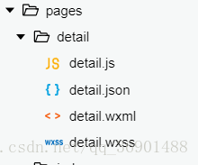
detail under the pages directory, and create a new page detail: 
in detail .json First change the text content of the navigation bar title:
{
  "navigationBarTitleText": "DETAIL页面"
}detail.wxml
<!--pages/detail/detail.wxml--><view class='detailContainer'>
<image class='headImg' src='/images/detail/carousel/1.jpg'></image>
<view class='avatar_date'>
<image src='/images/avatar/0.png'></image>
<text>美国队长</text>
<text>发布于</text>
<text>2018 06 12</text>
</view>
<text class='company'>火影村</text>
<view class='collection_share_container'>
<view class='collection_share'>
<image src='/images/icon/collection-anti.png'></image>
<image src='/images/icon/share-anti.png'></image>
</view>
<view class='line'></view>
</view>
<button>转发此文章</button>
<text class='content'>火咖啡馆就是了疯狂关键时刻来得及公司领导看过就发上来的考试管理的风格就是的离开几个老师</text></view>detail.wxss
/* pages/detail/detail.wxss */
.detailContainer {
  display: flex;
  flex-direction: column;
  }
.headImg{
  width:100%;
  height:460rpx;
  }
.avatar_date{
  padding: 10rpx;
  }
.avatar_date image{
  width: 64rpx;
  height: 64rpx;
  vertical-align: middle;
  }
.avatar_date text{
  font-size: 32rpx;
  margin-left: 10rpx;
  }
.company{
  font-size: 38rpx;
  font-weight: bold;
  margin-left: 10rpx;
  }
.collection_share_container{
  position: relative;
  }
.collection_share{
  float: right;
  margin-right: 50rpx;
  }
.collection_share image{
  width: 90rpx;
  height: 90rpx;
  margin-right: 20rpx;
  }
.line{
  width: 90%;
  height: 2rpx;
  background: rgb(226, 19, 19);
  top: 45rpx;
  left: 5%;
  position: absolute;
  z-index: -1;
  }
button{
  width: 280rpx;
  height: 80rpx;
  }
.content{
  font-size: 32rpx;
  text-indent: 64rpx;
  margin: 50rpx 0;
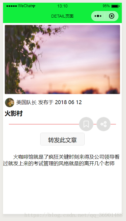
}The renderings are as follows: 
Related recommendations:
Detailed explanation of WeChat mini program case: Page construction
WeChat Mini Program Development-Creating a Welcome Page
The above is the detailed content of WeChat Mini Program Example: Introduction to the method of building a static page for details page. For more information, please follow other related articles on the PHP Chinese website!

Hot AI Tools

Undresser.AI Undress
AI-powered app for creating realistic nude photos

AI Clothes Remover
Online AI tool for removing clothes from photos.

Undress AI Tool
Undress images for free

Clothoff.io
AI clothes remover

AI Hentai Generator
Generate AI Hentai for free.

Hot Article

Hot Tools

Notepad++7.3.1
Easy-to-use and free code editor

SublimeText3 Chinese version
Chinese version, very easy to use

Zend Studio 13.0.1
Powerful PHP integrated development environment

Dreamweaver CS6
Visual web development tools

SublimeText3 Mac version
God-level code editing software (SublimeText3)

Hot Topics
 Xianyu WeChat mini program officially launched
Feb 10, 2024 pm 10:39 PM
Xianyu's official WeChat mini program has quietly been launched. In the mini program, you can post private messages to communicate with buyers/sellers, view personal information and orders, search for items, etc. If you are curious about what the Xianyu WeChat mini program is called, take a look now. What is the name of the Xianyu WeChat applet? Answer: Xianyu, idle transactions, second-hand sales, valuations and recycling. 1. In the mini program, you can post idle messages, communicate with buyers/sellers via private messages, view personal information and orders, search for specified items, etc.; 2. On the mini program page, there are homepage, nearby, post idle, messages, and mine. 5 functions; 3. If you want to use it, you must activate WeChat payment before you can purchase it;
 WeChat applet implements image upload function
Nov 21, 2023 am 09:08 AM
WeChat applet implements picture upload function With the development of mobile Internet, WeChat applet has become an indispensable part of people's lives. WeChat mini programs not only provide a wealth of application scenarios, but also support developer-defined functions, including image upload functions. This article will introduce how to implement the image upload function in the WeChat applet and provide specific code examples. 1. Preparatory work Before starting to write code, we need to download and install the WeChat developer tools and register as a WeChat developer. At the same time, you also need to understand WeChat
 Implement the drop-down menu effect in WeChat applet
Nov 21, 2023 pm 03:03 PM
To implement the drop-down menu effect in WeChat Mini Programs, specific code examples are required. With the popularity of mobile Internet, WeChat Mini Programs have become an important part of Internet development, and more and more people have begun to pay attention to and use WeChat Mini Programs. The development of WeChat mini programs is simpler and faster than traditional APP development, but it also requires mastering certain development skills. In the development of WeChat mini programs, drop-down menus are a common UI component, achieving a better user experience. This article will introduce in detail how to implement the drop-down menu effect in the WeChat applet and provide practical
 What is the name of Xianyu WeChat applet?
Feb 27, 2024 pm 01:11 PM
The official WeChat mini program of Xianyu has been quietly launched. It provides users with a convenient platform that allows you to easily publish and trade idle items. In the mini program, you can communicate with buyers or sellers via private messages, view personal information and orders, and search for the items you want. So what exactly is Xianyu called in the WeChat mini program? This tutorial guide will introduce it to you in detail. Users who want to know, please follow this article and continue reading! What is the name of the Xianyu WeChat applet? Answer: Xianyu, idle transactions, second-hand sales, valuations and recycling. 1. In the mini program, you can post idle messages, communicate with buyers/sellers via private messages, view personal information and orders, search for specified items, etc.; 2. On the mini program page, there are homepage, nearby, post idle, messages, and mine. 5 functions; 3.
 Use WeChat applet to achieve carousel switching effect
Nov 21, 2023 pm 05:59 PM
Use the WeChat applet to achieve the carousel switching effect. The WeChat applet is a lightweight application that is simple and efficient to develop and use. In WeChat mini programs, it is a common requirement to achieve carousel switching effects. This article will introduce how to use the WeChat applet to achieve the carousel switching effect, and give specific code examples. First, add a carousel component to the page file of the WeChat applet. For example, you can use the <swiper> tag to achieve the switching effect of the carousel. In this component, you can pass b
 How to use PHP to develop the second-hand transaction function of WeChat applet?
Oct 27, 2023 pm 05:15 PM
How to use PHP to develop the second-hand transaction function of WeChat applet? As a popular mobile application development platform, WeChat applet is used by more and more developers. In WeChat mini programs, second-hand transactions are a common functional requirement. This article will introduce how to use PHP to develop the second-hand transaction function of the WeChat applet and provide specific code examples. 1. Preparation work Before starting development, you need to ensure that the following conditions are met: the development environment of the WeChat applet has been set up, including registering the AppID of the applet and setting it in the background of the applet.
 Implement image filter effects in WeChat mini programs
Nov 21, 2023 pm 06:22 PM
Implementing picture filter effects in WeChat mini programs With the popularity of social media applications, people are increasingly fond of applying filter effects to photos to enhance the artistic effect and attractiveness of the photos. Picture filter effects can also be implemented in WeChat mini programs, providing users with more interesting and creative photo editing functions. This article will introduce how to implement image filter effects in WeChat mini programs and provide specific code examples. First, we need to use the canvas component in the WeChat applet to load and edit images. The canvas component can be used on the page
 Implement image rotation effect in WeChat applet
Nov 21, 2023 am 08:26 AM
To implement the picture rotation effect in WeChat Mini Program, specific code examples are required. WeChat Mini Program is a lightweight application that provides users with rich functions and a good user experience. In mini programs, developers can use various components and APIs to achieve various effects. Among them, the picture rotation effect is a common animation effect that can add interest and visual effects to the mini program. To achieve image rotation effects in WeChat mini programs, you need to use the animation API provided by the mini program. The following is a specific code example that shows how to


