 Web Front-end
 CSS Tutorial
 CSS achieves the effect of scaling the image when the mouse passes over it (code example)
CSS achieves the effect of scaling the image when the mouse passes over it (code example)
The content of this article is about how to use CSS to achieve the effect of image scaling (slow changes, with transition effects, and the scaling process has animated transitions) when the mouse passes over the image. It mainly uses CSS transform property, css3 transition property, the following implementation effects and specific implementation methods, I hope it will be helpful to you.
Let’s take a look at the effect preview first
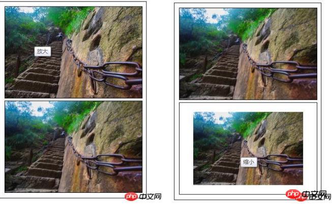
Code interpretation
HTML part Code
<div class="content">
	<ul>
	   <li><img  class="amplify lazy"  src="/static/imghw/default1.png"  data-src="img/1.jpg"    title="放大"/ alt="CSS achieves the effect of scaling the image when the mouse passes over it (code example)" ></li>
	   <li><img  class="narrow lazy"  src="/static/imghw/default1.png"  data-src="img/1.jpg"    title="缩小"/ alt="CSS achieves the effect of scaling the image when the mouse passes over it (code example)" ></li>
	</ul>
</div>
Define the container size, overflow: hidden; you can hide the overflow part when the size of the child container exceeds the parent container
* {
				margin: 0;
				padding: 0;
				font-family: "微软雅黑";
			}
			ul li{
				list-style: none;
			}
			.content{
				width: 310px;
				height: 420px;
				padding: 5px;
				border: 1px solid #000;
				margin: 10px auto;
			}
			/*定义容器的大小*/
			.content ul li{
				display: block;
				width: 300px;
				margin: 0 auto;
				margin: 5px;
				overflow: hidden;/*隐藏溢出*/
				border: 1px solid #000;
}Define the original scaling ratio of the image transform: scale(1 ),.
The transition effect when the image is zoomed: transition: all 1s ease 0s; all styles ease (gradually slow down) changes within 1 second. In addition to ease (default value), the transition attributes include: linear (Constant speed), ease-in: (accelerate), ease-out: (decelerate), ease-in-out: (accelerate and then decelerate)
 .content ul li img{
				display: block;
				border: 0;
				width: 100%;
				transform: scale(1);
				transition: all 1s ease 0s;
				-webkit-transform: scale(1);
				-webkit-transform: all 1s ease 0s;
}When the mouse moves to the picture, the zoom effect of the picture: scale If the value in () is greater than 1, it will be enlarged; if the value in scale() is less than 1, it will be reduced.
/*图片放大*/
			.content ul li:hover .amplify{
				transform: scale(1.3);
				transition: all 1s ease 0s;
				-webkit-transform: scale(1.3);
				-webkit-transform: all 1s ease 0s;
			}
			/*图片缩小*/
			.content ul li:hover .narrow{
				transform: scale(0.8);
				transition: all 1s ease 0s;
				-webkit-transform: scale(0.8);
				-webkit-transform: all 1s ease 0s;
}The above is the detailed content of CSS achieves the effect of scaling the image when the mouse passes over it (code example). For more information, please follow other related articles on the PHP Chinese website!

Hot AI Tools

Undresser.AI Undress
AI-powered app for creating realistic nude photos

AI Clothes Remover
Online AI tool for removing clothes from photos.

Undress AI Tool
Undress images for free

Clothoff.io
AI clothes remover

AI Hentai Generator
Generate AI Hentai for free.

Hot Article

Hot Tools

Notepad++7.3.1
Easy-to-use and free code editor

SublimeText3 Chinese version
Chinese version, very easy to use

Zend Studio 13.0.1
Powerful PHP integrated development environment

Dreamweaver CS6
Visual web development tools

SublimeText3 Mac version
God-level code editing software (SublimeText3)

Hot Topics
 1359
1359
 52
52
 How to remove the default style in Bootstrap list?
Apr 07, 2025 am 10:18 AM
The default style of the Bootstrap list can be removed with CSS override. Use more specific CSS rules and selectors, follow the "proximity principle" and "weight principle", overriding the Bootstrap default style. To avoid style conflicts, more targeted selectors can be used. If the override is unsuccessful, adjust the weight of the custom CSS. At the same time, pay attention to performance optimization, avoid overuse of !important, and write concise and efficient CSS code.
 How to use bootstrap button
Apr 07, 2025 pm 03:09 PM
How to use the Bootstrap button? Introduce Bootstrap CSS to create button elements and add Bootstrap button class to add button text
 How to resize bootstrap
Apr 07, 2025 pm 03:18 PM
To adjust the size of elements in Bootstrap, you can use the dimension class, which includes: adjusting width: .col-, .w-, .mw-adjust height: .h-, .min-h-, .max-h-
 How to insert pictures on bootstrap
Apr 07, 2025 pm 03:30 PM
There are several ways to insert images in Bootstrap: insert images directly, using the HTML img tag. With the Bootstrap image component, you can provide responsive images and more styles. Set the image size, use the img-fluid class to make the image adaptable. Set the border, using the img-bordered class. Set the rounded corners and use the img-rounded class. Set the shadow, use the shadow class. Resize and position the image, using CSS style. Using the background image, use the background-image CSS property.
 How to build a bootstrap framework
Apr 07, 2025 pm 12:57 PM
To create a Bootstrap framework, follow these steps: Install Bootstrap via CDN or install a local copy. Create an HTML document and link Bootstrap CSS to the <head> section. Add Bootstrap JavaScript file to the <body> section. Use the Bootstrap component and customize the stylesheet to suit your needs.
 How to layout bootstrap
Apr 07, 2025 pm 02:24 PM
To use Bootstrap to layout a website, you need to use a grid system to divide the page into containers, rows, and columns. First add the container, then add the rows in it, add the columns within the row, and finally add the content in the column. Bootstrap's responsive layout function automatically adjusts the layout according to breakpoints (xs, sm, md, lg, xl). Different layouts under different screen sizes can be achieved by using responsive classes.
 How to verify bootstrap date
Apr 07, 2025 pm 03:06 PM
To verify dates in Bootstrap, follow these steps: Introduce the required scripts and styles; initialize the date selector component; set the data-bv-date attribute to enable verification; configure verification rules (such as date formats, error messages, etc.); integrate the Bootstrap verification framework and automatically verify date input when form is submitted.
 How to upload files on bootstrap
Apr 07, 2025 pm 01:09 PM
The file upload function can be implemented through Bootstrap. The steps are as follows: introduce Bootstrap CSS and JavaScript files; create file input fields; create file upload buttons; handle file uploads (using FormData to collect data and then send to the server); custom style (optional).


