Gradient is a smooth transition between two or more colors. Previously, images had to be used to achieve these effects. However, by using CSS3 gradients, you can reduce download events and bandwidth usage. Additionally, elements with gradients look better when zoomed in because the gradient is generated by the browser. Gradient is divided into two types: linear gradient and radial gradient. The following is the css background color gradient: Actual examples of linear gradient and radial gradient effects
1. Linear gradient (linear-gradient)
To achieve a linear gradient, you need to define at least two colors. These two colors are the colors you want to transition smoothly, that is: one color is the starting point and the other color is the ending point.
Syntax:
background: linear-gradient(colorA,colorB)
colorA is the starting point color, colorB is the end point color.
You can also define the direction of the gradient, whether it is a gradient from top to bottom, a gradient from left to right, or a gradient from the upper left corner to the lower right corner (the default is from top to bottom).
Syntax:
background: linear-gradient(direction,colroA,colorB)
direction represents the direction of the gradient, just write the starting point of the direction directly, for example : The gradient direction is from left to right, just write left; the gradient direction is from bottom to top, just write bottom; the gradient direction is from the upper left corner to the lower right corner, just write background: linear-gradient(left top,colorA, colorB).
css linear gradient case
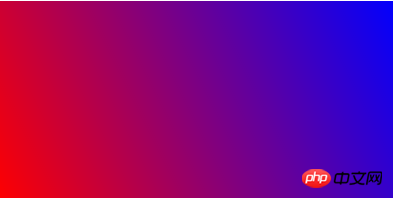
Example: from the lower left corner to the upper right corner, from red to blue gradient
Rendering:

Code:
<!DOCTYPE html>
<html>
 <head>
  <meta charset="utf-8" />
  <title></title>
  <style type="text/css">
   div{
    width: 400px;
    height: 200px;
    background: -webkit-linear-gradient(left bottom,red,blue);
    background: -o-linear-gradient(left bottom,red,blue);
    background: -moz-linear-gradient(left bottom,red,blue);
    background: linear-gradient(left bottom,red,blue);
   }
  </style>
 </head>
 <body>
  <div></div>
 </body>
</html>2. Radial-gradient
CSS3 radial gradient is a circular or oval gradient. Color no longer changes along a straight axis, but radiates in all directions from a starting point. It's more complex than a linear gradient.
You can define its center (the default gradient is center), shape (prototype or ellipse), size, etc.
Syntax: background: radial-gradient(position,shape,size,start-color,last-color)
position
left: Set the left side to be the abscissa value of the center of the radial gradient circle.
center: Set the abscissa value or ordinate of the center of the radial gradient circle in the middle.
right: Set the right side to be the abscissa value of the center of the radial gradient circle.
top: Set the top to the ordinate value of the center of the radial gradient circle.
bottom: Set the bottom to the vertical scale value of the center of the radial gradient circle.
shape
can be the value circle or ellipse. circle represents a circle and ellipse represents an ellipse. The default value is ellipse.
size
closest-side: Specify the radius length of the radial gradient from the center of the circle to the side closest to the center of the circle;
closest-corner: Specify the radial direction The radius length of the gradient is from the center of the circle to the corner closest to the center;
farthest-side: Specifies the radius length of the radial gradient from the center of the circle to the side farthest from the center;
farthest-corner: Specifies the radial gradient The radius length is from the center of the circle to the farthest corner from the center of the circle; default value
css radial gradient case
Example: start from 60%, 55% position Gradient, specify the radius length of the radial gradient from the center of the circle to the side closest to the center of the circle, and the gradient color from the inside to the outside is blue, green, yellow, black
Rendering:

Code:
<!DOCTYPE html>
<html>
 <head>
  <meta charset="utf-8" />
  <title></title>
  <style type="text/css">
   div{
    width: 400px;
    height: 200px;
    background: -webkit-radial-gradient(60% 55%, closest-side,blue,green,yellow,black);
     background: -o-radial-gradient(60% 55%, closest-side,blue,green,yellow,black);
    background: -moz-radial-gradient(60% 55%, closest-side,blue,green,yellow,black);
    background: radial-gradient(60% 55%, closest-side,blue,green,yellow,black);
   }
  </style>
 </head>
 <body>
  <div></div>
 </body>
</html> The above introduces the related usage of gradients, including meridional gradients and linear gradients. I hope it will be helpful to you!
The above is the detailed content of CSS background color gradient case: detailed explanation of linear gradient and radial gradient effect examples. For more information, please follow other related articles on the PHP Chinese website!