 Web Front-end
 CSS Tutorial
 How to make the overflow part of text display ellipsis in css? (code example)
How to make the overflow part of text display ellipsis in css? (code example)
When we are doing web front-end development, we usually get the article title and then display it line by line. But when the title is too long, it will cause line breaks. Also, when displaying part of the text information, it would be too cumbersome to display all of it, which would lead to a poor web experience. Although we can use overflow:hidden to hide characters that exceed the width. But the ending always seems a bit stiff. It is also not conducive to letting the user know that there are still undisplayed characters later. The best way is to replace the extra characters with ellipses.
In this chapter, we will give you a detailed introduction to how CSS makes the overflow part of the text display ellipses. I hope to be helpful.
1: A single line of text overflows and displays an ellipsis... (mostly the excess part of the title displays an ellipsis...)
<!DOCTYPE html>
<html>
	<head>
		<meta charset="UTF-8">
		<title>CSS如何使文本溢出部分显示省略号?单行超出</title>
		<style>
			*{margin: 0px;padding: 0px;}
			.box{width: 300px;height: 500px;margin: 50px auto;}
			.overflow{
				width:220px;
				overflow:hidden;
				white-space: nowrap;
				text-overflow: ellipsis;
				-o-text-overflow:ellipsis;
			}
		</style>
	</head>
	<body>
		<div class="box">
			<p>
				css 实现单行文本超出长度显示省略号
			</p>
			<p class="overflow">
				css 实现单行文本超出长度显示省略号
			</p>
		</div>
	</body>
</html>Rendering of the above code As follows:

Among them, white-space: nowrap; means that the text will not wrap and continue on the same line until it encounters a label;
overflow: hidden; Do not display content that exceeds the object size, that is, hide the excess part;
text-overflow: ellipsis; When the text object overflows, it is displayed..., of course, you can also set the attribute to clip Dots are not displayed;
-o-text-overflow: In order to be compatible with the opera browser;
2: Multi-line text overflow displays ellipses...
1. Directly use css attribute settings (only the -webkit kernel has an effect)
<!DOCTYPE html>
<html>
	<head>
		<meta charset="UTF-8">
		<title>CSS如何使文本溢出部分显示省略号?多行超出</title>
		<style>
			*{margin: 0px;padding: 0px;}
			.box{
				width: 280px;
				height: 62px;
				margin: 50px auto;
				overflow: hidden;
				text-overflow: ellipsis;
				display: -webkit-box;
				-webkit-line-clamp: 3;
				-webkit-box-orient: vertical;
			}
		</style>
	</head>
	<body>
		<div class="box">
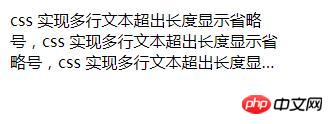
			css 实现多行文本超出长度显示省略号,css 实现多行文本超出长度显示省略号,
			css 实现多行文本超出长度显示省略号
		</div>
	</body>
</html>The rendering of the above code is as follows:

Among them, Most mobile browsers are based on WebKit core, so this method is suitable for mobile terminals;
-webkit-line-clamp is used to limit the number of lines of text displayed in a block element. This is a different Unsupported WebKit property, which does not appear in the CSS draft specification;
display: -webkit-box displays the object as a flexible box model;
-webkit-box- orient sets or retrieves the arrangement of the child elements of the flex box object;
text-overflow: ellipsis is used for multi-line text, using the ellipsis "..." to hide the text that exceeds the range.
2. Using pseudo-classes
<!DOCTYPE html>
<html>
	<head>
		<meta charset="UTF-8">
		<title>CSS如何使文本溢出部分显示省略号?多行超出</title>
		<style>
			*{margin: 0px;padding: 0px;}
			.box{
				width: 280px;
				height: 62px;
				margin: 50px auto;
				overflow: hidden;
				text-overflow: ellipsis;
				display: -webkit-box;
				-webkit-line-clamp: 3;
				-webkit-box-orient: vertical;
			}
			p{position: relative; line-height: 20px; max-height: 40px;overflow: hidden;}
			p::after{
				content: "..."; position: absolute; bottom: 0; right: 0; padding-left: 40px;
				background: -webkit-linear-gradient(left, transparent, #fff 55%);
				background: -o-linear-gradient(right, transparent, #fff 55%);
				background: -moz-linear-gradient(right, transparent, #fff 55%);
				background: linear-gradient(to right, transparent, #fff 55%);
			}
		</style>
	</head>
	<body>
		<div class="box">
		  <p>
		      css 实现多行文本超出长度显示省略号,
		      css 实现多行文本超出长度显示省略号,
		      css 实现多行文本超出长度显示省略号
		 </p>
		</div>
	</body>
</html>The rendering of the above code is as follows:

This method has a wide range of applications, but the text does not exceed Ellipses will also appear in the case of rows, and this method can be optimized with js.
Set height to an integer multiple of line-height to prevent excess text from being exposed. Adding a gradient background to p::after prevents only half of the text from being displayed. Since ie6-7 does not display content, you need to add tags to be compatible with ie6-7 (such as: ...); to be compatible with ie8, you need to replace ::after with :after.
3. Use absolute positioning and padding; (cross-browser solution)
<!DOCTYPE html>
<html>
	<head>
		<meta charset="UTF-8">
		<title>CSS如何使文本溢出部分显示省略号?多行超出</title>
		<style>
			*{margin: 0px;padding: 0px;}
			.box{width: 300px;height: 500px;margin: 50px auto;}
			.con{
			  position: relative;
			  height: 40px;
			  width: 250px;
			  line-height: 20px;
			  overflow: hidden;
			  padding-right: 12px;
			}
			.t{
			  position: absolute;
			  right: 0;
			  bottom: 0;
			}
		</style>
	</head>
	<body>
		<div class="box">
			 <p class="con">
			 	css 实现多行文本超出长度显示省略号,
			 	css 实现多行文本超出长度显示省略号,
			 	css 实现多行文本超出长度显示省略号。
			 	<span class="t">...</span>
			 </p>
		</div>
	</body>
</html>Rendering of the above code:

This The principle of the method is: first embed a ... in the element containing text, and then leave an ellipsis... position (padding-right) on the right side of the element containing text, Finally, use absolute positioning to position the ellipsis... to the padding-right area on the right (lower right corner).
The above is the detailed content of How to make the overflow part of text display ellipsis in css? (code example). For more information, please follow other related articles on the PHP Chinese website!

Hot AI Tools

Undresser.AI Undress
AI-powered app for creating realistic nude photos

AI Clothes Remover
Online AI tool for removing clothes from photos.

Undress AI Tool
Undress images for free

Clothoff.io
AI clothes remover

AI Hentai Generator
Generate AI Hentai for free.

Hot Article

Hot Tools

Notepad++7.3.1
Easy-to-use and free code editor

SublimeText3 Chinese version
Chinese version, very easy to use

Zend Studio 13.0.1
Powerful PHP integrated development environment

Dreamweaver CS6
Visual web development tools

SublimeText3 Mac version
God-level code editing software (SublimeText3)

Hot Topics
 What is node in js
May 07, 2024 pm 09:06 PM
Nodes are entities in the JavaScript DOM that represent HTML elements. They represent a specific element in the page and can be used to access and manipulate that element. Common node types include element nodes, text nodes, comment nodes, and document nodes. Through DOM methods such as getElementById(), you can access nodes and operate on them, including modifying properties, adding/removing child nodes, inserting/replacing nodes, and cloning nodes. Node traversal helps navigate within the DOM structure. Nodes are useful for dynamically creating page content, event handling, animation, and data binding.
 What language is the browser plug-in written in?
May 08, 2024 pm 09:36 PM
Browser plug-ins are usually written in the following languages: Front-end languages: JavaScript, HTML, CSS Back-end languages: C++, Rust, WebAssembly Other languages: Python, Java
 How to set unknown attributes in vscode vscode method to set unknown attributes
May 09, 2024 pm 02:43 PM
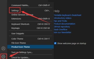
1. First, open the settings icon in the lower left corner and click the settings option. 2. Then, find the CSS column in the jumped window. 3. Finally, change the drop-down option in the unknownproperties menu to the error button.
 Can less files in vue introduce data?
May 07, 2024 pm 12:06 PM
Yes, Less files in Vue can introduce data through CSS variables and Less mixins: create a JSON file containing data. Import JSON files using the @import rule. Access JSON data using CSS variables or Less mixins.
 How to use less style in vue
May 07, 2024 pm 12:03 PM
Using LESS styles in Vue improves code maintainability and extensibility, specifically: Install the LESS compiler and LESS language plugin. Use lang="less" in the .vue file to specify the LESS style. Configure webpack in the Vue.js configuration file to compile LESS to CSS. The main advantages of the LESS style include: Using variables enhances maintainability and reusability. Use blending to simplify the use of repeating styles. Use functions to easily handle color and style manipulation.
 Graphical steps for setting the default properties of CSS in Visual Studio 2019
May 09, 2024 pm 02:01 PM
1. Open Visual Studio 2019, find its option settings, and click CSS. 2. Here you can see the technical settings of the following attributes. 3. Now you can set text and fill borders here. 4. At this time, you can also set the floating positioning here. 5. At this moment, you can also set the border and background here to complete the operation. 6. Finally, click the OK button here to set the CSS default properties.
 How to isolate styles in components in vue
May 09, 2024 pm 03:57 PM
Style isolation in Vue components can be achieved in four ways: Use scoped styles to create isolated scopes. Use CSS Modules to generate CSS files with unique class names. Organize class names using BEM conventions to maintain modularity and reusability. In rare cases, it is possible to inject styles directly into the component, but this is not recommended.
 How to wrap alert in javascript
May 08, 2024 pm 10:00 PM
How to wrap the alert box in JavaScript: use \n escape character: const myString = "First line\nSecond line\nThird line"; alert(myString);Use HTML <br> tag: const myString = " First line<br>Second line<br>Third line"; alert(myString); Set the CSS white-space property: const myString = First line, Second line, Third line; alert(myString);


