How to set vertical centering in CSS?
When we develop the front-end page, in order to make the page beautiful, there will be places where the vertical centering effect is required. In this chapter, let us learn how to set vertical centering using CSS, and introduce in detail several methods of setting vertical centering of text and div boxes. It has certain reference value. Friends in need can refer to it. I hope it will be helpful to you.
Recommended Manual: CSS Online Manual

1: How to set up css Center the text vertically
1. line-height Center the text vertically
<!DOCTYPE html>
<html>
	<head>
		<meta charset="UTF-8">
		<title>css 垂直居中</title>
		<style>
			.box{
				width: 300px;
			    height: 300px;
			    background: #ddd;
			    line-height:300px;
			}
		</style>
	</head>
	<body>
		<div class="box">css 垂直居中了--文本文字</div>
	</body>
</html>Rendering:
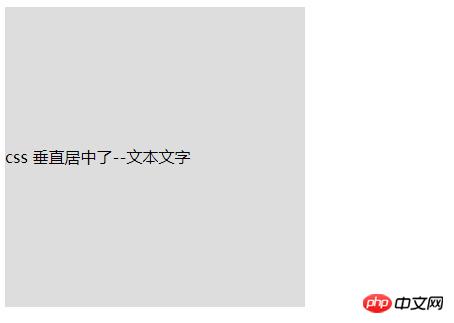
This will allow the text in the div to be centered horizontally and vertically
##2. CSS3 flex layout to center the text vertically
##<!DOCTYPE html>
<html>
<head>
<meta charset="UTF-8">
<title>css 垂直居中</title>
<style>
.box{
width: 300px;
height: 300px;
background: #ddd;
line-height:300px;
/*设置为伸缩容器*/
display: -webkit-box;
display: -moz-box;
display: -ms-flexbox;
display: -webkit-flex;
display: flex;
/*垂直居中*/
-webkit-box-align: center;/*旧版本*/
-moz-box-align: center;/*旧版本*/
-ms-flex-align: center;/*混合版本*/
-webkit-align-items: center;/*新版本*/
align-items: center;/*新版本*/
}
</style>
</head>
<body>
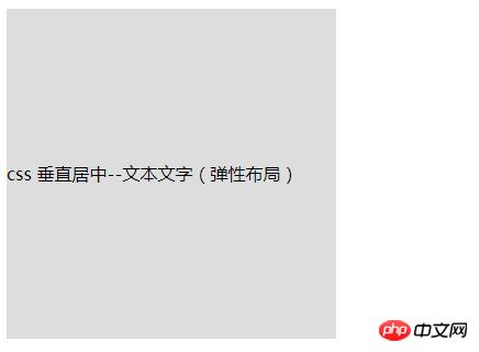
<div class="box">css 垂直居中--文本文字(弹性布局)</div>
</body>
</html>
 ## Recommended related articles:
1.How to achieve the vertical centering effect of Div 2: How to set up div box with css Vertically center the container (block element)
2.div tag: implementation of horizontal centering and vertical centering (with code)
Related video recommendations:
1.CSS video tutorial-Jade Girl Heart Sutra Edition
##1. Use absolute positioning and negative margins to vertically center the block-level element
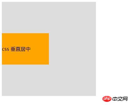
(already Knowing the height of the element) If we know the height of the element, we can achieve vertical centering like this:
<!DOCTYPE html>
<html>
	<head>
		<meta charset="UTF-8">
		<title>css 垂直居中</title>
		<style>
			.box{
				width: 300px;
			    height: 300px;
			    background: #ddd;
			    position: relative;
			}
			.child{
				width: 150px;
			    height: 100px;
			    background: orange;
			    position: absolute;
			    top: 50%;
			    margin: -50px 0 0 0;
			    line-height: 100px;
			}
		</style>
	</head>
	<body>
		<div class="box">
		    <div class="child">css 垂直居中</div>
		</div>
	</body>
</html>
Rendering:
(unknown element height)
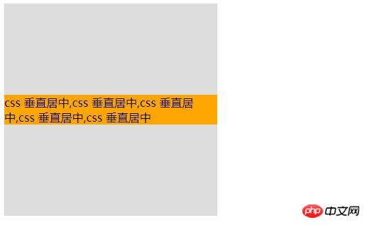
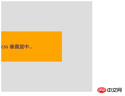
If we don’t know the height of the element, then we need to first move the element Position the center of the container, and then use the translate attribute of transform to coincide the center of the element with the center of the parent container to achieve vertical centering: <!DOCTYPE html>
<html>
<head>
<meta charset="UTF-8">
<title>css 垂直居中</title>
<style>
.box{
width: 300px;
height: 300px;
background: #ddd;
position: relative;
}
.child{
background: #93BC49;
position: absolute;
top: 50%;
transform: translate(0, -50%);
}
</style>
</head>
<body>
<div class="box">
<div class="child">css 垂直居中,css 垂直居中,css 垂直居中,css 垂直居中,css 垂直居中</div>
</div>
</body>
</html>
<!DOCTYPE html>
<html>
	<head>
		<meta charset="UTF-8">
		<title>css 垂直居中</title>
		<style>
			.box{
				width: 300px;
			    height: 300px;
			    background: #ddd;
			    position: relative;
			}
			.child{
				width: 200px;
                height: 100px;
				background: orange;
			    position: absolute;
			    top: 0;
			    bottom: 0;
			    margin: auto;
			    line-height: 100px;
			}
		</style>
	</head>
	<body>
		<div class="box">
		    <div class="child">css 垂直居中...</div>
		</div>
	</body>
</html>Rendering:
<!DOCTYPE html>
<html>
	<head>
		<meta charset="UTF-8">
		<title>css 垂直居中</title>
		<style>
			.box{
				width: 300px;
			    background: #ddd;
			    padding: 100px 0;
			}
			.child{
				width: 200px;
                height: 100px;
				background: orange;
			    line-height: 100px;
			}
		</style>
	</head>
	<body>
		<div class="box">
		    <div class="child">css 垂直居中了</div>
		</div>
	</body>
</html>Rendering:
这种实现方式非常简单,就是给父元素设置相等的上下内边距,则子元素自然是垂直居中的,当然这时候父元素是不能设置高度的,要让它自动被填充起来,除非设置了一个正好等于上内边距+子元素高度+下内边距的值,否则无法精确的垂直居中。这种方式看似没有什么技术含量,但其实在某些场景下也是非常好用的。
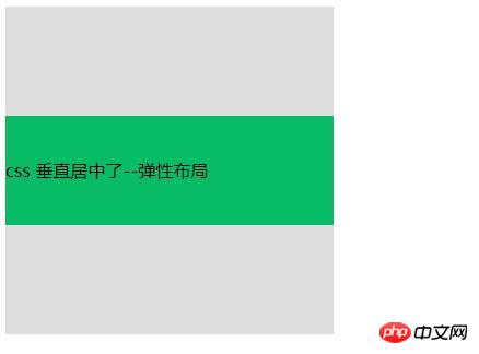
5. 使用flex布局
<!DOCTYPE html>
<html>
	<head>
		<meta charset="UTF-8">
		<title>css 垂直居中</title>
		<style>
			.box{
				width: 300px;
			    height: 300px;
			    background: #ddd;
			    display: flex;
			    flex-direction: column;
			    justify-content: center;
			}
			.child{
				width: 300px;
			    height: 100px;
			    background: #08BC67;
			    line-height: 100px;
			}
		</style>
	</head>
	<body>
		<div class="box">
		    <div class="child">css 垂直居中了--弹性布局</div>
		</div>
	</body>
</html>效果图:
关于flex布局(弹性布局/伸缩布局)里门道颇多,这里先针对用到的东西简单说一下:
flex也就是flexible,意为灵活的、柔韧的、易弯曲的。
元素可以通过设置display:flex;将其指定为flex布局的容器,指定好了容器之后再为其添加align-items属性,该属性定义项目在交叉轴(这里是纵向轴)上的对齐方式,可能的取值有五个,分别如下:
flex-start::交叉轴的起点对齐;
flex-end:交叉轴的终点对齐;
center:交叉轴的中点对齐;
baseline:项目第一行文字的基线对齐;
stretch(该值是默认值):如果项目没有设置高度或者设为了auto,那么将占满整个容器的高度。
The above is the detailed content of How to set vertical centering in CSS?. For more information, please follow other related articles on the PHP Chinese website!

Hot AI Tools

Undresser.AI Undress
AI-powered app for creating realistic nude photos

AI Clothes Remover
Online AI tool for removing clothes from photos.

Undress AI Tool
Undress images for free

Clothoff.io
AI clothes remover

Video Face Swap
Swap faces in any video effortlessly with our completely free AI face swap tool!

Hot Article

Hot Tools

Notepad++7.3.1
Easy-to-use and free code editor

SublimeText3 Chinese version
Chinese version, very easy to use

Zend Studio 13.0.1
Powerful PHP integrated development environment

Dreamweaver CS6
Visual web development tools

SublimeText3 Mac version
God-level code editing software (SublimeText3)

Hot Topics
 1386
1386
 52
52
 How to use bootstrap in vue
Apr 07, 2025 pm 11:33 PM
Using Bootstrap in Vue.js is divided into five steps: Install Bootstrap. Import Bootstrap in main.js. Use the Bootstrap component directly in the template. Optional: Custom style. Optional: Use plug-ins.
 The Roles of HTML, CSS, and JavaScript: Core Responsibilities
Apr 08, 2025 pm 07:05 PM
HTML defines the web structure, CSS is responsible for style and layout, and JavaScript gives dynamic interaction. The three perform their duties in web development and jointly build a colorful website.
 How to write split lines on bootstrap
Apr 07, 2025 pm 03:12 PM
There are two ways to create a Bootstrap split line: using the tag, which creates a horizontal split line. Use the CSS border property to create custom style split lines.
 How to do vertical centering of bootstrap
Apr 07, 2025 pm 03:21 PM
Use Bootstrap to implement vertical centering: flexbox method: Use the d-flex, justify-content-center, and align-items-center classes to place elements in the flexbox container. align-items-center class method: For browsers that do not support flexbox, use the align-items-center class, provided that the parent element has a defined height.
 Understanding HTML, CSS, and JavaScript: A Beginner's Guide
Apr 12, 2025 am 12:02 AM
WebdevelopmentreliesonHTML,CSS,andJavaScript:1)HTMLstructurescontent,2)CSSstylesit,and3)JavaScriptaddsinteractivity,formingthebasisofmodernwebexperiences.
 How to set up the framework for bootstrap
Apr 07, 2025 pm 03:27 PM
To set up the Bootstrap framework, you need to follow these steps: 1. Reference the Bootstrap file via CDN; 2. Download and host the file on your own server; 3. Include the Bootstrap file in HTML; 4. Compile Sass/Less as needed; 5. Import a custom file (optional). Once setup is complete, you can use Bootstrap's grid systems, components, and styles to create responsive websites and applications.
 How to insert pictures on bootstrap
Apr 07, 2025 pm 03:30 PM
There are several ways to insert images in Bootstrap: insert images directly, using the HTML img tag. With the Bootstrap image component, you can provide responsive images and more styles. Set the image size, use the img-fluid class to make the image adaptable. Set the border, using the img-bordered class. Set the rounded corners and use the img-rounded class. Set the shadow, use the shadow class. Resize and position the image, using CSS style. Using the background image, use the background-image CSS property.
 How to resize bootstrap
Apr 07, 2025 pm 03:18 PM
To adjust the size of elements in Bootstrap, you can use the dimension class, which includes: adjusting width: .col-, .w-, .mw-adjust height: .h-, .min-h-, .max-h-


