 Web Front-end
 CSS Tutorial
 CSS3 What is flexbox? The difference and usage of flex and box attribute values in the display attribute
CSS3 What is flexbox? The difference and usage of flex and box attribute values in the display attribute
In our development and design process of Web front-end web pages, layout is a very important part. Layout is used to determine the size and position of different components and elements on the page. In this chapter, we introduce to you a CSS3 layout model: the flex box model (flex box), so that you can understand what a flex box is in CSS3, as well as the difference and usage of the flex and box attribute values of the display attribute in the flex box. It has certain reference value. Friends in need can refer to it. I hope it will be helpful to you.
1: What is a flexible box
CSS3 Flexible Box (Flexible Box or flexbox) is a layout method that ensures that elements have appropriate behavior when the page needs to adapt to different screen sizes and device types. The purpose of introducing the flexbox layout model is to provide a more efficient way to arrange, align and allocate empty space to sub-elements in a container. Many common complex layout needs can be met in a simple way. Its advantage is that developers only declare the behavior that the layout should have, without giving specific implementation methods. The browser is responsible for doing the actual layout. This layout model is supported in major browsers.
2: CSS3 Flexible Box Content
The flexible box is composed of a flexible container (Flex container) and a flexible sub-element (Flex item).
A flexible container is defined as a flexible container by setting the value of the display property to flex or inline-flex.
A flexible container contains one or more flexible sub-elements.
Note: The outside of the flexible container and inside the flexible sub-element are rendered normally. The flex box only defines how the flex child elements are laid out within the flex container.
3: The difference and usage between display:box and display:flex
1. display:box mainly controls the arrangement, order, and verticality of the child elements in the parent container ( Horizontal) alignment
display:box is a syntax before 2009 and is outdated. You need to add the corresponding prefix to use it.
So the compatibility code is roughly as follows
display: -webkit-box; /* Chrome 4+, Safari 3.1, iOS Safari 3.2+ */
    display: -moz-box; /* Firefox 17- */
    display: -webkit-flex; /* Chrome 21+, Safari 6.1+, iOS Safari 7+, Opera 15/16 */
    display: -moz-flex; /* Firefox 18+ */
    display: -ms-flexbox; /* IE 10 */
display: flex;For example:
<!DOCTYPE html>
<html>
	<head>
		<meta charset="UTF-8">
		<title>弹性盒子--display: box;</title>
		<style>
			.box {
				width: 330px;
				height: 400px;
				border: 1px #000 solid;
				margin: 0 auto;
				display: -webkit-box;
				display: -moz-box;
				display: -ms-flexbox;
				display: -o-box;
				display: box;
				}

				.box p {
				width: 100px;
				height: 20px;
				background: #000;
				margin: 5px;
			}
		</style>
	</head>
	<body>
		<div class="box">
			<p>123</p>
			<p>123</p>
			<p>123</p>
		</div>
	</body>
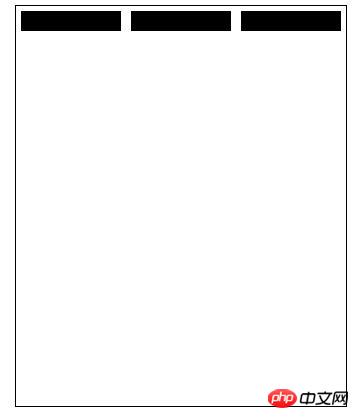
</html>Rendering:

After declaring a display:box telescopic box attribute for the parent element, it means that the block elements in the entire box are turned into inline elements, and then the child elements in the parent element can freely allocate space, and Each block element will not occupy its own line, but will be arranged on the same line together. For example, in the example above, the three p tags in the div will be displayed in one row, rather than being distributed hierarchically.
2: display:flex mainly allows the child container to be divided according to certain rules according to the width of the parent container.
display:flex; appeared after 2011, and will also be the standard syntax in the future. Most new browsers basically no longer need to use prefixes. Currently, only Apple browsers should have webkit prefixes, and others can display normally.
The new version sets the display attributes of the telescopic box as follows:
display:flex;Display the container box model as a block-level elastic box (new version)
display:inline-flex;Display the container box model as an inline-level elastic box (new version)
Usage:
First of all, the use of flex requires a parent Container, there are several items in the parent container.
Parent container: container
Properties:
display:flex;/*flex block level, inline-flex: inline fast */
justify-content:space-around;/*center: horizontally centered, flex-start: to the left; flex-end: to the right; space-between: lean to both sides, equally divided in the middle ;space-around: perfect even distribution*/
align-items: stretch;/*center: vertical center, flex-start: to top, flex-end: to bottom, space-between, space- around*/
flex-direction: row;/*column is arranged from top to bottom, column-reverse, row: from left to right, row-reverse: from right to left*/
flex-wrap:wrap;/*wrap multi-line display (when the parent container is not enough to display, from top to bottom), nowrap (when the container is not wide enough, the child elements will equally divide the width or height of the parent container), wrap -reverse: from bottom to top*/
/*flex-flow is the abbreviation of flex-direction and flex-wrap*/
For example:
<!doctype html>
<html>
 <head>
  <meta charset="UTF-8">
  <title>弹性盒子--display:flex;</title>
  <style>
    .container{
       width:600px;
       height:400px;
       border:1px solid #000;
       display:flex;/*flex块级,inline-flex:行内快*/
       justify-content:space-around;
       align-items:stretch;
       flex-direction: row;
       flex-wrap:wrap;
       /*flex-flow是flex-direction、flex-wrap的缩写*/
    }
    .box{
      width:200px;
       height:100px;
        border:1px solid #000;
     }
   </style>
 </head>
 <body>
     <div>
       <div>这是中间的box1</div>
         <div>这是中间的box2</div>
   </div>
 </body>
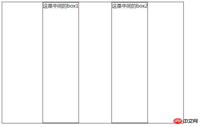
</html>Rendering :

Note that after setting to Flex layout, the float, clear and vertical-align attributes of child elements will be invalid.
The above is the detailed content of CSS3 What is flexbox? The difference and usage of flex and box attribute values in the display attribute. For more information, please follow other related articles on the PHP Chinese website!

Hot AI Tools

Undresser.AI Undress
AI-powered app for creating realistic nude photos

AI Clothes Remover
Online AI tool for removing clothes from photos.

Undress AI Tool
Undress images for free

Clothoff.io
AI clothes remover

Video Face Swap
Swap faces in any video effortlessly with our completely free AI face swap tool!

Hot Article

Hot Tools

Notepad++7.3.1
Easy-to-use and free code editor

SublimeText3 Chinese version
Chinese version, very easy to use

Zend Studio 13.0.1
Powerful PHP integrated development environment

Dreamweaver CS6
Visual web development tools

SublimeText3 Mac version
God-level code editing software (SublimeText3)

Hot Topics
 1387
1387
 52
52
 How to achieve wave effect with pure CSS3? (code example)
Jun 28, 2022 pm 01:39 PM
How to achieve wave effect with pure CSS3? This article will introduce to you how to use SVG and CSS animation to create wave effects. I hope it will be helpful to you!
 Use CSS skillfully to realize various strange-shaped buttons (with code)
Jul 19, 2022 am 11:28 AM
This article will show you how to use CSS to easily realize various weird-shaped buttons that appear frequently. I hope it will be helpful to you!
 How to hide elements in css without taking up space
Jun 01, 2022 pm 07:15 PM
Two methods: 1. Using the display attribute, just add the "display:none;" style to the element. 2. Use the position and top attributes to set the absolute positioning of the element to hide the element. Just add the "position:absolute;top:-9999px;" style to the element.
 How to implement lace borders in css3
Sep 16, 2022 pm 07:11 PM
In CSS, you can use the border-image attribute to achieve a lace border. The border-image attribute can use images to create borders, that is, add a background image to the border. You only need to specify the background image as a lace style; the syntax "border-image: url (image path) offsets the image border width inward. Whether outset is repeated;".
 How to enlarge the image by clicking the mouse in css3
Apr 25, 2022 pm 04:52 PM
Implementation method: 1. Use the ":active" selector to select the state of the mouse click on the picture; 2. Use the transform attribute and scale() function to achieve the picture magnification effect, the syntax "img:active {transform: scale(x-axis magnification, y Axis magnification);}".
 It turns out that text carousel and image carousel can also be realized using pure CSS!
Jun 10, 2022 pm 01:00 PM
How to create text carousel and image carousel? The first thing everyone thinks of is whether to use js. In fact, text carousel and image carousel can also be realized using pure CSS. Let’s take a look at the implementation method. I hope it will be helpful to everyone!
 How to set animation rotation speed in css3
Apr 28, 2022 pm 04:32 PM
In CSS3, you can use the "animation-timing-function" attribute to set the animation rotation speed. This attribute is used to specify how the animation will complete a cycle and set the speed curve of the animation. The syntax is "element {animation-timing-function: speed attribute value;}".
 Does css3 animation effect have deformation?
Apr 28, 2022 pm 02:20 PM
The animation effect in css3 has deformation; you can use "animation: animation attribute @keyframes ..{..{transform: transformation attribute}}" to achieve deformation animation effect. The animation attribute is used to set the animation style, and the transform attribute is used to set the deformation style. .


