How the overflow attribute of css defines scroll bars
Scroll bars are often seen on web pages, but they have not received enough attention. Only perform debugging operations when compatibility needs to be addressed due to scroll bar issues. This chapter will bring you the common content of CSS scroll bars.
1: Condition
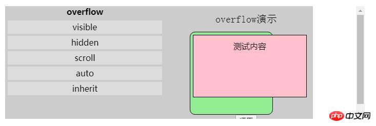
Scroll bars and overflow are closely related. Only when the parent's overflow value is auto or scroll and the content of the element exceeds the element area, the scroll bar may appear

2: Default
Regardless of the browser, the default scroll bar comes from , not
. Because the element has a margin of 8px by default. If the scroll bar comes from the element, there should be a gap of 8px between the scroll bar and the page. In fact, there is no gap, so the scroll bar comes from the element3: Size
Through the following code, it can be concluded that the scroll bar will occupy the available width of the browser:
chrome/firefox/IE 17px
safari 21px
.box{
    width: 400px;
    overflow: scroll;
}
.in{
    *zoom: 1;
}<div class="box">
<div id="in" class="in"></div>
</div>console.log(400-document.getElementById('in').clientWidth);
Compatible
[1] By default, IE7-browser has a vertical scroll bar by default. While other browsers do not
//IE7-浏览器
html{overflow-y: scroll;}
//其他浏览器
html{overflow: auto;}
//去除页面默认滚动条
html{overflow: hidden;}[2] IE7-browser and other browsers have different width setting mechanisms for the scroll bar
.box{
    width: 200px;
    height: 100px;
    background-color: pink;
    overflow: scroll;
}
.in{
    width: 100%;
    height: 60px;
    background-color: lightgreen;
}<div class="box">
<div class="in">测试文字</div>
</div>A vertical scroll bar appears in the parent box. In fact, The available width of the child in is reduced. The child width of IE7-browser ignores the width of the scroll bar. If the child width=400*100%=400px, a horizontal scroll bar appears; while the child width of other browsers takes the width of the scroll bar into account, Child width = (400-scroll bar width)*100%
The left side is IE7-browser, the right side is other browsers

【3】 Horizontal centering jumping problem
When an element is horizontally centered on the page, a vertical scroll bar will appear on the page and the horizontal centering jumping problem will occur. The solution is as follows:
//IE8-默认
html{overflow-y: scroll}//IE9+,100vw表示浏览器的宽度,100%表示可用内容的宽度
.container{padding-left: calc(100vw-100%)}Custom
【1】IE
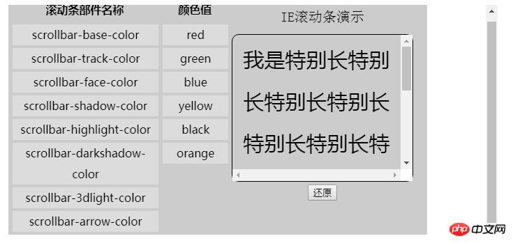
IE browser supports changing the custom color of the scroll bar components through CSS styles
scrollbar-face-color 滚动条凸出部分的颜色
scrollbar-shadow-color 立体滚动条阴影的颜色
scrollbar-highlight-color 滚动条空白部分的颜色
scrollbar-3dlight-color 滚动条亮边的颜色
scrollbar-darkshadow-color 滚动条强阴影的颜色
scrollbar-track-color 滚动条的背景颜色
scrollbar-arrow-color 上下按钮上三角箭头的颜色
scrollbar-base-color  滚动条的基本颜色

【2】webkit
Webkit-based browsers support scroll bar custom styles, but unlike IE, webkit is implemented through pseudo-classes
::-webkit-scrollbar 滚动条整体部分
::-webkit-scrollbar-thumb 滚动滑块
::-webkit-scrollbar-track 外层轨道
::-webkit-scrollbar-track-piece 内层轨道
::-webkit-scrollbar-corner 边角
::-webkit-scrollbar-button 两端按钮
[Note] When setting the width and height style of the scroll bar to a percentage value, it is relative to the window size
[Note] The stacking of the scroll bar The relationship is that the scrollbar is at the bottom, followed by the track outer track and the track-piece inner track. The button button, corner corner and thumb slider have the top level
Four: Pseudo-class related
:horizontal
//horizontal伪类适用于任何水平方向上的滚动条

:vertical
//vertical伪类适用于任何垂直方向的滚动条

:decrement
//decrement伪类适用于按钮和轨道碎片。表示递减的按钮或轨道碎片,例如可以使区域向上或者向右移动的区域和按钮

:increment
//increment伪类适用于按钮和轨道碎片。表示递增的按钮或轨道碎片,例如可以使区域向下或者向左移动的区域和按钮

:start
//start伪类适用于按钮和轨道碎片。表示对象(按钮 轨道碎片)是否放在滑块的前面

:end
//end伪类适用于按钮和轨道碎片。表示对象(按钮 轨道碎片)是否放在滑块的后面

:double-button
//double-button伪类适用于按钮和轨道碎片。判断轨道结束的位置是否是一对按钮。也就是轨道碎片紧挨着一对在一起的按钮。

:single-button
//single-button伪类适用于按钮和轨道碎片。判断轨道结束的位置是否是一个按钮。也就是轨道碎片紧挨着一个单独的按钮。

:no-button
no-button伪类表示轨道结束的位置没有按钮。

:corner-present
//corner-present伪类表示滚动条的角落是否存在。

:window-inactive
//适用于所有滚动条,表示包含滚动条的区域,焦点不在该窗口的时候。

::-webkit-scrollbar-track-piece:start {
/*滚动条上半边或左半边*/
}

::-webkit-scrollbar-thumb:window-inactive {
/*当焦点不在当前区域滑块的状态*/
}

::-webkit-scrollbar-button:horizontal:decrement:hover {
/*当鼠标在水平滚动条下面的按钮上的状态*/
}
The above is the detailed content of How the overflow attribute of css defines scroll bars. For more information, please follow other related articles on the PHP Chinese website!

Hot AI Tools

Undresser.AI Undress
AI-powered app for creating realistic nude photos

AI Clothes Remover
Online AI tool for removing clothes from photos.

Undress AI Tool
Undress images for free

Clothoff.io
AI clothes remover

Video Face Swap
Swap faces in any video effortlessly with our completely free AI face swap tool!

Hot Article

Hot Tools

Notepad++7.3.1
Easy-to-use and free code editor

SublimeText3 Chinese version
Chinese version, very easy to use

Zend Studio 13.0.1
Powerful PHP integrated development environment

Dreamweaver CS6
Visual web development tools

SublimeText3 Mac version
God-level code editing software (SublimeText3)

Hot Topics
 How to use bootstrap in vue
Apr 07, 2025 pm 11:33 PM
Using Bootstrap in Vue.js is divided into five steps: Install Bootstrap. Import Bootstrap in main.js. Use the Bootstrap component directly in the template. Optional: Custom style. Optional: Use plug-ins.
 The Roles of HTML, CSS, and JavaScript: Core Responsibilities
Apr 08, 2025 pm 07:05 PM
HTML defines the web structure, CSS is responsible for style and layout, and JavaScript gives dynamic interaction. The three perform their duties in web development and jointly build a colorful website.
 How to write split lines on bootstrap
Apr 07, 2025 pm 03:12 PM
There are two ways to create a Bootstrap split line: using the tag, which creates a horizontal split line. Use the CSS border property to create custom style split lines.
 Understanding HTML, CSS, and JavaScript: A Beginner's Guide
Apr 12, 2025 am 12:02 AM
WebdevelopmentreliesonHTML,CSS,andJavaScript:1)HTMLstructurescontent,2)CSSstylesit,and3)JavaScriptaddsinteractivity,formingthebasisofmodernwebexperiences.
 How to insert pictures on bootstrap
Apr 07, 2025 pm 03:30 PM
There are several ways to insert images in Bootstrap: insert images directly, using the HTML img tag. With the Bootstrap image component, you can provide responsive images and more styles. Set the image size, use the img-fluid class to make the image adaptable. Set the border, using the img-bordered class. Set the rounded corners and use the img-rounded class. Set the shadow, use the shadow class. Resize and position the image, using CSS style. Using the background image, use the background-image CSS property.
 How to set up the framework for bootstrap
Apr 07, 2025 pm 03:27 PM
To set up the Bootstrap framework, you need to follow these steps: 1. Reference the Bootstrap file via CDN; 2. Download and host the file on your own server; 3. Include the Bootstrap file in HTML; 4. Compile Sass/Less as needed; 5. Import a custom file (optional). Once setup is complete, you can use Bootstrap's grid systems, components, and styles to create responsive websites and applications.
 How to use bootstrap button
Apr 07, 2025 pm 03:09 PM
How to use the Bootstrap button? Introduce Bootstrap CSS to create button elements and add Bootstrap button class to add button text
 How to resize bootstrap
Apr 07, 2025 pm 03:18 PM
To adjust the size of elements in Bootstrap, you can use the dimension class, which includes: adjusting width: .col-, .w-, .mw-adjust height: .h-, .min-h-, .max-h-


