This chapter will introduce to you how to draw a regular hexagon with css? Two ways to draw regular hexagons using CSS (code examples). It has certain reference value. Friends in need can refer to it. I hope it will be helpful to you.
Before, you need to understand the relationship between the interior angles and sides of a regular hexagon. Each interior angle of a regular hexagon is 60deg, as shown in the figure (√3 is actually the root sign 3):

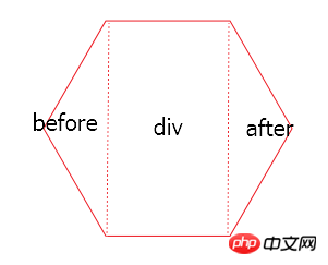
Method 1: Principle: Divide the regular hexagon into three parts. The left, middle and right parts are: before part, div part, and after part, as shown in the picture:

The before triangle part is the before pseudo-element of the div, and the after triangle part is the after pseudo-element of the div.
<!DOCTYPE html>
<html>
<head>
<meta charset="UTF-8">
<title>用css画正六边形</title>
<style type="text/css">
.div {
position: relative;
width: 50px;
height: 86.6px;
margin: 50px auto;
background-color: red;
}
.div:before {
content: '';
display: block;
position: absolute;
width: 0;
height: 0;
right:50px;
border-width: 43.3px 25px;
border-style: solid;
border-color: transparent red transparent transparent;
}
.div:after {
content: '';
display: block;
position: absolute;
width: 0;
height: 0;
left:50px;
border-width: 43.3px 25px;
border-style: solid;
border-color: transparent transparent transparent red;
top:0;
}
</style>
</head>
<body>
<div class='div'></div>
</body>
</html>Rendering:

Note that the width and height of div and pseudo elements need to be calculated according to the above formula.
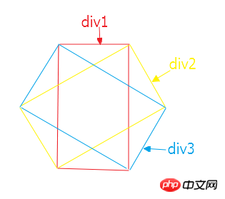
Method 2: Divide the regular hexagon into three divs with the same width and height, and then use positioning and css3 transform:rotate to rotate 60deg left and right to form a regular hexagon, as shown in the figure:

<!DOCTYPE html>
<html>
<head>
<meta charset="UTF-8">
<title>用css画正六边形</title>
<style type="text/css">
.one {
width: 50px;
height: 86.6px;
margin: 0 auto;
border-top: 1px solid red;
border-bottom: 1px solid red;
}
.two {
position: absolute;
width: 50px;
height: 86.6px;
left: 25px;
top: 0;
transform: translate(-50%,-50%);
transform: rotate(60deg);
border-top: 1px solid red;
border-bottom: 1px solid red;
}
.three {
position: absolute;
width: 50px;
height: 86.6px;
left: 25px;
top: 0;
transform: translate(-50%,-50%);
transform: rotate(300deg);
border-top: 1px solid red;
border-bottom: 1px solid red;
}
</style>
</head>
<body>
<div style='position:relative;width:100px;margin:0 auto;'>
<div class='one'></div>
<div class='two'></div>
<div class='three'></div>
</div>
</body>
</html>Rendering:

The above is the detailed content of How to draw a regular hexagon with css? Two ways to draw regular hexagons with CSS (code examples). For more information, please follow other related articles on the PHP Chinese website!