Many front-end developers think that CSS is too simple and there is no need to spend so long learning it. In fact, this is not the case. After a front-end developer uses CSS well, the efficiency and user experience will be improved a lot. I plan to learn CSS in depth recently. , so that when encountering a problem, you will know how to deal with it and prescribe the right remedy quickly. Next, we mainly introduce the CSS box model.
What is the box model
Speaking of the box model, as front-end developers, I believe everyone has understood it. The explanation from the mdn official website is applied here:
In a document, each element is represented as a rectangular box. Determining the dimensions, properties --- aspects like its color, background, border --- and position of these boxes are the goals of the rendering engine.
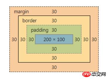
In CSS, each of these rectangular boxes is described using the standard box model. This model describes the content of the space occupied by an element. Each box has four sides: margin, border, padding and content.
The official language is always so obscure, so let me take a screenshot of the chrome console to illustrate:

The outermost orange one is The margin area, the yellow one inside is the border area, the green one further inside is the padding area, and the innermost green one is the content area.
The role of the box model
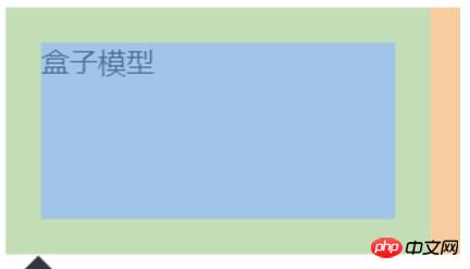
Well, there seems to be nothing to say about the concept of the box model, just the picture above. Let's take a look at the impact of the box model on our layout. For example, if you want to set the size of an element to 200px, if you write the following code:
<style>
  .box {
    width: 200px;
    height: 100px;
    padding: 20px;
  }
</style>
<div class="box">
  盒子模型
</div>As a result, when you review the element, you find that the size of the element has become 240px, and It’s not 200px anymore.

Why is this? Because by default, the setting of width, height, etc. is for the content area, so the set width: 200px is only the width of the content area, plus the size of the left and right padding, causing the overall size of the element to become larger. This is different from our understanding of the middle box in the real world. For example, when we talk about the area of a house, it does not only refer to the available area, but also includes the thickness of the walls, balconies, elevators and other spaces.
Box model and box-sizing
In order to match CSS with the real world, box-sizing comes into play at this time. Box-sizing is used to set the effect objects of width and height. There are three values, namely content-box, paading-box, and border-box. The default value is content-box. Some people may ask, why is there no margin-box? I don’t know the specific reasons. You can refer to the two reasons mentioned by teacher Zhang Xinxu in the book "CSS World":
margin-box itself does not have much value
And the standardization of margin conflict. Because the margin specification says "the background of the margin is always transparent", if there is a margin-box, what about the background?
As for why there is no margin-box, I will briefly mention it. Friends who are interested can check it out by themselves.
Best Practice
For layout convenience, some experts suggest that we set all elements to box-sizing: border-box
If you do not consider low-version browsers, you can use the following code:
*,
*:before,
*:after {
  box-sizing: border-box;
}Later, experts suggested the inheritance method, as follows:
html {
  box-sizing: border-box;
}

*,
*::before,
*::after {
  box-sizing: inherit;
}This method is called Best practice, I won’t go into the specific reasons. Since it is recommended by experts, we can put the code snippet of the second method into reset.css in the future.
The above is the detailed content of In-depth understanding of the meaning and principles of the CSS box model. For more information, please follow other related articles on the PHP Chinese website!