The effect of css rounded borders is usually used in navigation bars or prompt boxes in front-end web design. The effect of setting rounded borders or rounded images through CSS can make the overall web page look richer.
This article will introduce to you how to use css to set the effect of rounded borders. Below we will give you a detailed explanation of the relevant knowledge through specific code examples.
css rounded border codeThe example is as follows:
Example 1: css single-sided rounded border effect
<!DOCTYPE html>
<html>
<head>
   <meta charset="utf-8">
   <title>css圆角边框代码示例</title>
   <style type="text/css">
      div{
         width: 200px;
         height: 200px;
         background: #A6E22B;
         margin: 20px auto;
         /*实现单边圆角*/
         border-top-left-radius:20px;
            border-top-right-radius:20px;
            border-bottom-left-radius:20px;
            border-bottom-right-radius:20px;
      }
   </style>
</head>
<body>
<div></div>
</body>
</html>In the above code, we create a square with a side length of 200. When we only add a css style border-top-left-radius of 20px, the upper left rounded corner effect of this div will be achieved. As shown below:

#When we continue to add a css style border-top-right-radius of 20px, the effect of only adding rounded corners to the top will be achieved. As shown below:

Then we continue to add two css styles, namely border-bottom-left-radius and border-bottom-right-radius, that is The final effect of the above code implemented in the browser is as follows:

#So through the above series of descriptions, have you discovered important knowledge points about CSS rounded borders? That's the border-radius attribute! This property is a shorthand property for setting the four border-*-radius properties. This attribute is used to add rounded borders to elements!
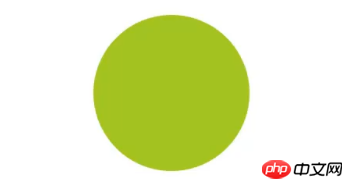
Example 2: css circular border effect
 /*同时实现四个边圆角*/
 border-radius: 100px;
Based on the HTML code of example 1, we add only one css border to the square div block with a side length of 200px -radius style attribute, and setting the value to 100px means that the radius is set to 100px. The rendering effect is as shown below:

This article is a specific introduction to setting rounded borders in css. I hope it will be helpful to friends in need! For more HTML/css knowledge, you can follow PHP Chinese website HTML Video Tutorial and CSS Video Tutorial
The above is the detailed content of How to achieve rounded borders and circular effects with css? (Picture + video tutorial). For more information, please follow other related articles on the PHP Chinese website!
 What are the common management systems?
 mintui
 Which version of linux system is easy to use?
 What to do if an error occurs in the script of the current page
 What are the requirements for Douyin live broadcast?
 Why can't I open pinterest?
 Introduction to Document in JS
 What is the format of the account name of steam
 What are the enterprise erp systems?


