 Web Front-end
 CSS Tutorial
 Summary of 10 ways to achieve horizontal and vertical centering with CSS worth collecting
Summary of 10 ways to achieve horizontal and vertical centering with CSS worth collecting
This article brings you a summary of 10 ways to achieve horizontal and vertical centering in CSS that are worth collecting. It has certain reference value. Friends in need can refer to it. I hope it will be helpful to you.
Mark the key points. This is a must-have interview question. Many interviewers like to ask this question. I have been asked it several times

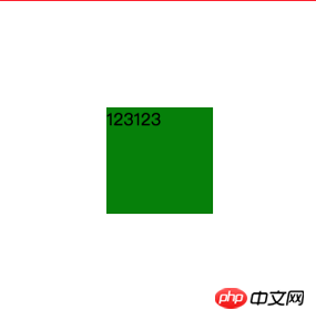
It seems very simple to achieve the effect of the above picture, but in fact there is a hidden secret. This article summarizes the following ways to achieve horizontal and vertical centering in CSS. This article will introduce them one by one.
Only centered elements Width and height apply
absolute negative margin
absolute margin auto
- ##absolute calc
- absolute transform
- lineheight
- writing-mode
- table
- css-table
- flex
- #grid
<div>
    <div>123123</div>
</div>
Note: This common code will not be repeated later, only the corresponding prompt will be given
/* 公共代码 */
.wp {
    border: 1px solid red;
    width: 300px;
    height: 300px;
}

.box {
    background: green;
}

.box.size{
    width: 100px;
    height: 100px;
}
/* 公共代码 *//* 此处引用上面的公共代码 */
/* 此处引用上面的公共代码 */
/* 定位代码 */
.wp {
position: relative;
}
.box {
position: absolute;;
top: 50%;
left: 50%;
margin-left: -50px;
margin-top: -50px;
}<div> <div>123123</div> </div>
/* 此处引用上面的公共代码 */
/* 此处引用上面的公共代码 */
/* 定位代码 */
.wp {
position: relative;
}
.box {
position: absolute;;
top: 0;
left: 0;
right: 0;
bottom: 0;
margin: auto;
}<div> <div>123123</div> </div>
/* 此处引用上面的公共代码 */
/* 此处引用上面的公共代码 */
/* 定位代码 */
.wp {
position: relative;
}
.box {
position: absolute;;
top: calc(50% - 50px);
left: calc(50% - 50px);
}<div> <div>123123</div> </div>
/* 此处引用上面的公共代码 */
/* 此处引用上面的公共代码 */
/* 定位代码 */
.wp {
position: relative;
}
.box {
position: absolute;
top: 50%;
left: 50%;
transform: translate(-50%, -50%);
}<div> <div>123123</div> </div>
text-align Achieve horizontal centering, but many students may not know that it can also be vertically centered through vertical-align, the code is as follows
/* 此处引用上面的公共代码 */
/* 此处引用上面的公共代码 */
/* 定位代码 */
.wp {
line-height: 300px;
text-align: center;
font-size: 0px;
}
.box {
font-size: 16px;
display: inline-block;
vertical-align: middle;
line-height: initial;
text-align: left; /* 修正文字 */
}writing-mode Attribute, thanks to teacher @张鑫兴 for the feedback. Simply put, writing-mode can change the display direction of text. For example, writing-mode can be used to change the display direction of text to vertical direction
<div>水平方向</div> <div>垂直方向</div>
.div2 {
writing-mode: vertical-lr;
}text-align, through writing-mode and text-align can achieve horizontal and vertical centering, but it is a little more troublesome
水平方向 垂 直 方 向
<div> <div> <div>123123</div> </div> </div>
/* 此处引用上面的公共代码 */
/* 此处引用上面的公共代码 */
/* 定位代码 */
.wp {
writing-mode: vertical-lr;
text-align: center;
}
.wp-inner {
writing-mode: horizontal-tb;
display: inline-block;
text-align: center;
width: 100%;
}
.box {
display: inline-block;
margin: auto;
text-align: left;
}|
123123
|
点击查看完整DEMO
css-table
css新增的table属性,可以让我们把普通元素,变为table元素的现实效果,通过这个特性也可以实现水平垂直居中
<div>
    <div>123123</div>
</div>
下面通过css属性,可以让p显示的和table一样
.wp {
display: table-cell;
text-align: center;
vertical-align: middle;
}
.box {
display: inline-block;
}这种方法和table一样的原理,但却没有那么多冗余代码,兼容性也还不错
点击查看完整DEMO
flex
flex作为现代的布局方案,颠覆了过去的经验,只需几行代码就可以优雅的做到水平垂直居中
<div>
    <div>123123</div>
</div>
.wp {
display: flex;
justify-content: center;
align-items: center;
}目前在移动端已经完全可以使用flex了,PC端需要看自己业务的兼容性情况
点击查看完整DEMO
grid
感谢@一丝姐 反馈的这个方案,css新出的网格布局,由于兼容性不太好,一直没太关注,通过grid也可以实现水平垂直居中
<div>
    <div>123123</div>
</div>
.wp {
    display: grid;
}
.box {
    align-self: center;
    justify-self: center;
}代码量也很少,但兼容性不如flex,不推荐使用
点击查看完整DEMO
总结
下面对比下各个方式的优缺点,肯定又双叒叕该有同学说回字的写法了,简单总结下
PC端有兼容性要求,宽高固定,推荐absolute + 负margin
PC端有兼容要求,宽高不固定,推荐css-table
PC端无兼容性要求,推荐flex
移动端推荐使用flex
小贴士:
| 方法 | 居中元素定宽高固定 | PC兼容性 | 移动端兼容性 |
|---|---|---|---|
| absolute + 负margin | 是 | ie6+, chrome4+, firefox2+ | 安卓2.3+, iOS6+ |
| absolute + margin auto | 是 | ie6+, chrome4+, firefox2+ | 安卓2.3+, iOS6+ |
| absolute + calc | 是 | ie9+, chrome19+, firefox4+ | 安卓4.4+, iOS6+ |
| absolute + transform | 否 | ie9+, chrome4+, firefox3.5+ | 安卓3+, iOS6+ |
| writing-mode | 否 | ie6+, chrome4+, firefox3.5+ | 安卓2.3+, iOS5.1+ |
| lineheight | 否 | ie6+, chrome4+, firefox2+ | 安卓2.3+, iOS6+ |
| table | 否 | ie6+, chrome4+, firefox2+ | 安卓2.3+, iOS6+ |
| css-table | 否 | ie8+, chrome4+, firefox2+ | 安卓2.3+, iOS6+ |
| flex | 否 | ie10+, chrome4+, firefox2+ | 安卓2.3+, iOS6+ |
| grid | 否 | ie10+, chrome57+, firefox52+ | 安卓6+, iOS10.3+ |
最近发现很多同学都对css不够重视,这其实是不正确的,比如下面的这么简单的问题都有那么多同学不会,我也是很无语
<div>123</div>
<div>123</div>
.red {
    color: red
}

.blue {
    color: blue
}相关推荐:
The above is the detailed content of Summary of 10 ways to achieve horizontal and vertical centering with CSS worth collecting. For more information, please follow other related articles on the PHP Chinese website!

Hot AI Tools

Undresser.AI Undress
AI-powered app for creating realistic nude photos

AI Clothes Remover
Online AI tool for removing clothes from photos.

Undress AI Tool
Undress images for free

Clothoff.io
AI clothes remover

Video Face Swap
Swap faces in any video effortlessly with our completely free AI face swap tool!

Hot Article

Hot Tools

Notepad++7.3.1
Easy-to-use and free code editor

SublimeText3 Chinese version
Chinese version, very easy to use

Zend Studio 13.0.1
Powerful PHP integrated development environment

Dreamweaver CS6
Visual web development tools

SublimeText3 Mac version
God-level code editing software (SublimeText3)

Hot Topics
 1387
1387
 52
52
 How to use bootstrap in vue
Apr 07, 2025 pm 11:33 PM
Using Bootstrap in Vue.js is divided into five steps: Install Bootstrap. Import Bootstrap in main.js. Use the Bootstrap component directly in the template. Optional: Custom style. Optional: Use plug-ins.
 The Roles of HTML, CSS, and JavaScript: Core Responsibilities
Apr 08, 2025 pm 07:05 PM
HTML defines the web structure, CSS is responsible for style and layout, and JavaScript gives dynamic interaction. The three perform their duties in web development and jointly build a colorful website.
 How to write split lines on bootstrap
Apr 07, 2025 pm 03:12 PM
There are two ways to create a Bootstrap split line: using the tag, which creates a horizontal split line. Use the CSS border property to create custom style split lines.
 Understanding HTML, CSS, and JavaScript: A Beginner's Guide
Apr 12, 2025 am 12:02 AM
WebdevelopmentreliesonHTML,CSS,andJavaScript:1)HTMLstructurescontent,2)CSSstylesit,and3)JavaScriptaddsinteractivity,formingthebasisofmodernwebexperiences.
 What Does H5 Refer To? Exploring the Context
Apr 12, 2025 am 12:03 AM
H5referstoHTML5,apivotaltechnologyinwebdevelopment.1)HTML5introducesnewelementsandAPIsforrich,dynamicwebapplications.2)Itsupportsmultimediawithoutplugins,enhancinguserexperienceacrossdevices.3)SemanticelementsimprovecontentstructureandSEO.4)H5'srespo
 How to resize bootstrap
Apr 07, 2025 pm 03:18 PM
To adjust the size of elements in Bootstrap, you can use the dimension class, which includes: adjusting width: .col-, .w-, .mw-adjust height: .h-, .min-h-, .max-h-
 How to use bootstrap button
Apr 07, 2025 pm 03:09 PM
How to use the Bootstrap button? Introduce Bootstrap CSS to create button elements and add Bootstrap button class to add button text
 How to set up the framework for bootstrap
Apr 07, 2025 pm 03:27 PM
To set up the Bootstrap framework, you need to follow these steps: 1. Reference the Bootstrap file via CDN; 2. Download and host the file on your own server; 3. Include the Bootstrap file in HTML; 4. Compile Sass/Less as needed; 5. Import a custom file (optional). Once setup is complete, you can use Bootstrap's grid systems, components, and styles to create responsive websites and applications.


