With the development of the times, there are more and more mobile devices. It used to be that front-end engineers had to write two sets of codes for a page, one for PC and one for mobile. But now only one set of codes is enough. , because we can use media query, that is, the @media method. Next, I will introduce to you some key resolutions of media query @media to achieve self-adaptation. Friends in need can refer to it.
I often have headaches due to misaligned layouts on devices with different resolutions or different window sizes. You can use @media screen to adapt web page layout, but how to be compatible with all mainstream devices becomes a problem. What is the resolution when setting it?
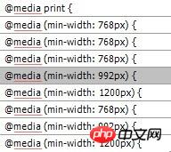
1. First look at the following code, which is traversed from bootstrap. The min-width is
768, 992, and 1200 to confirm. Of course, in the past, some devices had a width of 600-480, and we classified those with small resolutions as less than 767. Why is it less than 767 instead of 768? That’s because in CSS @media (min-width: 768px) means that the minimum is 768, which is >=768. There is equal to here, so we use @media ( max-width: 767px) Here means

2. Use @media to realize several key resolutions in web page adaptation
From the above we can see that there are several critical point resolutions, then we can easily write our own adaptive code
@media (min-width: 768px) { //>=768 device}
@media (min-width: 992px){ //>=992 device}
@media (min-width: 1200) { //>=1200 device}
Pay attention to the order. If you write @media (min-width: 768px) below, it will be very tragic.
@media (min -width: 1200){ //>=1200 device}
@media (min-width: 992px){ //>=992 device}
@media (min -width: 768px){ //>=768 device}
Because if it is 1440, since 1440>768, your 1200 will be invalid.
So when we use min-width, the small ones are on top and the big ones are on the bottom. Similarly, if we use max-width, the big ones are on top and the small ones are on the bottom.
@media (max-width: 1199){ //
@media (max-width: 991px){ //
@media (max-width: 767px){ //
3. After the above introductory learning, we can flexibly use advanced hybrid applications
@media screen and (min-width:1200px){ #page{ width: 1100px; }#content,.div1{width: 730px;}#secondary{width:310px} }
@media screen and ( min-width: 960px) and (max-width: 1199px) { #page{ width: 960px; }#content,.div1{width: 650px;}#secondary{width:250px}select{max-width:200px} }
@media screen and (min-width: 768px) and (max-width: 959px) { #page{ width: 900px; }#content,.div1{width: 620px;}#secondary{width: 220px}select{max-width:180px} }
@media only screen and (min-width: 480px) and (max-width: 767px){ #page{ width: 450px; }#content,. div1{width: 420px; position: relative; }#secondary{display:none}#access{width: 450px; }#access a {padding-right:5px}#access a img{display:none}#rss{display: none}#branding #s{display:none} }
@media only screen and (max-width: 479px) { #page{ width: 300px; }#content,.div1{width: 300px;} #secondary{display:none}#access{width: 330px;} #access a {padding-right:10px;padding-left:10px}#access a img{display:none}#rss{display:none}#branding # s{display:none}#access ul ul a{width:100px} }
Summary: screen is used in the above code, which specifies the monitor as the display device, or it can also be a print printer and other other devices. Generally We use screen. Or omit it altogether. If you want to see a detailed explanation about media, you can Baidu to learn about media query.
The above is the detailed content of Share a few media queries @media to achieve adaptive key resolutions. For more information, please follow other related articles on the PHP Chinese website!