A brief summary after learning Bootstrap
This chapter brings you a brief summary after learning Bootstrap, so that you can know the composition of Bootstrap, the advantages and disadvantages of Bootstrap, and how Bootstrap implements responsive layout (example). It has certain reference value. Friends in need can refer to it. I hope it will be helpful to you.
【Related video recommendation: Bootstrap tutorial】
Bootstrap4 features: 1. Compatible with IE10 2. Use flexbox layout 3. Abandon Normalize.css 4. Provide layout and reboot version
Bootstrap consists of: 1. Basic style 2. Common components 3. JS plug-in
FAQ:
1. Advantages and disadvantages of Bootstrap
Advantages: The CSS code structure is reasonable, ready-made styles can be used directly
Disadvantages: Customization is cumbersome and large in size
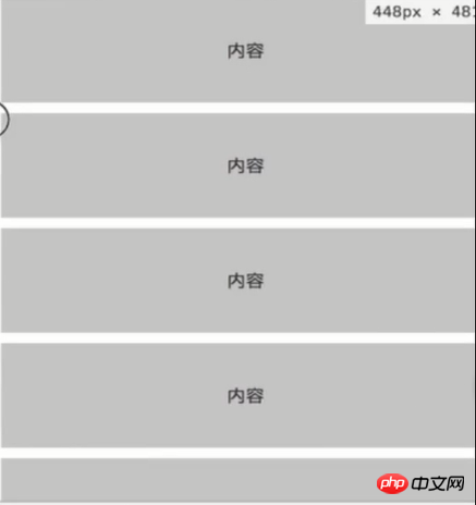
2. How to implement responsive layout with Bootstrap
Principle: Set classes of different resolutions through media query
Usage: Select for different resolutions Different grid classes
3. How to customize your own style based on Bootstrap
1. Use css class override with the same name (used in simple scenarios)
2. Modify the source code and rebuild
3. Reference the scss source file and modify the variables
Knowledge points:
1. Basic usage
Making a simple login page
<!DOCTYPE html>
<html>
<head>
<meta charset="UTF-8">
<meta name="viewport" content="width=device-width, initial-scale=1.0">
<meta http-equiv="X-UA-Compatible" content="ie=edge">
<link rel="stylesheet" href="bootstrap/css/bootstrap.css">
<title>Bootstrap</title>
<style>
#result{
display: none;
}
.title{
margin-top: 50px;
margin-bottom: 50px;
}
.operate button{
margin: 0 auto;
}
</style>
</head>
<body>
<h2 class="title col-6 offset-3">注册</h1>
<form id="myForm" class="col-6 offset-3">
<div class="form-group row">
<label class="col-2 col-form-label">姓名</label>
<div>
<input name="name" type="text" />
</div>
</div>
<div class="form-group row">
<label class="col-2 col-form-label">密码</label>
<div>
<input name="password" type="password" />
</div>
</div>
<div class="form-group row">
<label class="col-2 col-form-label">电话</label>
<div>
<input name="cellphone" type="text" />
</div>
</div>
<div class="form-group row">
<label class="col-2 col-form-label">地址</label>
<div>
<input name="address" type="text" />
</div>
</div>
<div id="result" class="alert alert-danger">
</div>
<div class="operate form-group row">
<button class="btn btn-primary" type="submit">提交</button>
</div>
</form>
<script>
var form = document.querySelector('#myForm');
var result = document.querySelector('#result');
form.addEventListener('submit', function(e){
if(!document.querySelector('[name=password]').value){
result.style.display = 'block';
result.innerHTML = '密码为空';
}else{
result.style.display = 'none';
}
e.preventDefault();
});
</script>
</body>
</html>Rendering:
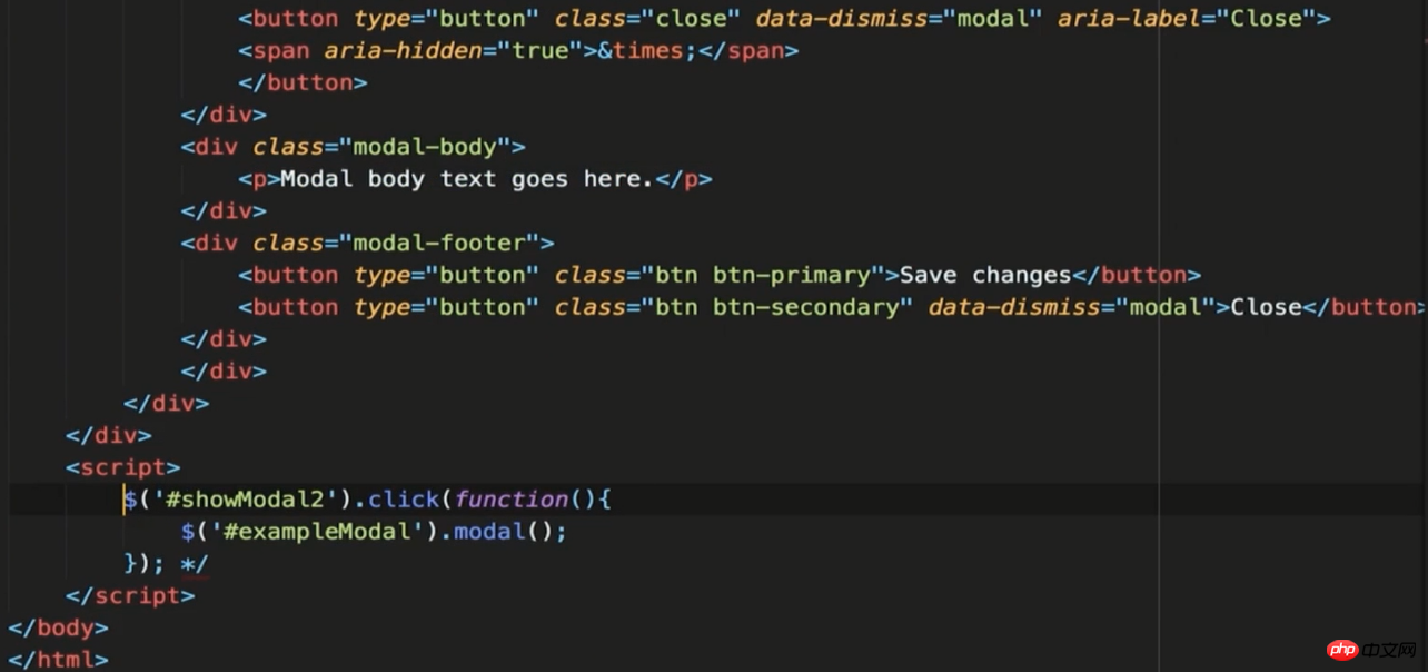
2.Bootstrap JS component
Written based on jQuery, many interactive effects can be achieved, so jQuery needs to be introduced, as well as Popper.js (library) and bootstrap.js
How to use: 1. Based on HTML's data-** attribute 2 .Based on JS API


Rendering:
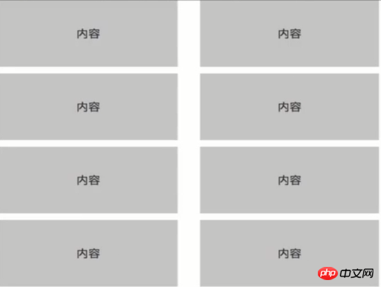
3 .Bootstrap responsive layout

<!DOCTYPE html>
<html>
<head>
    <meta charset="UTF-8">
    <meta name="viewport" content="width=device-width, initial-scale=1.0">
    <meta http-equiv="X-UA-Compatible" content="ie=edge">
    <link rel="stylesheet" href="bootstrap/css/bootstrap.css">
    <title>Bootstrap</title>
    <style>
        .content > div{
            height: 100px;
            line-height: 100px;
            text-align: center;
            color: #333;
            background:#cccccc;
            margin-bottom: 10px;
        }
    </style>
</head>
<body>
    <div>
        <div>
            <div class="content col-12 col-lg-3 col-md-4 col-sm-6"><div>内容</div></div>
            <div class="content col-12 col-lg-3 col-md-4 col-sm-6"><div>内容</div></div>
            <div class="content col-12 col-lg-3 col-md-4 col-sm-6"><div>内容</div></div>
            <div class="content col-12 col-lg-3 col-md-4 col-sm-6"><div>内容</div></div>
            <div class="content col-12 col-lg-3 col-md-4 col-sm-6"><div>内容</div></div>
            <div class="content col-12 col-lg-3 col-md-4 col-sm-6"><div>内容</div></div>
            <div class="content col-12 col-lg-3 col-md-4 col-sm-6"><div>内容</div></div>
            <div class="content col-12 col-lg-3 col-md-4 col-sm-6"><div>内容</div></div>
        </div>
    </div>
</body>
</html> 
The above is the detailed content of A brief summary after learning Bootstrap. For more information, please follow other related articles on the PHP Chinese website!

Hot AI Tools

Undresser.AI Undress
AI-powered app for creating realistic nude photos

AI Clothes Remover
Online AI tool for removing clothes from photos.

Undress AI Tool
Undress images for free

Clothoff.io
AI clothes remover

AI Hentai Generator
Generate AI Hentai for free.

Hot Article

Hot Tools

Notepad++7.3.1
Easy-to-use and free code editor

SublimeText3 Chinese version
Chinese version, very easy to use

Zend Studio 13.0.1
Powerful PHP integrated development environment

Dreamweaver CS6
Visual web development tools

SublimeText3 Mac version
God-level code editing software (SublimeText3)

Hot Topics
 How to introduce bootstrap into Eclipse
Apr 05, 2024 am 02:30 AM
Introduce Bootstrap in Eclipse in five steps: Download the Bootstrap file and unzip it. Import the Bootstrap folder into the project. Add Bootstrap dependency. Load Bootstrap CSS and JS in HTML files. Start using Bootstrap to enhance your user interface.
 How to read the bootstrap mediation effect test results in stata
Apr 05, 2024 am 01:48 AM
Interpretation steps of Bootstrap mediation effect test in Stata: Check the sign of the coefficient: Determine the positive or negative direction of the mediation effect. Test p value: less than 0.05 indicates that the mediating effect is significant. Check the confidence interval: not containing zero indicates that the mediation effect is significant. Comparing the median p-value: less than 0.05 further supports the significance of the mediation effect.
 750,000 rounds of one-on-one battle between large models, GPT-4 won the championship, and Llama 3 ranked fifth
Apr 23, 2024 pm 03:28 PM
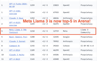
Regarding Llama3, new test results have been released - the large model evaluation community LMSYS released a large model ranking list. Llama3 ranked fifth, and tied for first place with GPT-4 in the English category. The picture is different from other benchmarks. This list is based on one-on-one battles between models, and the evaluators from all over the network make their own propositions and scores. In the end, Llama3 ranked fifth on the list, followed by three different versions of GPT-4 and Claude3 Super Cup Opus. In the English single list, Llama3 overtook Claude and tied with GPT-4. Regarding this result, Meta’s chief scientist LeCun was very happy and forwarded the tweet and
 How to introduce idea into bootstrap
Apr 05, 2024 am 02:33 AM
Steps to introduce Bootstrap in IntelliJ IDEA: Create a new project and select "Web Application". Add "Bootstrap" Maven dependency. Create an HTML file and add Bootstrap references. Replace with the actual path to the Bootstrap CSS file. Run the HTML file to use Bootstrap styles. Tip: Use a CDN to import Bootstrap or customize HTML file templates.
 How to use bootstrap to test mediation effects
Apr 05, 2024 am 03:57 AM
The Bootstrap test uses resampling technology to evaluate the reliability of the statistical test and is used to prove the significance of the mediation effect: first, calculate the confidence interval of the direct effect, indirect effect and mediation effect; secondly, calculate the significance of the mediation type according to the Baron and Kenny or Sobel method. significance; and finally estimate the confidence interval for the natural indirect effect.
 How to read the results of bootstrap mediation test
Apr 05, 2024 am 03:30 AM
The Bootstrap mediation test evaluates the mediation effect by resampling the data multiple times: Indirect effect confidence interval: indicates the estimated range of the mediation effect. If the interval does not contain zero, the effect is significant. p-value: Evaluates the probability that the confidence interval does not contain zero, with values less than 0.05 indicating significant. Sample size: The number of data samples used for analysis. Bootstrap subsampling times: the number of repeated samplings (500-2000 times). If the confidence interval does not contain zero and the p-value is less than 0.05, the mediation effect is significant, indicating that the mediating variable explains the relationship between the independent and dependent variables.
 What is the difference between bootstrap and springboot
Apr 05, 2024 am 04:00 AM
The main difference between Bootstrap and Spring Boot is: Bootstrap is a lightweight CSS framework for website styling, while Spring Boot is a powerful, out-of-the-box backend framework for Java web application development. Bootstrap is based on CSS and HTML, while Spring Boot is based on Java and the Spring framework. Bootstrap focuses on creating the look and feel of a website, while Spring Boot focuses on back-end functionality. Spring Boot can be integrated with Bootstrap to create fully functional, beautiful
 How to export the results of bootstrap test mediation effect stata command
Apr 05, 2024 am 03:39 AM
Export the results of the Bootstrap mediation effect test in Stata: Save the results: bootstrap post Create variable list: local vars: coef se ci Export the results (CSV): export delimited results.csv, varlist(`vars') replace comma nolabel


