The content of this article is about what is the CSS overflow mechanism? The detailed introduction of CSS overflow (with examples) has certain reference value. Friends in need can refer to it. I hope it will be helpful to you.
In the actual development process, content overflow is often seen. If you don't understand this mechanism in depth, you will often encounter this question: Why is this element not affected by the overflow:hidden of the ancestor element? Which element does the scroll bar that appears here belong to? How to eliminate this scroll bar? How to add scrolling functionality to a specific element?
In this article, we will start from the CSS standard and discuss the details of the CSS overflow mechanism.
When the content (child elements, grandchild elements, etc. descendants) of a box (block container box) exceeds the size of the box itself, overflow will occur . At this time, the CSS property overflow determines how to handle overflow. Everyone knows this css attribute, so we won’t discuss it here. Here are some points to note:
overflow will affect the clipping and scrolling of all content of the element where it is located, but there is one exception: "It affects the clipping of all of the element's content except any descendant elements (and their respective content and descendants) whose containing block is the viewport or an ancestor of the element." In other words, the element where the of the overflow is located must be the direct or indirect containing block of the content element , then the overflow attribute can Will affect this content element. For example, <a><b><c><c></c><b></b><a></a></c></b></a>, generally speaking, the overflow of B will affect C, but If C is positioned relative to viewport or A (for example, position:absolute is used), then the display of C will not be affected by the cropping and scrolling of B.
When a scroll bar is needed, the scroll bar will be placed between the border and padding. After the parent element generates a scroll bar, the size of the containing block it generates will be reduced to make room for the scroll bar.
The overflow property on and
has a bubble phenomenon: "UAs must apply the 'overflow' property set on the root element to the viewport. When the root element is an HTML "HTML" element or an XHTML "html" element, and that element has an HTML "BODY" element or an XHTML "body" element as a child, user agents must instead apply the 'overflow' property from the first such child element to the viewport, if the value on the root element is 'visible'. The 'visible' value when used for the viewport must be interpreted as 'auto'. The element from which the value is propagated must have a used value for 'overflow' of 'visible'. "can be inferred:
Generally speaking, only elements can have scroll bars (more precisely, only elements that generate block container boxes can have scroll bars). But visual viewport is an exception. Although it is not an element, it can also have scroll bars. If the overflow attribute is not set on both and
and the default value visible is used (this is the case in most scenarios), then the overflow of the visual viewport is auto: when the content in the web page exceeds the visual viewport, Scroll bars will appear on the visual viewport.’s final overflow is always visible. In other words, the element can never have scroll bars.
If you want to set a non-visible overflow for
, you need to set a non-visible value for to bubble up, so that overflow will not be bubbled.Small exercise: Use the above principles to make both the visual viewport and
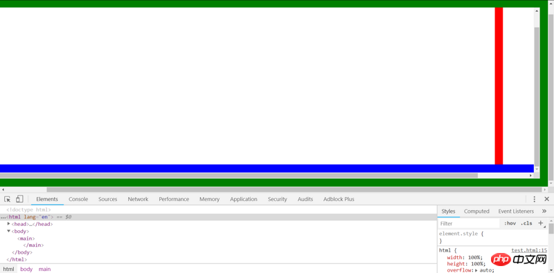
have horizontal and vertical scroll bars, a total of 4 scroll bars. Cannot use overflow: scroll (this would be too simple).Make the final overflow value of the visual viewport and
both be auto, so that the scroll bar can appear.Trigger the overflow of visual viewport and
. Do this by [Set a larger size for the content].Code Comments:
nbsp;html>


  <meta>
  <meta>
  <title>test</title>
  <style>
    * {
      padding: 0;
      margin: 0;
      box-sizing: border-box;
    }

    html {
      /* 使html的尺寸始终与visual viewport相同(即使你缩放、调整浏览器窗口的大小),从而body可以设置一个比visual viewport还大的尺寸(110%)。
      对于默认为block的元素可以省略width: 100%; */
      width: 100%;
      height: 100%;
      /* 非visible的值冒泡到visual viewport上,使visual viewport可以出现滚动条 */
      overflow: auto;
      border: 15px solid red;
    }

    body {
      /* 使得body可以出现滚动条 */
      overflow: auto;
      /* body溢出html,从而溢出initial containning block,从而溢出visual viewport,使得visual viewport出现滚动条。
      当然,你也可以通过很多其他的方式来触发visual viewport的溢出,比如增大html元素,或者在body中弄一个position: absolute的p */
      width: 110%;
      height: 110%;
      border: 15px solid green;
    }

    main {
      /* main溢出body,使得body出现滚动条 */
      width: 110%;
      height: 110%;
      border: 15px solid blue;
    }
  </style>


  <main>
  </main>
Result:

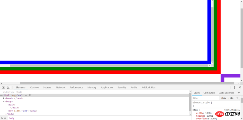
也可以通过absolute的方式来溢出initial containing block:
nbsp;html>


  <meta>
  <meta>
  <title>test</title>
  <style>
    * {
      padding: 0;
      margin: 0;
      box-sizing: border-box;
    }

    html {
      /* 使html的尺寸始终与visual viewport相同(即使你缩放、调整浏览器窗口的大小),从而body可以设置一个比visual viewport还大的尺寸(110%)。
      对于默认为block的元素可以省略width: 100%; */
      width: 100%;
      height: 100%;
      /* 非visible的值冒泡到visual viewport上,使visual viewport可以出现滚动条 */
      overflow: auto;
      border: 15px solid red;
    }

    body {
      /* 使得body可以出现滚动条 */
      overflow: auto;
      /* 为body设置一个尺寸,从而main可以设置一个比body还大的尺寸(110%)。
      对于默认为block的元素可以省略width: 100%; */
      height: 100%;
      border: 15px solid green;
    }

    main {
      /* main溢出body,使得body出现滚动条 */
      width: 110%;
      height: 110%;
      border: 15px solid blue;
    }

    .abs {
      /* 通过absolute的方式来溢出initial containing block,从而溢出viewport */
      position: absolute;
      width: 100px;
      height: 100px;
      right: -100px;
      bottom: -100px;
      border: 15px solid blueviolet;
    }
  </style>


  <main>
  </main>

  <p></p>
结果:

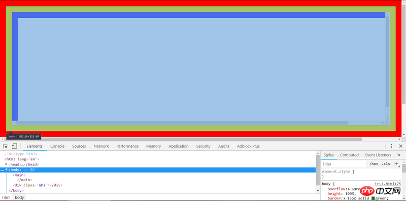
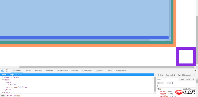
通过Chrome DevTools就可以看出滚动条的所属元素。
前面已经说过,滚动条的位置在元素的border与padding之间。当你使用Chrome DevTools选中某个元素,发现滚动条恰好在高亮区域(border)内部时,滚动条就属于当前元素。

要判断滚动条是否属于visual viewport,首先先将右边、下边的滚动条分别滚动到最下、最右(这一步很重要,它保证没有内容藏在滚动条下面)。然后,Ctrl+Shift+C选择右边或下边的滚动条,如果高亮的区域不包含这个滚动条,就说明这个滚动条不属于任何元素,也就是属于visual viewport。

The above is the detailed content of What is the css overflow mechanism? Detailed introduction to css overflow (with examples). For more information, please follow other related articles on the PHP Chinese website!