The content of this article is about how to achieve bottom alignment in CSS? The three ways to achieve bottom alignment in CSS have certain reference value. Friends in need can refer to it. I hope it will be helpful to you.
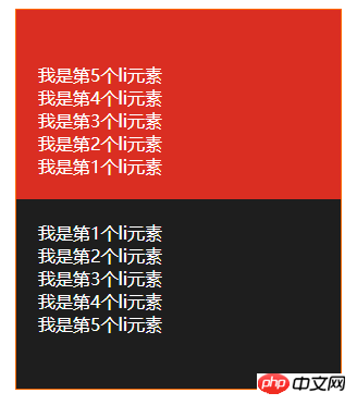
Due to the company’s business requirements, it is necessary to achieve the effect of the red area in the following picture: 

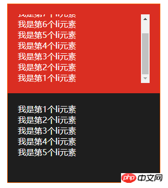
Effect description:
1. The data in the red area needs to be arranged in reverse order (that is, counting from the bottom, the numbers are 1, 2, 3, 4, 5), and displayed at the bottom
2. When there is too much data, the scroll bar needs to be displayed, **and the scroll bar needs to be pulled to the bottom**
3. The data is pushed from the websocket, The push interval is tens of milliseconds
4. It needs to be compatible with IE10 and above browsers
<style>
    *{
        margin: 0;
        padding: 0;
        box-sizing: border-box;
    }
    .container{
        position: relative;
        width: 300px;
        height: 500px;
        margin: 10px auto;
        border: 1px solid #f60;
        color: #fff;
    }
    .top,
    .bottom{
        height: 50%;
        padding: 20px;
    }
    .top{
        background-color: #da2e22;
    }
    .top>ul{
        width: 100%;
        height: 100%;
        overflow: auto;
    }
    .bottom{
        overflow: auto;
        background-color: #1e1e1e;
    }
</style><div> <div> <ul> <li>我是第1个li元素</li> <li>我是第2个li元素</li> <li>我是第3个li元素</li> <li>我是第4个li元素</li> <li>我是第5个li元素</li> </ul> </div> <div> <ul> <li>我是第1个li元素</li> <li>我是第2个li元素</li> <li>我是第3个li元素</li> <li>我是第4个li元素</li> <li>我是第5个li元素</li> </ul> </div> </div>
Using flex layout is the best solution at present, and sub-element layout is still Layout in the order of 1, 2, 3, 4, 5, the browser will automatically reverse it when rendering, and the scroll bar will also reverse, that is, it will automatically be positioned at the bottom. ButIE10 does not support it so far~, so it cannot be used in this project I am doing, so I can only find another way.
<style>
    *{
        margin: 0;
        padding: 0;
        box-sizing: border-box;
    }
    .container{
        position: relative;
        width: 300px;
        height: 500px;
        margin: 10px auto;
        border: 1px solid #f60;
        color: #fff;
    }
    .top,
    .bottom{
        height: 50%;
        padding: 20px;
    }
    .top{
        background-color: #da2e22;
    }
    .top>ul{
        width: 100%;
        height: 100%;
        overflow: auto;
    }
    .bottom{
        overflow: auto;
        background-color: #1e1e1e;
    }
</style><div> <div> <ul> <li>我是第1个li元素</li> <li>我是第2个li元素</li> <li>我是第3个li元素</li> <li>我是第4个li元素</li> <li>我是第5个li元素</li> </ul> </div> <div> <ul> <li>我是第1个li元素</li> <li>我是第2个li元素</li> <li>我是第3个li元素</li> <li>我是第4个li元素</li> <li>我是第5个li元素</li> </ul> </div> </div>
Using padding-top is the easiest way to think of it, but it cannot be implemented with pure css. It must also be calculated using js. At the beginning of my project, I implemented padding-top js calculations. This way of implementation just felt uncomfortable. Every time a piece of data is pushed to the websocket, calculations must be performed. So is there a better way? The answer is definitely yes. There are always unexpected surprises in the CSS world. The key is to have strong internal skills.
<style>
    *{
        margin: 0;
        padding: 0;
        box-sizing: border-box;
    }
    .container{
        position: relative;
        width: 300px;
        height: 500px;
        margin: 10px auto;
        border: 1px solid #f60;
        color: #fff;
    }
    .top,
    .bottom{
        height: 50%;
        padding: 20px;
        overflow: auto;
    }
    .top{
        background-color: #da2e22;
    }
    .top-container{
        display: table;
        width: 100%;
        height: 100%;
    }
    .top-container>ul{
        display: table-cell;
        vertical-align: bottom;
        width: 100%;
        height: 100%;
    }
    .bottom{
        background-color: #1e1e1e;
    }
</style><div> <div> <div> <ul> <li>我是第1个li元素</li> <li>我是第2个li元素</li> <li>我是第3个li元素</li> <li>我是第4个li元素</li> <li>我是第5个li元素</li> </ul> </div> </div> <div> <ul> <li>我是第1个li元素</li> <li>我是第2个li元素</li> <li>我是第3个li元素</li> <li>我是第4个li元素</li> <li>我是第5个li元素</li> </ul> </div> </div>
Using table-cell to achieve bottom alignment is currently the final solution, and it is also compatible with ie8. The bottom alignment problem has been solved. The problem of "the scroll bar needs to be pulled to the bottom" cannot be realized using table-cell. I have no choice but to use js to control it. I wonder if any master has other methods~
The table and table-cell layout of CSS can achieve many special effects.
The above is the detailed content of How to achieve bottom alignment with CSS? Three ways to achieve bottom alignment in css. For more information, please follow other related articles on the PHP Chinese website!