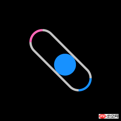
The content of this article is about how to use pure CSS to realize the small ball bouncing in the container (source code attached). It has certain reference value. Friends in need can refer to it. I hope it will be helpful to you. You helped.

https://github.com/comehope/front- end-daily-challenges
Define dom, only one element:
<div></div>
Centered display:
body {
    margin: 0;
    height: 100vh;
    display: flex;
    align-items: center;
    justify-content: center;
    background-color: black;
}Define the size of the container:
.loader {
    width: 10em;
    height: 3em;
    border: 0.3em solid silver;
    border-radius: 3em;
    font-size: 20px;
}Paint the left and right sides of the container with different colors:
.loader {
    border-left-color: hotpink;
    border-right-color: dodgerblue;
}Draw a small ball in the container:
.loader {
    position: relative;
}

.loader::before {
    content: '';
    position: absolute;
    top: 0;
    left: 0;
    width: 3em;
    height: 3em;
    border-radius: 50%;
    background-color: dodgerblue;
}Let the ball move back and forth in the container:
.loader::before {
    animation: shift 3s linear infinite;
}

@keyframes shift {
    50% {
        left: 7em;
    }
}Let the ball change color when it hits both ends:
.loader::before {
    animation:
        shift 3s linear infinite,
        change-color 3s linear infinite;
}

@keyframes change-color {
    0%, 55% {
        background-color: dodgerblue;
    }

    5%, 50% {
        background-color: hotpink;
    }
}Finally, let the container rotate continuously:
.loader {
    animation: spin 3s linear infinite;
}

@keyframes spin {
    to {
        transform: rotate(360deg);
    }
}You’re done!
The above is the detailed content of How to use pure CSS to realize a ball that bounces in a container (source code attached). For more information, please follow other related articles on the PHP Chinese website!