This chapter brings you What is css negative margin? The role of css negative margins (detailed explanation), will show you the role of css negative margins. It has certain reference value. Friends in need can refer to it. I hope it will be helpful to you.
Introduction to negative margins
The use of negative margins is as follows:
#content {margin-left:-100px;}Negative margins are usually used in small areas . But as you'll see next, there's a lot it can do. Here are some things you should know about negative margins:
They are perfectly valid CSS
I’m not kidding you. The W3C even says that using negative margins in outer borders is allowed.
Negative margins are not a hack
This is especially true. It's precisely not understanding negative margins well that leads to all kinds of weird problems. A hack only if used to solve a bug elsewhere
It conforms to normal document flow
When used with negative margins It does not disrupt the normal document flow when used on unfloated elements. So if you use negative margins to nudge an element upward, all subsequent elements will also be nudged upward.
It has pretty good compatibility
Negative margins are basically supported by all modern browsers (as is most cases with IE6)
When using float, there will be different performances
Negative margin is not an attribute you usually use, so be extra careful when using it.
Dreamweaver does not understand it
Negative margins will not show the effect in the DW design window. Then why do you still use the design window of DW to view the effect? What about working with him?
Negative margins are very powerful if used correctly. There are two scenarios where negative margins are important.
Use negative margins in static elements:

A static element is an element that has not used float. The picture above shows a static element using negative margins.
When a static element uses negative margins on top/left, it pulls the element in this specific direction, such as
/* Moves the element 10px upwards */
#mydiv1 {margin-top:-10px;}But when you set the negative margin to relative bottom/ When right, it will not pull the element down or to the right. On the contrary, it will pull the following elements inward, thus covering itself.
/*
所有在#mydiv1后面的元素都会向上
移动10px,而#mydiv1一点都不会移动
*/#mydiv1{margin-bottom:-10px;}If the width is not set, the left and right negative margins will pull the element in both directions to increase the width. The role of margin here is equivalent to padding
Use negative margins in floats
Add the following to our html code:
<div id="mydiv1">First</div>
<div id="mydiv2">Second</div>
If you use negative margins for a floating element, It creates a white space that other elements can cover. This technique works great for user-flowing layouts. For example, one column has a width of 100%, and another column has a fixed width, say 100px.
#mydiv1 {float:left; margin-right:-100px;}If both elements use left floating and set margin-right:-20px. #mydiv2 will regard #mydiv1 as being reduced in width by 20px (so it will cover part of it), but the interesting thing is that #mydiv1 will not change in any way, but will still maintain the original width.
If the negative margin is as large as the width, it will be completely covered. Because margins, padding, borders, and content add up to the width of the element. If the negative margin is equal to the width of the element, then the width of the element will become 0px.
Apply what you learn
Now that we know that using negative margins works in CSS2, using it can give us some very interesting CSS tricks.
Turn a single list into three columns
If you have a list that is too long vertically, why not break it into several columns? Negative margins allow you to do this without adding any floats or labels. You'll see how easy it is to achieve this with negative margins, like this:
HTML:
<ul>
<li class="col1">Eggs</li>
<li class="col1">Ham<li>
<li class="col2 top">Bread<li>
<li class="col2">Butter<li>
<li class="col3 top">Flour<li>
<li class="col3">Cream</li>
</ul>
CSS
ul {list-style:none;}
li {line-height:1.3em;}
.col2 {margin-left:100px;}
.col3 {margin-left:200px;}
.top {margin-top:-2.6em;} /* the clincher */By adding margin-top to .top :-2.6em. All elements will line up perfectly. Using negative margins is much better than using relative positioning because you only need to add negative margins to the first element of the new column.
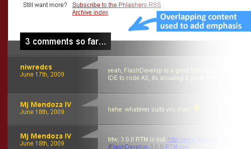
Overlap for emphasis

Intentionally overlapping elements is also a good design metaphor. The overlay effect can enhance the sense of depth and make certain elements stand out. A good example of this is the image above, which uses overlap to attract attention. Just use the z-index property and a little creativity and you can do it.
Amazing 3D text effect

这是一个精致的技巧。通过使用两个视图的两种颜色创建safari一样有点倾斜的效果。然后通过负边距来把其中一个叠加到另一个上面,保持1到2像素的偏移。这样你就可以二道可选的,机器友好的倾斜字体。就不需要浪费很多贷款来加载大的图片来实现这个效果啦
简单的两列布局
负边距也是在流式布局中创建简单一列宽度固定,一列内容为宽度的100%的两列布局的好方法。
HTML
<div id="content"> <p>Main content in here</p> </div>
<div id="sidebar"> <p>I’m the Sidebar! </p> </div>
CSS
#content {width:100%; float:left; margin-right:-200px;}
#sidebar {width:200px; float:left;}哈哈,这样你就得到了一个简单的两列布局。它也能在IE6完美的渲染出来。现在为了让#sidebar不要被#content给掩盖,只要简单的加上:
/* Prevent text from being overlapped */
#content p {margin-right:210px;}
/* It’s 200px + 10px, the 10px being an additional margin.*/当适当的使用的时候,负外边距能够提供一个灵活的文档结构,完爆table的布局。灵活的文档布局是一种可访问性和SEO的技巧,通过它能够让你根据你的关注点以任意顺序组织你的html代码。这里有一个文章讨论了负边距在多列布局中的应用。
微调元素
这是负外边距最常也是最简单的使用方式。假如你把第十个div插入到9个其他的div中,不知道什么原因没有正确的排列,使用负边距来调整这个div就不需要改变其他9个div了,很方便。
解决bug
文本和链接问题
在float中使用负边距可能会在旧的浏览器造成一些问题,比如下面的这些:
让链接不可点击
文本变得很难选择
失去焦点的时候按tab键失效
解决方法:只要添加position:relative,就可以啦。
图片被剪切啦
如果你运气不好刚好在办公室使用IE6,当遇到覆盖和浮动的时候内容有些时候回突然被剪切掉。
解决方法:同样的只要给浮动元素加上position:relative,所有的问题就解决啦。
结论
负外边距能够在不使用任何额外标签的情况下定位元素让它在现在网页设计中占有一席之地。随着更多的用户使用更新的浏览器(包括IE8),未来使用这些技巧的网站会变得更加有前景。
The above is the detailed content of What is css negative margin? The role of css negative margins (detailed explanation). For more information, please follow other related articles on the PHP Chinese website!