 Web Front-end
 CSS Tutorial
 How to use css to draw some small graphics using border and border-radius (code example)
How to use css to draw some small graphics using border and border-radius (code example)
In page development, some small graphics are often needed to beautify the page. These graphics can be displayed in the form of pictures, but it takes time to load the pictures each time the page is loaded. So how to implement these graphics using CSS? This chapter will introduce to you how to use CSS to draw some small graphics using border and border-radius (code examples). It has certain reference value. Friends in need can refer to it. I hope it will be helpful to you.
Most of us know that the border attribute has four parameters, so border-radius must also have four parameters.
We know that the four parameters of the border attribute are border-top, border-right, and border. -bottom, border-left.(clockwise)
So what are the four parameters of border-radius?
border-radius: top left, top right, bottom right, bottom left;
Below we use border-radius to draw some common pictures.
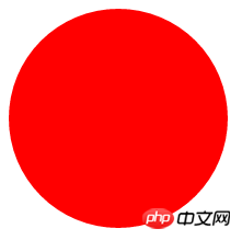
1.Simple circle
<!DOCTYPE html>
<html>
    <head>
        <meta charset="utf-8">
        <title></title>
        <style type="text/css">
            #div{
                width: 200px;
                height: 200px;
                background: red;
                border-radius: 50%;
            }
        </style>
    </head>
    <body>
        <div id="div">

        </div>
    </body>
</html>Rendering:

<!DOCTYPE html>
<html>
    <head>
        <meta charset="utf-8">
        <title></title>
        <style type="text/css">
            #div{
                width: 100px;
                height: 200px;
                background: red;
                border-radius: 50%;
            }
        </style>
    </head>
    <body>
        <div id="div">

        </div>
    </body>
</html>
<!DOCTYPE html>
<html>
    <head>
        <meta charset="utf-8">
        <title></title>
        <style type="text/css">
            #div{
                position: relative;
                width: 200px;
                height: 180px;
                border: 1px solid black;
            }
            .left{
                position: absolute;
                top: 0;
                left: 100px;
                width: 100px;
                height: 170px;
                background: red;
                /*左下角为旋转基点*/
                transform-origin: 0 100%;
                transform: rotate(-45deg);
                border-radius: 50% 50% 0 0;
                /*让left的上左和上右变成圆形就可以*/
            }
            .right{
                position: absolute;
                top: 0;
                left: 0px;
                width: 100px;
                height: 170px;
                background: red;
                /*右下角为旋转基点*/
                transform-origin: 100% 100%;
                transform: rotate(45deg);
                border-radius: 50% 50% 0 0;
                /*让right的上左和上右变成圆形就可以*/
            }
        </style>
    </head>
    <body>
        <div id="div">
            <div class="left"></div>
            <div class="right"></div>
        </div>
    </body>
</html>
<!DOCTYPE html>
<html>
    <head>
        <meta charset="utf-8">
        <title></title>
        <style type="text/css">
            #div{
                position: relative;
                width: 100px;
                height: 180px;
                background: red;
                border-radius: 50% 50% 50% 50%/60% 60% 40% 40%;
                /*border-radius参数在/左右的区别,/左边是四个圆角的水平半径/右边是四个圆角垂直半径*/
            }

        </style>
    </head>
    <body>
        <div id="div">
        </div>
    </body>
</html>
<!DOCTYPE html>
<html>
    <head>
        <meta charset="utf-8">
        <title></title>
        <style type="text/css">
            #div {
                width: 120px;
                height: 80px;
                background: red;
                position: relative;
                border-radius: 10px;
                margin-left: 50px;
                }
                #div:before {
                content:"";
                position: absolute;
                right: 100%;
                top: 26px;
                width: 0;
                height: 0;
                border-top: 13px solid transparent;
                border-right: 26px solid red;
                border-bottom: 13px solid transparent;
                }
        </style>
    </head>
    <body>
        <div id="div">
        </div>
    </body>
</html>
<!DOCTYPE html>
<html>
    <head>
        <meta charset="utf-8">
        <title></title>
        <style type="text/css">
            #baGua {
                width: 96px;
                height: 48px;
                background: #eee;
                border-color: red;
                border-style: solid;
                border-width: 2px 2px 50px 2px;
                border-radius: 100%;
                position: relative;
            }
            #baGua:before {
                content: "";
                position: absolute;
                top: 50%;
                left: 0;
                background: #eee;
                border: 18px solid red;
                border-radius: 50%;
                width: 12px;
                height: 12px;
            }
            #baGua:after {
                content: "";
                position: absolute;
                top: 50%;
                left: 50%;
                background: red;
                border: 18px solid #eee;
                border-radius:100%;
                width: 12px;
                height: 12px;
            }
        </style>
    </head>
    <body>
        <div id="baGua">
        </div>
    </body>
</html>
<!DOCTYPE html>
<html>
    <head>
        <meta charset="utf-8">
        <title></title>
        <style type="text/css">
            #wuQ{
                position: relative;
                width: 212px;
                height: 100px;
                }
            #wuQ:before{
                content: "";
                position: absolute;
                top: 0;
                left: 0;
                width: 60px;
                height: 60px;
                border: 20px solid red;
                border-radius: 50px 50px 0 50px;
                /*下右不变圆弧*/
                transform: rotate(-45deg);
                }
            #wuQ:after{
                content: "";
                position: absolute;
                top: 0;
                right: 0;
                width: 60px;
                height: 60px;
                border: 20px solid red;
                border-radius: 50px 50px 50px 0;
                /*下左不变圆弧*/
                transform: rotate(45deg);
                }
        </style>
    </head>
    <body>
        <div id="wuQ">
        </div>
    </body>
</html>The above is the detailed content of How to use css to draw some small graphics using border and border-radius (code example). For more information, please follow other related articles on the PHP Chinese website!

Hot AI Tools

Undresser.AI Undress
AI-powered app for creating realistic nude photos

AI Clothes Remover
Online AI tool for removing clothes from photos.

Undress AI Tool
Undress images for free

Clothoff.io
AI clothes remover

AI Hentai Generator
Generate AI Hentai for free.

Hot Article

Hot Tools

Notepad++7.3.1
Easy-to-use and free code editor

SublimeText3 Chinese version
Chinese version, very easy to use

Zend Studio 13.0.1
Powerful PHP integrated development environment

Dreamweaver CS6
Visual web development tools

SublimeText3 Mac version
God-level code editing software (SublimeText3)

Hot Topics
 How to correctly display the locally installed 'Jingnan Mai Round Body' on the web page?
Apr 05, 2025 pm 10:33 PM
Using locally installed font files in web pages Recently, I downloaded a free font from the internet and successfully installed it into my system. Now...
 How to select a child element with the first class name item through CSS?
Apr 05, 2025 pm 11:24 PM
When the number of elements is not fixed, how to select the first child element of the specified class name through CSS. When processing HTML structure, you often encounter different elements...
 Does H5 page production require continuous maintenance?
Apr 05, 2025 pm 11:27 PM
The H5 page needs to be maintained continuously, because of factors such as code vulnerabilities, browser compatibility, performance optimization, security updates and user experience improvements. Effective maintenance methods include establishing a complete testing system, using version control tools, regularly monitoring page performance, collecting user feedback and formulating maintenance plans.
 How to make progress bar with h5
Apr 06, 2025 pm 12:09 PM
Create a progress bar using HTML5 or CSS: Create a progress bar container. Set the progress bar width. Create internal elements of the progress bar. Sets the internal element width of the progress bar. Use JavaScript, CSS, or progress bar library to display progress.
 How to compatible with multi-line overflow omission on mobile terminal?
Apr 05, 2025 pm 10:36 PM
Compatibility issues of multi-row overflow on mobile terminal omitted on different devices When developing mobile applications using Vue 2.0, you often encounter the need to overflow text...
 What application scenarios are suitable for H5 page production
Apr 05, 2025 pm 11:36 PM
H5 (HTML5) is suitable for lightweight applications, such as marketing campaign pages, product display pages and corporate promotion micro-websites. Its advantages lie in cross-platformity and rich interactivity, but its limitations lie in complex interactions and animations, local resource access and offline capabilities.
 How to use the shape-outside attribute of CSS to achieve the display effect of gradually shortening text?
Apr 05, 2025 pm 10:54 PM
Implementing the display effect of gradually shortening text In web design, how to achieve a special text display effect to make the text length gradually shortening? This effect...
 Is H5 page production a front-end development?
Apr 05, 2025 pm 11:42 PM
Yes, H5 page production is an important implementation method for front-end development, involving core technologies such as HTML, CSS and JavaScript. Developers build dynamic and powerful H5 pages by cleverly combining these technologies, such as using the <canvas> tag to draw graphics or using JavaScript to control interaction behavior.


)


