
Floats are often used during page layout, but floats will deviate from the standard flow, and some unexpected results will occur. This article will tell you about the relationship between CSS floats and document flow, if necessary Friends can refer to it, I hope it is useful to you.
The so-called document flow refers to the automatic flow arrangement of elements from left to right and top to bottom during the layout process. Being separated from the document flow means that the elements disrupt the arrangement or are taken away from the layout.
Speaking of document flow, let’s talk about elements first. Each element has a display attribute.
The inline element itself is the display: inline attribute. For example: a b span img input select strong. There will be no automatic line wrapping. For example, if we insert several picture tags, they will be closely connected. The pictures will be tall and short because of their size. If they cannot fit in one line, they will automatically wrap.
The block-level element itself is the display:block attribute. For example: div ol li dl dt dd h1-h6 p. Block-level elements will occupy their own line. When no operations are performed, no matter the size, they will not be connected behind them, which is domineering. (Block-level elements and row-level elements can be converted by setting the corresponding display attributes) as shown below.
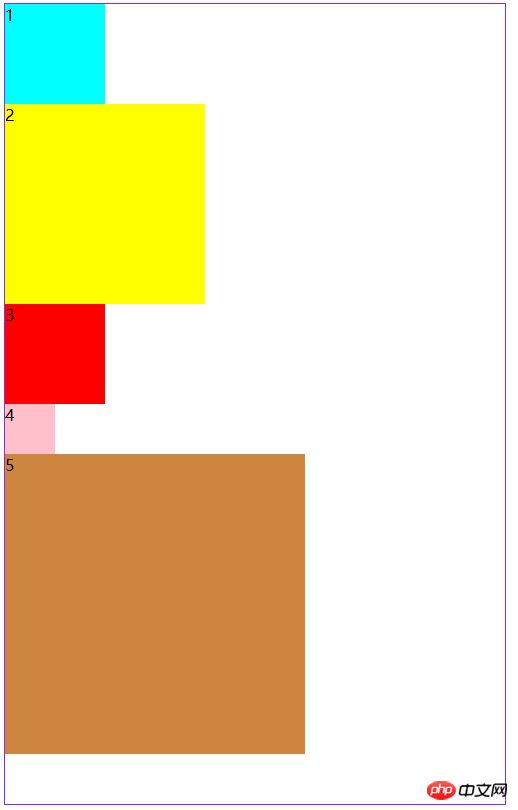
Another special thing is display: inline-block. This way the element has the common characteristics of inline elements and block-level elements.
As currently known, there are two ways to break away from the document flow: floating and positioning.
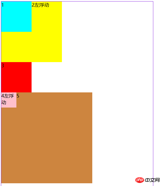
Float (float), any element in CSS can float. Float is often followed by the attribute values left, right, and none. Float:none does not use floating, Float:left floats to the left, and Float:right floats to the left. Float right. When floating left and right, this element will break away from the document flow.
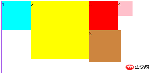
For example, I let the second and fourth float left, 2 broke away from its original position and ran below 1, and 4 ran above 5, indicating that they are out of the document flow, but they still need to be displayed. Come out, 1, 3, and 5 are arranged according to the normal document flow, but 2 occupies the place where 3 is next to 1, and 3 is forced to squeeze down.
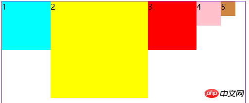
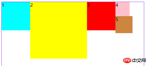
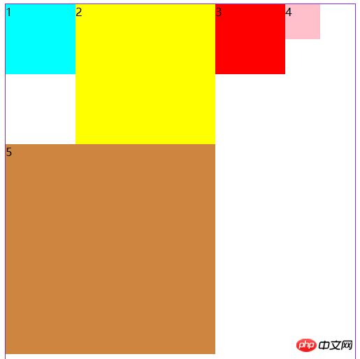
If we float them all to one side, they will be displayed side by side, but one thing is that you need to leave room for them to float. This is in the normal layout It is easy to appear when there is not enough space in a certain row, then the piece will slide until it finds space. As shown in the picture description
 ##
##
<style type="text/css">
            #big-box{ width: 500px; height: 800px; border:1px solid #8a2be2; }
            #a1 { width: 100px;  height: 100px; background: aqua; }
            #a2 {width: 200px; height: 200px; background:yellow; }
            #a3 {width: 100px; height: 100px; background:red; }
            #a4 {width:50px; height: 50px; background:pink;}
            #a5 {width: 300px; height: 300px; background:peru; }
            #big-box > * {float: left;}
        </style>
    </head>
    <body>
        <div id="big-box">
            <div id="a1">1</div>
            <div id="a2">2</div>
            <div id="a3">3</div>
            <div id="a4">4</div>
            <div id="a5">5</div>
        </div>
</body>The above is the detailed content of Detailed graphic explanation of the relationship between CSS float and document flow. For more information, please follow other related articles on the PHP Chinese website!