The traditional layout scheme is based on the box model of float, display and position. With the improvement of development languages, the flexible box layout model has become a good tool in the web developer's toolbox because it abandons the complexity of the traditional box. The setting can perfectly meet the developer's requirements for page compatibility, that is, it can still ensure that elements have appropriate behavior when the page needs to adapt to different screen sizes and device types. The content of this article is about how to quickly use flexible box layout. It has certain reference value. Friends in need can refer to it. I hope it will be helpful to you.
Understanding of the flexible box
The flexible box is composed of a flexible container (Flex container) and a flexible sub-element (Flex item) , and a flexible container can be defined as a flexible container by setting the value of the display attribute to flex or inline-flex, where the flexible container can contain one or more flexible sub-elements.
The traditional box model is very inconvenient for the layout of those special pages, such as vertical centering and the implementation of sorting of sub-elements is very troublesome. However, with the introduction of flex layout by w3c, various page layouts can be implemented simply, completely, and responsively, which greatly simplifies the development process, and flex layout has been supported by all browsers.
Related course recommendations: flex layout video tutorial recommendations: 2018 latest 5 flex elastic layout video tutorials
##Elastic Example of box
Example 1: Traditional model
<style>
        .flex-container{
            display: flex;
            display: -webkit-flex;
            width: 450px;
            height: 150px;
            background-color: darkcyan;
                     }
        .flex-item{
            width: 130px;
            height: 125px;
            margin: 10px;
            background-color: yellowgreen;
                 }
    </style>
    <body>
        <div class="flex-container">
            <div class="flex-item one">盒子1</div>
            <div class="flex-item tow">盒子2</div>
            <div class="flex-item three">盒子3</div>
        </div>
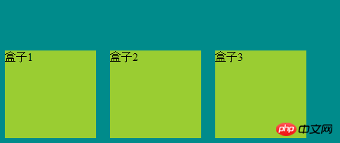
</body>The structure is as shown in the figure

Example 2: Sorting of sub-elements
<style>
        .flex-container{
            display: flex;
            display: -webkit-flex;
            width: 450px;
            background-color: darkcyan;
            flex-direction: row-reverse;
        }
        .flex-item{
            width: 130px;
            height: 125px;
            margin: 10px;
            background-color: yellowgreen;
        }
    </style>
    <body>
        <div class="flex-container">
            <div class="flex-item one">盒子1</div>
            <div class="flex-item tow">盒子2</div>
            <div class="flex-item three">盒子3</div>
        </div>
</body>The structure is as shown in the figure

Example 3: The box is displayed in the center
<style>
        .flex-container{
            display: flex;
            display: -webkit-flex;
            width: 500px;
            background-color: darkcyan;
            justify-content: center;
        }
        .flex-item{
            width: 130px;
            height: 125px;
            margin: 10px;
            background-color: yellowgreen;
        }
    </style>
    <body>
        <div class="flex-container">
            <div class="flex-item one">盒子1</div>
            <div class="flex-item tow">盒子2</div>
            <div class="flex-item three">盒子3</div>
        </div>
</body>The structure is as shown in the picture

Example 4: Display from the bottom
<style>
        .flex-container{
            display: flex;
            display: -webkit-flex;
            width: 500px;
            height: 211px;
            background-color: darkcyan;
            align-items: flex-end;
        }
        .flex-item{
            width: 130px;
            height: 125px;
            margin: 10px;
            background-color: yellowgreen;
        }
    </style>
    <body>
        <div class="flex-container">
            <div class="flex-item one">盒子1</div>
            <div class="flex-item tow">盒子2</div>
            <div class="flex-item three">盒子3</div>
        </div>
</body>The structure is as shown

The above is the detailed content of How to use CSS3 to implement flexible box layout. For more information, please follow other related articles on the PHP Chinese website!