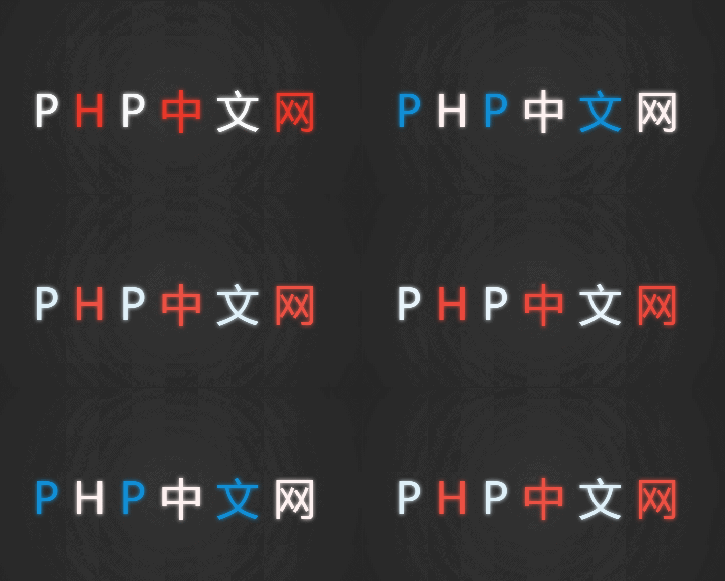
Today, with the increasing development of science and technology, people are becoming more and more picky about aesthetics. This requires us to be more rigorous in our attitude towards front-end development and at the same time, we need to add fresh elements to achieve the purpose of attracting attention. So today this article will show you how to use css3 html5 to create text neon effects. It has certain reference value. Friends in need can refer to it. I hope it will be helpful to you.
Features of using css3 html5 to create text neon effects
The text has a flashing neon animation, and the text There are also cool animated special effects when selected;
text can be input dynamically, and the input text is rendered with neon light effects in real time.
Steps to use css3 html5 to create text neon effect
Enter the text that needs to be added with special effects.
Use the multi-layer shadow properties of box-shadow to draw the three-dimensional effect of neon tubes.
Use text-shadow multi-layer shadow to draw text tubes, emit light, and project, to achieve the effect of setting three-dimensional text.
Here we focus on the principle of achieving the neon flashing effect
We need to set two labels on the text and make them completely overlap , the upper layer implements the lamp effect, the lower layer implements the halo effect, and then uses the selector to make it flash continuously. At the same time, we need to set the text-shadow attribute values of the two states of off and on, so that they switch at different speeds, forming A neon flashing effect.
Note: If you don’t understand the above content, you can check other articles on this site
How to use css3 to achieve Simple shadow effect of pictures (complete code attached)
How to use css3 to achieve the glow effect within fonts (detailed explanation)
Use css3 The code for creating text neon light effect using html5
<!DOCTYPE html>
<html>
<head>
<meta charset="UTF-8">
<title>css3 html5文字霓虹灯交替闪烁效果</title>
<style>html, body, div, span, applet, object, iframe,
h1, h2, h3, h4, h5, h6, p, blockquote, pre,
a, abbr, acronym, address, big, cite, code,
del, dfn, em, img, ins, kbd, q, s, samp,
small, strike, strong, sub, sup, tt, var,
b, u, i, center,
dl, dt, dd, ol, ul, li,
fieldset, form, label, legend,
table, caption, tbody, tfoot, thead, tr, th, td,
article, aside, canvas, details, embed,
figure, figcaption, footer, header, hgroup,
menu, nav, output, ruby, section, summary,
time, mark, audio, video {
margin: 0;
padding: 0;
border: 0;
font-size: 100%;
font: inherit;
vertical-align: baseline;
}
/* HTML5 display-role reset for older browsers */
article, aside, details, figcaption, figure,
footer, header, hgroup, menu, nav, section {
display: block;
}
body {
line-height: 1;
}
ol, ul {
list-style: none;
}
blockquote, q {
quotes: none;
}
blockquote:before, blockquote:after,
q:before, q:after {
content: '';
content: none;
}
table {
border-collapse: collapse;
border-spacing: 0;
}
body {
background-color: #222;
background-image: -webkit-radial-gradient(circle, #333, #222, #111);
background-attachment: fixed;
overflow: hidden;
font-family: 'Wire One', sans-serif;
font-size: 6em;
color: #FFF;
line-height: normal;
text-align: center;
}
#glow {
position: absolute;
top: 0;
bottom: 0;
width: 100%;
height: 1em;
margin: auto;
display: block;
}
#glow p,
#glow span{
display: inline-block;
color: #FFF;
text-shadow: 0 0 15px;
}
#glow p:nth-child(odd) {
-webkit-animation: bglow .3s ease infinite;
}
#glow p:nth-child(even) {
-webkit-animation: rglow .3s ease infinite;
}
@-webkit-keyframes bglow {
0% {
color: rgb(0, 135, 211);
text-shadow: 0 0 15px;
}
}
@-webkit-keyframes rglow {
100% {
color: rgb(233, 54, 40);
text-shadow: 0 0 15px;
}
}
</style>
<script>
window.confirm = function(){};
window.prompt = function(){};
window.open = function(){};
window.print = function(){};
// Support hover state for mobile.
if (false) {
window.ontouchstart = function(){};
}
</script>
</head>
<body>
<section id="glow">
<p>P</p>
<p>H</p>
<p>P</p>
<p>中</p>
<p>文</p>
<p>网</p>
</section>
<script src="//ajax.googleapis.com/ajax/libs/jquery/1.10.1/jquery.min.js"></script>
<script>
if (document.location.search.match(/type=embed/gi)) {
window.parent.postMessage('resize', "*");
}
</script>
</body>
</html>The text neon light effect is as shown in the picture

Summary
#At first I thought the text neon effect was a gif animation or something like that, but after reviewing the elements I found that it actually used html5 The implementation of CSS3 animation immediately aroused my (hao) desire (qi) desire (xin), and I decided to find out. After checking the code, I found that the principle is so simple. I hope the content of this article can help everyone.
The above is the detailed content of How to use css3+html5 to create text neon effect (pay full code). For more information, please follow other related articles on the PHP Chinese website!
 css3 tutorial
 What are the css3 gradient properties?
 How to get http status code in PHP
 Introduction to linux system classification
 How to solve the problem that Ethernet cannot connect to the internet
 What to do if postscript cannot be parsed
 How to view Tomcat source code
 How to buy Bitcoin
 What does vram mean?