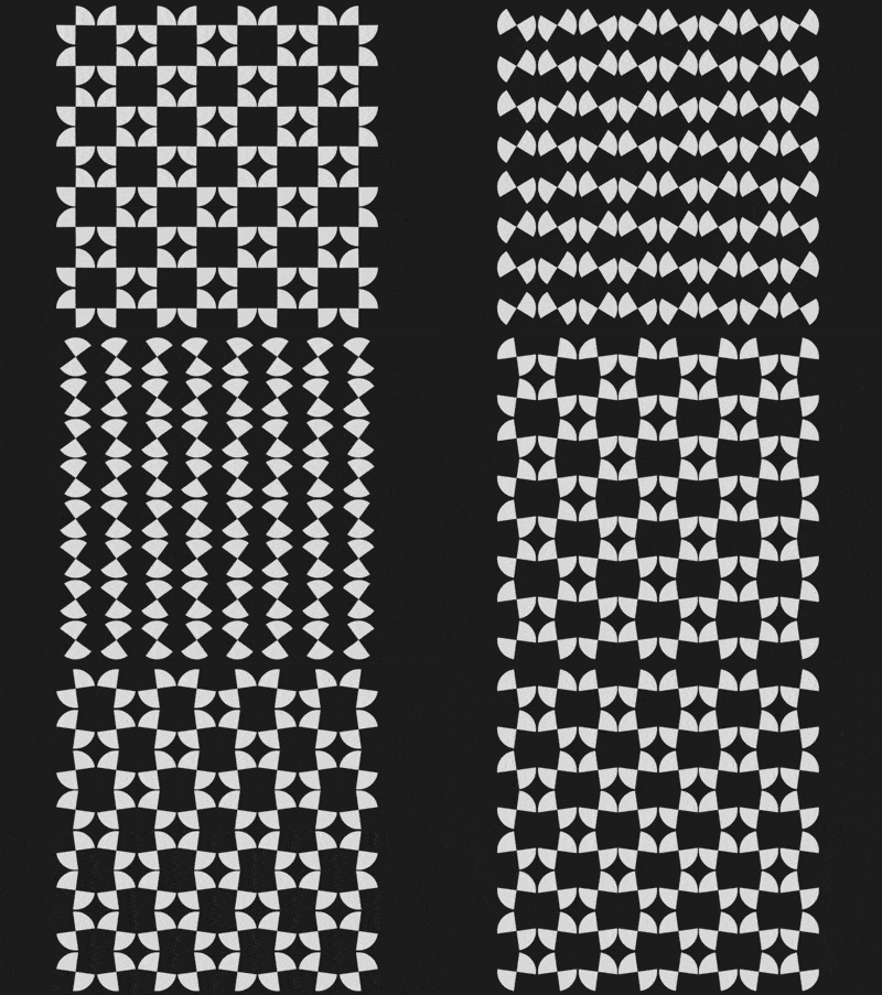
The content of this article is about how to use CSS and D3 to realize a dancing picture (source code attached). It has certain reference value. Friends in need can refer to it. I hope it will be helpful to you. helped.

https://github.com/comehope/front- end-daily-challenges
Define dom, the container contains 1 .square sub-container, and the sub-container contains 4 <span>, each <code><span></span> represents a diagonal sector:
<figure>
    <div>
        <span></span>
        <span></span>
        <span></span>
        <span></span>
    </div>
</figure>
Centered display:
body {
    margin: 0;
    height: 100vh;
    display: flex;
    align-items: center;
    justify-content: center;
    background-color: #222;
}Set the size unit of the container, 1em is equal to 8px:
.container {
    font-size: 8px;
} The 4 <span></span> in the sub-container have no width and height, only borders, among which the first and 4 <span></span> only take the left and right borders, the 2nd and 3rd <span></span> take only the top and bottom borders:
.square span {
    display: block;
    border: 2.5em solid transparent;
    color: #ddd;
}

.square span:nth-child(1),
.square span:nth-child(4) {
    border-left-color: currentColor;
    border-right-color: currentColor;
}

.square span:nth-child(2),
.square span:nth-child(3) {
    border-top-color: currentColor;
    border-bottom-color: currentColor;
}Change the border to Arc:
.square span {
    border-radius: 50%;
}Use grid layout in the sub-container to set 4 <span></span> to a 2 * 2 grid:
.square {
    display: grid;
    grid-template-columns: repeat(2, 1fr);
    grid-gap: 0.2em;
    padding: 0.1em;
}Rotate 4 <span></span>, so that they form a square and look like a flower. The result of the formula is 45 degrees. It is written like this to be consistent with the formula of the following animation:
.square span {
    transform: rotate(calc(45deg + 90deg * 0));
}Add an animation that makes <span></span> rotate. The entire animation process rotates 4 times, each rotation is 90 degrees. After 4 rotations, it returns to the original position:
.square span {
    animation: rotation 2s ease-in-out infinite;
}

@keyframes rotation {
    0% { transform: rotate(calc(45deg + 90deg * 0)); }
    25% { transform: rotate(calc(45deg + 90deg * 1)); }
    50% { transform: rotate(calc(45deg + 90deg * 2)); }
    75% { transform: rotate(calc(45deg + 90deg * 3)); }
    100% { transform: rotate(calc(45deg + 90deg * 4)); }
}Make it 2 <span></span> move in opposite directions:
.square span:nth-child(2),
.square span:nth-child(3) {
    animation-direction: reverse;
}At this point, the animation of a .square sub-container has been completed, next, create 4 ## Animation of #.square. Add 3 more groups of
.square subcontainers in the dom:
<figure>
    <div>
        <span></span>
        <span></span>
        <span></span>
        <span></span>
    </div>
    <div>
        <span></span>
        <span></span>
        <span></span>
        <span></span>
    </div>
    <div>
        <span></span>
        <span></span>
        <span></span>
        <span></span>
    </div>
    <div>
        <span></span>
        <span></span>
        <span></span>
        <span></span>
    </div>
</figure>
.square into a grid, variable--columns is the side length of the grid, that is, there are 2 .square subcontainers on each side:
.container {
    display: grid;
    --columns: 2;
    grid-template-columns: repeat(var(--columns), 1fr);
}Introduce the d3 library:
<script></script>
COLUMNS constant, indicating the side length of the grid:
const COLUMNS = 2;
.square in the html file Sub-element, use d3 to dynamically create it instead:
d3.select('.container')
    .selectAll('p')
    .data(d3.range(COLUMNS * COLUMNS))
    .enter()
    .append('p')
.attr('class', 'square'); Sub-element: d3.select('.container')
.selectAll('p')
.data(d3.range(COLUMNS * COLUMNS))
.enter()
.append('p')
.attr('class', 'square')
.selectAll('span')
.data(d3.range(4))
.enter()
.append('span');
--columns variable declaration, use d3 dynamic declaration instead:
d3.select('.container')
    .style('--columns', COLUMNS)
/*略*/.square animate together :
const COLUMNS = 4;
The above is the detailed content of How to use CSS and D3 to achieve a dancing picture (source code attached). For more information, please follow other related articles on the PHP Chinese website!