Sample code for multiple ways to achieve bottom alignment with CSS
This article mainly introduces the relevant information about the sample code of bottom alignment using CSS in various ways. It has certain reference value. Friends in need can refer to it. I hope it will be helpful to you.
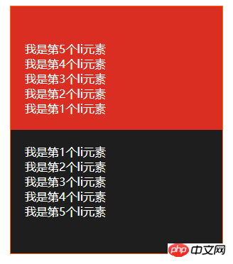
Due to the company’s business requirements, it is necessary to achieve the effect of the red area in the following picture:


Effect description:
1. The data in the red area needs to be inverted (that is, counting from the bottom, the numbers are 1, 2, 3, 4, 5) and displayed at the bottom
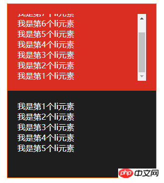
2. When there is too much data, a scroll bar needs to be displayed. **And the scroll bar needs to be pulled to the bottom**
3. Data is pushed from websocket, and the push interval is tens of milliseconds
4. It needs to be compatible with IE10 and above browsers
Use flex Layout implementation
<style>
    *{
        margin: 0;
        padding: 0;
        box-sizing: border-box;
    }
    .container{
        position: relative;
        width: 300px;
        height: 500px;
        margin: 10px auto;
        border: 1px solid #f60;
        color: #fff;
    }
    .top,
    .bottom{
        height: 50%;
        padding: 20px;
    }
    .top{
        background-color: #da2e22;
    }
    .top>ul{
        width: 100%;
        height: 100%;
        overflow: auto;
    }
    .bottom{
        overflow: auto;
        background-color: #1e1e1e;
    }
</style><p class="container">
<p class="top">
<ul style="padding-top: 104px;">
<li>我是第1个li元素</li>
<li>我是第2个li元素</li>
<li>我是第3个li元素</li>
<li>我是第4个li元素</li>
<li>我是第5个li元素</li>
</ul>
</p>
<p class="bottom">
<ul>
<li>我是第1个li元素</li>
<li>我是第2个li元素</li>
<li>我是第3个li元素</li>
<li>我是第4个li元素</li>
<li>我是第5个li元素</li>
</ul>
</p>
</p>Using flex layout is currently the best solution. The sub-element layout is still laid out in the order of 1, 2, 3, 4, 5. The browser will automatically reverse it when rendering. Come over, and the scroll bar will be reversed, that is, it will be automatically positioned at the bottom. But IE10 does not support it so far~, so it cannot be used in this project I am working on, so I have to find another way.
Use padding-top to achieve
<style>
    *{
        margin: 0;
        padding: 0;
        box-sizing: border-box;
    }
    .container{
        position: relative;
        width: 300px;
        height: 500px;
        margin: 10px auto;
        border: 1px solid #f60;
        color: #fff;
    }
    .top,
    .bottom{
        height: 50%;
        padding: 20px;
    }
    .top{
        background-color: #da2e22;
    }
    .top>ul{
        width: 100%;
        height: 100%;
        overflow: auto;
    }
    .bottom{
        overflow: auto;
        background-color: #1e1e1e;
    }
</style><p class="container">
<p class="top">
<ul style="padding-top: 104px;">
<li>我是第1个li元素</li>
<li>我是第2个li元素</li>
<li>我是第3个li元素</li>
<li>我是第4个li元素</li>
<li>我是第5个li元素</li>
</ul>
</p>
<p class="bottom">
<ul>
<li>我是第1个li元素</li>
<li>我是第2个li元素</li>
<li>我是第3个li元素</li>
<li>我是第4个li元素</li>
<li>我是第5个li元素</li>
</ul>
</p>
</p>Using padding-top is the easiest way to think of it, but it cannot be implemented with pure css, it must also be used js can be used for calculations. At the beginning of my project, I implemented padding-top js calculations. This way of implementation just felt uncomfortable. Every time a piece of data is pushed to the websocket, calculations must be performed. So is there a better way? The answer is definitely yes. There are always unexpected surprises in the CSS world. The key is to have strong internal skills.
Use table-cell to achieve
<style>
    *{
        margin: 0;
        padding: 0;
        box-sizing: border-box;
    }
    .container{
        position: relative;
        width: 300px;
        height: 500px;
        margin: 10px auto;
        border: 1px solid #f60;
        color: #fff;
    }
    .top,
    .bottom{
        height: 50%;
        padding: 20px;
        overflow: auto;
    }
    .top{
        background-color: #da2e22;
    }
    .top-container{
        display: table;
        width: 100%;
        height: 100%;
    }
    .top-container>ul{
        display: table-cell;
        vertical-align: bottom;
        width: 100%;
        height: 100%;
    }
    .bottom{
        background-color: #1e1e1e;
    }
</style><p class="container">
<p class="top">
<p class="top-container">
<ul>
<li>我是第1个li元素</li>
<li>我是第2个li元素</li>
<li>我是第3个li元素</li>
<li>我是第4个li元素</li>
<li>我是第5个li元素</li>
</ul>
</p>
</p>
<p class="bottom">
<ul>
<li>我是第1个li元素</li>
<li>我是第2个li元素</li>
<li>我是第3个li元素</li>
<li>我是第4个li元素</li>
<li>我是第5个li元素</li>
</ul>
</p>
</p>Using table-cell to achieve bottom alignment is currently the final solution, and it is also compatible with ie8. The bottom alignment problem has been solved. The problem of "the scroll bar needs to be pulled to the bottom" cannot be realized using table-cell. I have no choice but to use js to control it. I wonder if any master has other methods~
CSS’s table and table-cell layout can achieve many special effects. For details, you can read Zhang Xinxu’s Several Displays I Know: Table-cell Applications
Summary: That’s it for this article The entire content of the article is hoped to be helpful to everyone's study. For more related tutorials, please visit CSS Video Tutorial!
Related recommendations:
php public welfare training video tutorial
The above is the detailed content of Sample code for multiple ways to achieve bottom alignment with CSS. For more information, please follow other related articles on the PHP Chinese website!

Hot AI Tools

Undresser.AI Undress
AI-powered app for creating realistic nude photos

AI Clothes Remover
Online AI tool for removing clothes from photos.

Undress AI Tool
Undress images for free

Clothoff.io
AI clothes remover

AI Hentai Generator
Generate AI Hentai for free.

Hot Article

Hot Tools

Notepad++7.3.1
Easy-to-use and free code editor

SublimeText3 Chinese version
Chinese version, very easy to use

Zend Studio 13.0.1
Powerful PHP integrated development environment

Dreamweaver CS6
Visual web development tools

SublimeText3 Mac version
God-level code editing software (SublimeText3)

Hot Topics
 1377
1377
 52
52
 How to use bootstrap button
Apr 07, 2025 pm 03:09 PM
How to use the Bootstrap button? Introduce Bootstrap CSS to create button elements and add Bootstrap button class to add button text
 How to resize bootstrap
Apr 07, 2025 pm 03:18 PM
To adjust the size of elements in Bootstrap, you can use the dimension class, which includes: adjusting width: .col-, .w-, .mw-adjust height: .h-, .min-h-, .max-h-
 How to write split lines on bootstrap
Apr 07, 2025 pm 03:12 PM
There are two ways to create a Bootstrap split line: using the tag, which creates a horizontal split line. Use the CSS border property to create custom style split lines.
 How to view the date of bootstrap
Apr 07, 2025 pm 03:03 PM
Answer: You can use the date picker component of Bootstrap to view dates in the page. Steps: Introduce the Bootstrap framework. Create a date selector input box in HTML. Bootstrap will automatically add styles to the selector. Use JavaScript to get the selected date.
 How to set up the framework for bootstrap
Apr 07, 2025 pm 03:27 PM
To set up the Bootstrap framework, you need to follow these steps: 1. Reference the Bootstrap file via CDN; 2. Download and host the file on your own server; 3. Include the Bootstrap file in HTML; 4. Compile Sass/Less as needed; 5. Import a custom file (optional). Once setup is complete, you can use Bootstrap's grid systems, components, and styles to create responsive websites and applications.
 How to insert pictures on bootstrap
Apr 07, 2025 pm 03:30 PM
There are several ways to insert images in Bootstrap: insert images directly, using the HTML img tag. With the Bootstrap image component, you can provide responsive images and more styles. Set the image size, use the img-fluid class to make the image adaptable. Set the border, using the img-bordered class. Set the rounded corners and use the img-rounded class. Set the shadow, use the shadow class. Resize and position the image, using CSS style. Using the background image, use the background-image CSS property.
 How to verify bootstrap date
Apr 07, 2025 pm 03:06 PM
To verify dates in Bootstrap, follow these steps: Introduce the required scripts and styles; initialize the date selector component; set the data-bv-date attribute to enable verification; configure verification rules (such as date formats, error messages, etc.); integrate the Bootstrap verification framework and automatically verify date input when form is submitted.
 How to use bootstrap in vue
Apr 07, 2025 pm 11:33 PM
Using Bootstrap in Vue.js is divided into five steps: Install Bootstrap. Import Bootstrap in main.js. Use the Bootstrap component directly in the template. Optional: Custom style. Optional: Use plug-ins.


