This article introduces three commonly used encryption and decryption algorithms in PHP. It has certain reference value. Friends in need can refer to it. I hope it will be helpful to you.
Preface
As a front-end engineer, we must not only be able to develop on the PC side, but also on the mobile side, and now the mobile side It occupies the main traffic, so it is even more necessary to master the skills of mobile terminal development.
So what are the requirements for mobile terminal development, and what is the effect we want?
Adaptive. Yes, the effect we want should be that the elements on the web page can change year-on-year as the window size changes.
Suppose we get a 750px wide design drawing with an element on it that is 75px wide. When this page appears on a device that is only 540px wide, the element must be 54px wide.
If you use a fixed length unit like px, you know what will happen on devices of different sizes. I don’t need to tell you.
There are now a wide variety of mobile phone models, including mainstream mobile phones iPhone6/7/8 4.7 inches, iPhone6/7/8 Plus 5.5 inches, iPhoneX 5.8 inches, etc.
So how do we make these mobile phones with different sizes show the effect we want?
Solution
There are actually many solutions to solve the problem of mobile terminal adaptation.
1. Percentage
It is easy to think that percentage can achieve self-adaptation, but percentage is very limited.
On a web page, there is an element that occupies half of the width of the web page. You can easily think of width: 50%.
But if this element appears in a situation where you don’t know how many px it is from the left edge of the page, you won’t be able to see what percentage it occupies at once. At this time, you have to measure and calculate the proportion. If the element is very If there are more, it will be quite troublesome.
However, the real drawback to using percentages is font size and element height.
The font size cannot be adjusted through percentage.
The same goes for the height of the element. Generally, mobile pages do not know the height and can scroll down infinitely with the content. The height of the element is difficult to calculate by percentage.
2. Media query (@media)
Using multiple sets of CSS can also achieve mobile adaptation.
But the most suitable scenario for media queries is when a web page is one form of presentation on the PC side and another form of presentation on the mobile side.
If a purely mobile webpage (only considering mobile devices and not PC devices) uses media queries, there will be multiple sets of CSS for different models, and the code will be quite lengthy.
3.vw
vw is a CSS length unit and a relative unit.
represents the relative viewport width (Viewport Width), 1vw = 1% * viewport width, 100vw is equal to the screen width.
Its adaptive effect is very good, but its current compatibility is not good, especially in an environment where mobile browsers have many compatibility issues, it seems particularly inappropriate here, so it is not recommended.
4.rem
rem is also a CSS length unit and a relative unit.
It is relative to the value of font-size under the root element (), 1rem = the value of font-size under html.
This unit can be said to combine the advantages of relative size and absolute size. Through it, you can adjust all font sizes proportionally by modifying only the root element, and you can Avoid the chain reaction of compounding font sizes layer by layer.
Currently, all browsers except IE8 and earlier versions support rem.
viewport
Before actually using it, I must introduce the element tag.
Presumably, in every mobile page, there is such a piece of code:
<meta name="viewport" content="width=device-width, initial-scale=1.0, minimum-scale=1.0, maximum-scale=1.0, user-scalable=no">
This code means to make the width of the viewport (viewport) equal to the width of the device, and the initial scaling ratio is 1, the minimum zoom ratio is 1, the maximum zoom ratio is 1, and the user is prohibited from zooming. The content of content is configurable.
The mobile browser will place the web page in a viewport.
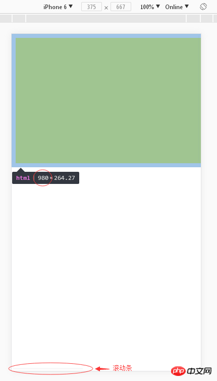
By default, the viewport on the mobile device is larger than the browser's visible area,
So Scroll bars generally appear in order to properly display websites designed for PCs on mobile devices. The browsers on mobile devices will set their default viewport to 980px or other values.
Like the following, simulate the mobile browser without writing :

So we must use the element To limit the size and scaling of the viewport, generally we are equal to the width of the device.
The element must be used. Another point is related to rem.
As mentioned above, rem is a relative unit, relative to the value of font-size under the html element.
If the font-size value under the html element can change as the size of the page changes, then rem can also make corresponding changes.
所以,如果没有加上元素标签这一段代码,在不同机型大小下,html元素下的font-size的值是一直不变的,因为viewport不变,一直保持980px。
使用
“假如我们拿到一张750px宽的设计图,上面有一个元素是75px宽,当这张页面出现在只有540px宽的设备上,这个元素就得是54px宽。”
我们说过达到这种移动端自适应的效果最好的方法是使用rem单位。
因为1rem = html下font-size的值,如果html下font-size的值能随着页面的大小改变而改变,我们在代码写的rem就不用改变。
先约定1rem = 50px,如750px页面,75px元素,那么元素的width我们在代码中设置的值就是1.5rem。当页面大小变成540px,1rem = 36px,代码中元素的宽度是1.5rem,所以元素现在在页面的宽度是54px。
好,现在我们就写一段代码来让html下font-size的值能随着页面的大小改变而改变,代码如下:
(function(doc, win){    var docEl = doc.documentElement,
        resizeEvt = 'orientationchange' in window ? 'orientationchange' : 'resize',
        recalc = function () {            var clientWidth = docEl.clientWidth;            if (!clientWidth) return;
            docEl.style.fontSize = 50 * (clientWidth / 750) + 'px';
        };    if (!doc.addEventListener) return;
    win.addEventListener(resizeEvt, recalc, false);
    doc.addEventListener('DOMContentLoaded', recalc, false);
})(document, window);实例
假设我们的设计师给我们一张设计图(嗯,没错!就长这个样子)

这是一张 750*1334 px的设计图,在设计图上量得这个黄色的矩形的长是330px,宽是190px。
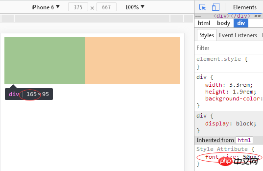
因为一般设计图都是按照iPhone6的二倍图进行设计,所以iPhone6的实际尺寸是 375*667 px,所以黄色矩形的长应是165px,宽是95px,
而且PC端浏览器调试手机模式下iPhone6的尺寸也是 375*667 px。
我们约定1rem = 50px,所以黄色矩形 width: 3.3rem; height: 1.9rem;
我们的设置html下font-size的值的js代码为
// 50是1rem等价于多少px,375是设计稿的宽度,这里我们除以了2docEl.style.fontSize = 50 * (clientWidth / 375) + 'px';
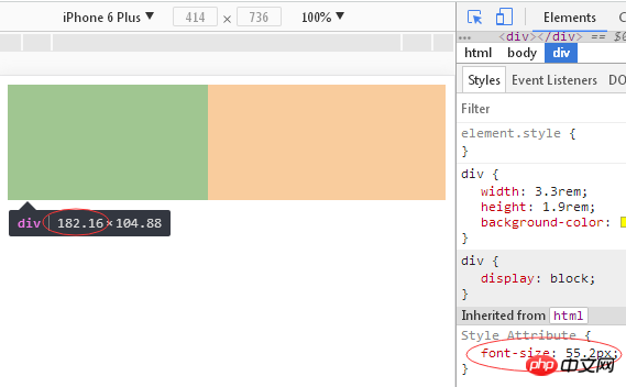
效果:


源码
<meta name="viewport" content="width=device-width, initial-scale=1.0, minimum-scale=1.0, maximum-scale=1.0, user-scalable=no">rem <script> (function(doc, win){ var docEl = doc.documentElement, resizeEvt = 'orientationchange' in window ? 'orientationchange' : 'resize', recalc = function () { var clientWidth = docEl.clientWidth; if (!clientWidth) return; docEl.style.fontSize = 50 * (clientWidth / 375) + 'px'; }; if (!doc.addEventListener) return; win.addEventListener(resizeEvt, recalc, false); doc.addEventListener('DOMContentLoaded', recalc, false); })(document, window); </script>
额外概念
在为写这篇博客上网查资料的过程中,总结了几个与移动端开发相关的概念。
1.物理像素physical pixel
一个物理像素是显示器上最小的物理显示单位。
2.设备独立像素(也叫密度无关像素、css像素、逻辑像素)
device independent pixels(dips)
一种物理测量单位,基于计算机控制的坐标系统和抽象像素(虚拟像素),由底层系统的程序使用,转换为物理像素的应用。
3.设备像素比device pixel ratio(dpr)
定义了物理像素和设备独立像素的对应关系。
公式:设备像素比 = 物理像素 / 设备独立像素 (该值也是平时手机说的几倍屏几倍屏的值)
4.分辨率
比如图片是由1280个像素* 720个像素组成。
5.PPI(每英寸所拥有的像素)
PPI是用来描述屏幕的像素显示密度。
6.DPI(每英寸打印的点数)
DPI表示每英寸打印的点数。
总结:以上就是本篇文的全部内容,希望能对大家的学习有所帮助。更多相关教程请访问 CSS视频教程!
相关推荐:
The above is the detailed content of Front-end mobile development uses rem to achieve adaptive effects. For more information, please follow other related articles on the PHP Chinese website!