 Web Front-end
 CSS Tutorial
 How to use CSS to achieve the animation effect of stars in front of your eyes (source code attached)
How to use CSS to achieve the animation effect of stars in front of your eyes (source code attached)
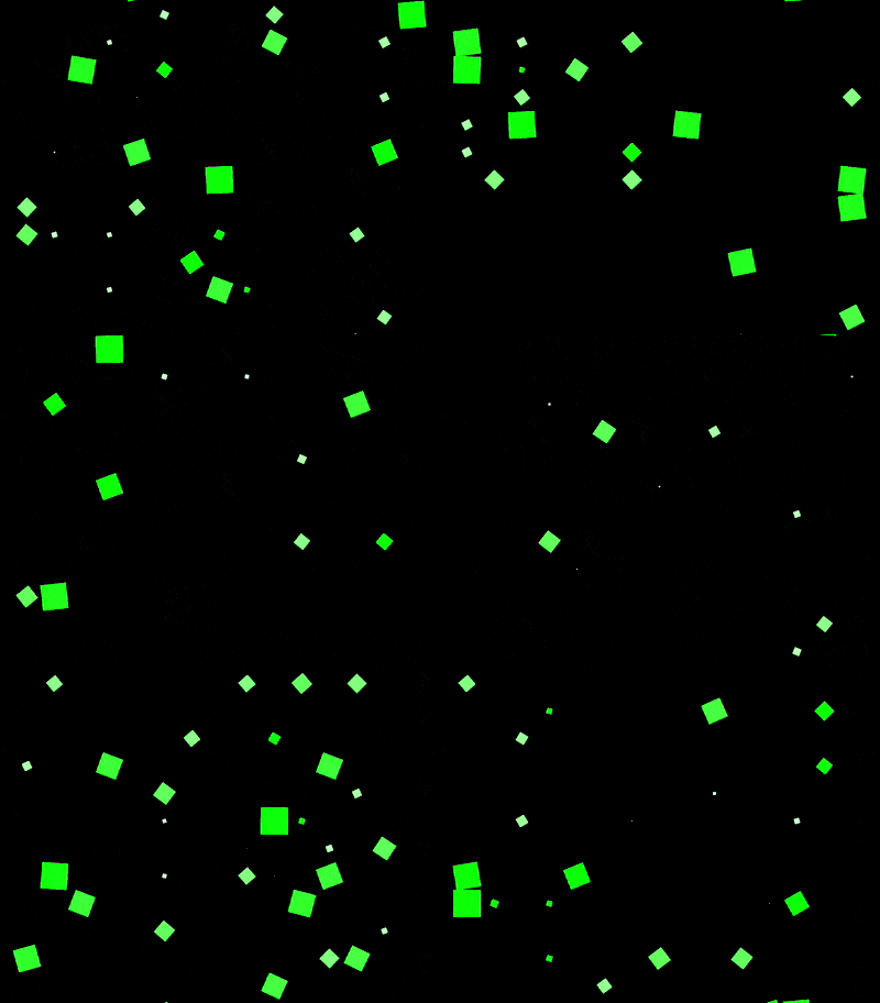
The content of this article is about how to use CSS to achieve the animation effect of seeing stars (with source code). It has certain reference value. Friends in need can refer to it. I hope it will be useful to you. helped.
Effect preview

Source code download
https://github.com/comehope/front- end-daily-challenges
Code interpretation
Define dom, the container contains 9 sub-elements:
<div>
    <span></span>
    <span></span>
    <span></span>
    <span></span>
    <span></span>
    <span></span>
    <span></span>
    <span></span>
    <span></span>
</div>
Centered display:
body {
    margin: 0;
    height: 100vh;
    display: flex;
    align-items: center;
    justify-content: center;
    background-color: black;
}Set the container neutron The elements are laid out to form a 3 * 3 grid, where --columns is the number of child elements on each side of the grid:
.container {
    display: grid;
    --columns: 3;
    grid-template-columns: repeat(var(--columns), 1fr);
}Define the child element style:
.container span {
    width: 25px;
    height: 25px;
    color: lime;
    background-color: currentColor;
}Increase the animation effect of child elements. The total animation duration is 5 seconds, of which the first second (0% ~ 20%) is animated, and the remaining 4 seconds (20% ~ 100%) are static:
.container span {
    transform: scale(0);
    animation: spin 5s linear infinite;
}

@keyframes spin {
    0% {
        transform: rotate(0deg) scale(1);
    }

    5%, 15% {
        transform: rotate(90deg) scale(0);
        background: white;
    }

    17.5% {
        transform: rotate(180deg) scale(1);
        background-color: currentColor;
    }

    20%, 100% {
        transform: rotate(90deg) scale(0);
    }
}Set the animation delay so that the animation of each sub-element is randomly delayed for any time within 4 seconds:
.container span {
    animation-delay: calc(var(--delay) * 1s);
}

.container span:nth-child(1) { --delay: 0.8 }
.container span:nth-child(2) { --delay: 0.2 }
.container span:nth-child(3) { --delay: 1.9 }
.container span:nth-child(4) { --delay: 3.9 }
.container span:nth-child(5) { --delay: 2.8 }
.container span:nth-child(6) { --delay: 3.5 }
.container span:nth-child(7) { --delay: 1.5 }
.container span:nth-child(8) { --delay: 2.3 }
.container span:nth-child(9) { --delay: 1.7 } At this point, the static effect is completed, and then the dom elements are processed in batches.
Introduce the d3 library:
<script></script>
Delete the --columns variable declaration in the css file, and use d3 to assign values to the variables:
const COLUMNS = 3;

d3.select('.container')
.style('--columns', COLUMNS);Delete the html file The <span></span> sub-element is dynamically generated using d3:
d3.select('.container')
    .style('--columns', COLUMNS)
    .selectAll('span')
    .data(d3.range(COLUMNS * COLUMNS))
    .enter()
.append('span');Delete the --delay variable declaration in the css file and use d3 to generate random variables. Number:
d3.select('.container')
    .style('--columns', COLUMNS)
    .selectAll('span')
    .data(d3.range(COLUMNS * COLUMNS))
    .enter()
    .append('span')
.style('--delay', () => Math.random() * 4);Finally, change the side length to 15 to generate more sub-elements and enhance the visual effect:
const COLUMNS = 15;
The above is the detailed content of How to use CSS to achieve the animation effect of stars in front of your eyes (source code attached). For more information, please follow other related articles on the PHP Chinese website!

Hot AI Tools

Undresser.AI Undress
AI-powered app for creating realistic nude photos

AI Clothes Remover
Online AI tool for removing clothes from photos.

Undress AI Tool
Undress images for free

Clothoff.io
AI clothes remover

AI Hentai Generator
Generate AI Hentai for free.

Hot Article

Hot Tools

Notepad++7.3.1
Easy-to-use and free code editor

SublimeText3 Chinese version
Chinese version, very easy to use

Zend Studio 13.0.1
Powerful PHP integrated development environment

Dreamweaver CS6
Visual web development tools

SublimeText3 Mac version
God-level code editing software (SublimeText3)

Hot Topics
 Table Border in HTML
Sep 04, 2024 pm 04:49 PM
Guide to Table Border in HTML. Here we discuss multiple ways for defining table-border with examples of the Table Border in HTML.
 Nested Table in HTML
Sep 04, 2024 pm 04:49 PM
This is a guide to Nested Table in HTML. Here we discuss how to create a table within the table along with the respective examples.
 HTML margin-left
Sep 04, 2024 pm 04:48 PM
Guide to HTML margin-left. Here we discuss a brief overview on HTML margin-left and its Examples along with its Code Implementation.
 HTML Table Layout
Sep 04, 2024 pm 04:54 PM
Guide to HTML Table Layout. Here we discuss the Values of HTML Table Layout along with the examples and outputs n detail.
 Moving Text in HTML
Sep 04, 2024 pm 04:45 PM
Guide to Moving Text in HTML. Here we discuss an introduction, how marquee tag work with syntax and examples to implement.
 HTML Ordered List
Sep 04, 2024 pm 04:43 PM
Guide to the HTML Ordered List. Here we also discuss introduction of HTML Ordered list and types along with their example respectively
 HTML onclick Button
Sep 04, 2024 pm 04:49 PM
Guide to HTML onclick Button. Here we discuss their introduction, working, examples and onclick Event in various events respectively.
 HTML Input Placeholder
Sep 04, 2024 pm 04:54 PM
Guide to HTML Input Placeholder. Here we discuss the Examples of HTML Input Placeholder along with the codes and outputs.


