What is CSS stacking context? what's the effect?
This article brings you what is CSS stacking context? what's the effect? It has certain reference value. Friends in need can refer to it. I hope it will be helpful to you.
What is CSS stacking context?
We have a basic style div, the style is as follows:
div{
    width: 200px;
    height: 200px;
    border:10px solid red;
    padding:15px;
    margin:12px;
}The effect is as follows:

A question here is: What is the relationship between border and background?
There are two options here:
Parallel
border closer to the user
background closer to users
Which one will you choose?
In fact, it is very simple to understand this. We only need to set the border to semi-transparent to know the answer
border:10px solid rgba(255, 0, 0, 0, .3);

It can be seen from the running results that red shows green, so the border is closer to the user. At this time, you will know that the div is not flat, but also has a hierarchical relationship on the vertical screen. Then this hierarchical relationship is called stacking Stacking context.
Then we write 'Hello, world' inside the div, the effect is as follows:

Another question arises here , which layer is this 'Hello, world' on? Is it on the border or between the border and the background?
Here we only need to move 'Hello' to the border to know the reason. So how to move the text there? Here we use text-indent, the style is as follows:
div{
  width: 200px;
  height: 200px;
  border:10px solid rgb(255, 0, 0);
  padding:15px;
  margin:12px;
  background-color: green;
  text-indent: -20px;
}The effect is as follows:
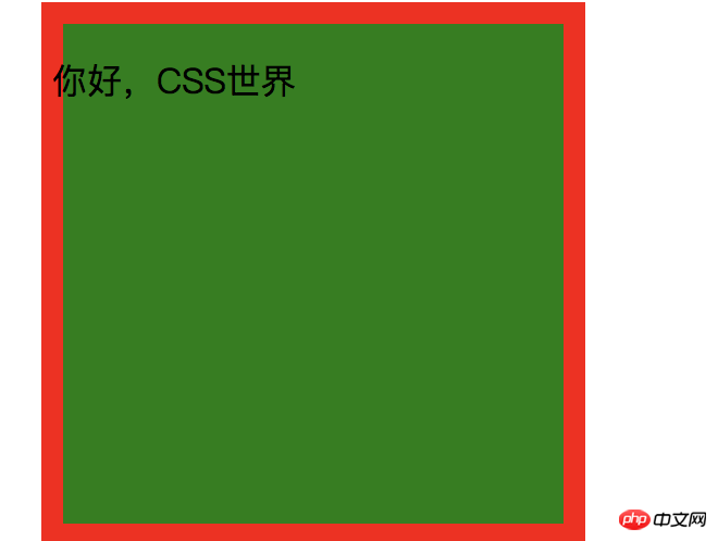
You can see from the running effect that the text is above the border, so the text area (inline element) is closer to the user
What if there is another div inside the div? The code structure is as follows:
 // html
  <div>
    你好,CSS世界
    <div></div>
  </div>
    // css
   .parent{
      width: 200px;
      height: 200px;
      border:10px solid rgb(255, 0, 0);
      padding:15px;
      margin:12px;
      background-color: green;
      text-indent: -20px;
    }
    .child{
      height: 20px;
      background:purple;
}The effect is as follows:

Note that position cannot be used here because in order to change the hierarchical structure, we only need to use margin-top, such as:
margin-top:-20px;

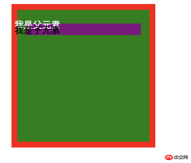
So there is another small conclusion here: what appears after the text area will overwrite what appears before it.
Floating elements Come to a basic structure: // html
<div>
你好
<div>
</div>
</div>
// css
.parent{
width: 200px;
height: 200px;
border:10px solid rgb(255, 0, 0);
padding:15px;
margin:12px;
background-color: green;
color: aliceblue;
}
.float{
height: 40px;
width: 40px;
background:purple;
float: left;
}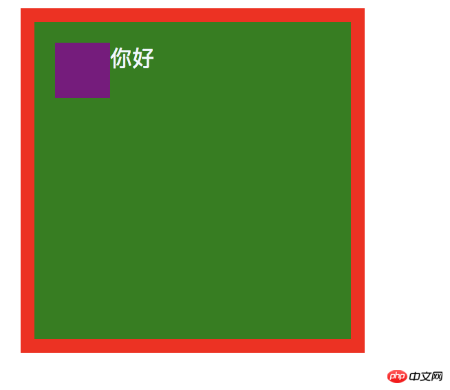 ## I won’t explain the above code. I’m sure you all know it? According to the above routine, the same question is still here: Are you better at the top or this float element?
To verify this problem, also use text-indent to move the text to the left. Here I directly apply the effect:
 # #From the renderings, we can conclude that the text area is above the floating cloud element.
那浮动元素是在 文字区域与内部块级元素之间呢,还是内部块级与border元素之间呢?换句话说就是 浮动元素与块级元素哪个离用户更近?
我们直接在父级元素写一个 child:
    // hmtl
  <div>
      你好
    <div></div>
    <div></div>
  </div>

  // css

 .child{
  height: 20px;
  background: black;
}效果如下:

从上可以看出浮云元素盖住了 child元素,说明浮动元素的层级是比块级元素高的。即浮动元素是在文字区域与块级元素之间的。
那浮动元素里面的文字与外面的文字是怎么样的呢?这边我直接在浮动里面加了 float文字,效果如下:
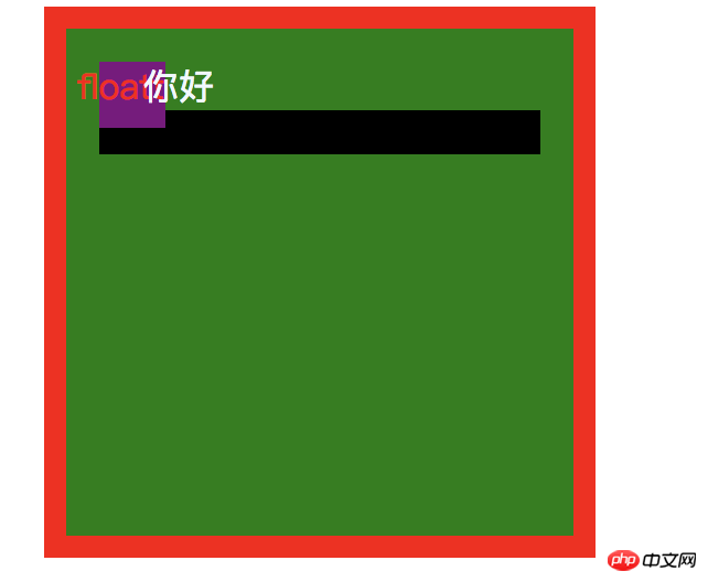
你会发现 浮动里面的文字是盖不住浮动外面文字的。
绝对定位元素
在上面的基础上我们增加一个 relative 元素,如下:
  // htmk
  <div>
      你好
    <div>floatt</div>
    <div></div>
    <div></div>
  </div>

 // css
.relative{
  width: 100px;
  height: 100px;
  background: pink;
  margin-top: -15px;
}效果如下:

这时我们给类relative 加上一个:
position:relative;
效果如下:

你会发现 relative 元素盖住了浮动元素,这说明 给元素加一个 relative 定位会增加对应的一个层级。检查 relative 元素,会看到:

加了 position:relative定位会多了一个 z-index:auto 的东西,实际上你定位,都是按z-index来计算的。
这里我们给没有定位的 child元素加上一个z-index:
  <div>
      你好
    <div>floatt</div>
    <div></div>
    <div></div>
  </div>
效果如下:
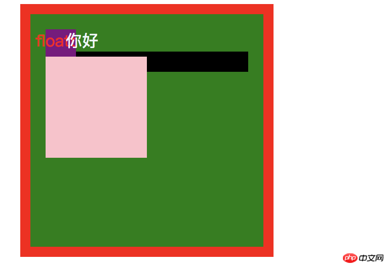
你会发现 child 元素并没有盖住 relative 元素!
这边直接 给了结论了:z-index 只有在 position:relative|absolute才有效果,如果都是relative,z-index一样,那么后面会盖前面,z-index值大的会盖住小的。
我们接着在原有上加一个relative2,样式如下:
.relative2{
  width: 100px;
  height: 150px;
  background: gold;
  margin-top: -15px;
  position: relative;
}效果如下:
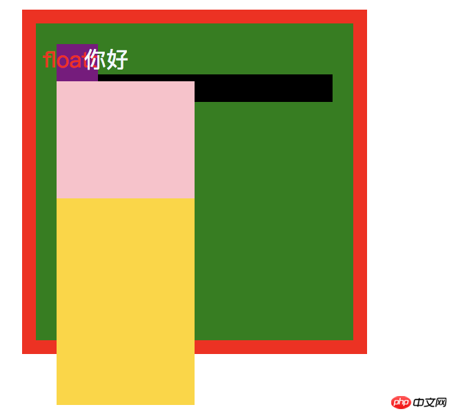
此时给 relative2 加上一个 z-index:-1,在看
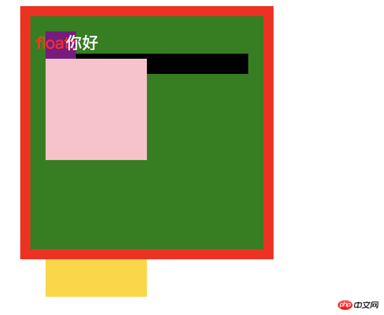
又得出一个结论:z-index为负值时,是位于 background下面的
这时,我们给.parent元素添加以下两个样式:
  position: relative;
  z-index: 0;
这时的效果如下:
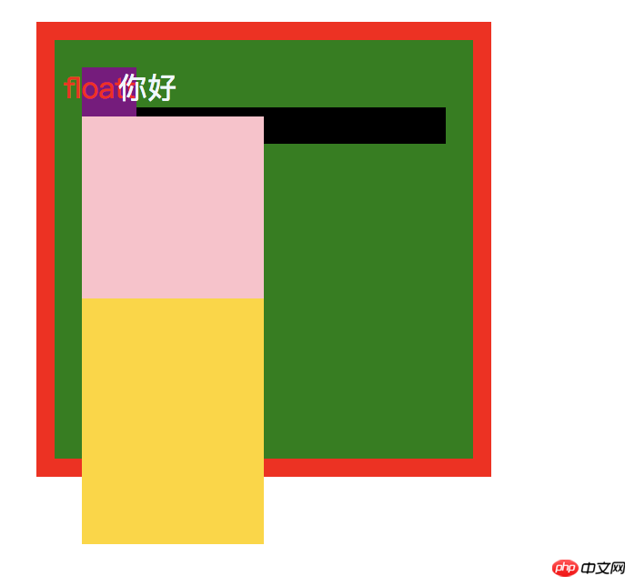
这时奇怪的事情就出现了,z-index: -1 的跑到上面来了。
MDN上有对什么堆叠给出了一些内容,如下 :
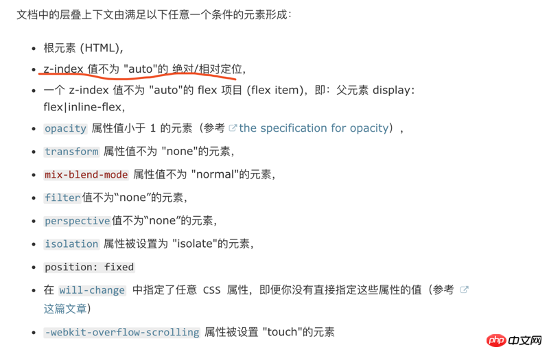
其实我们给.parent元素设置z-index:0 ,根据MDN说的,我们其实已经 创造一个层叠上下文 。
那什么是堆叠上下文?下面是张鑫旭一段原文:

其实这跟美国一个大法官说的一句话很像:我不知道什么色情,但当我看到它是我就知道什么是色情。
CSS堆叠上下文也是类似的道理,你很难说出什么是CSS堆叠上下文,但只要它满足MDN列出的几种情况,它就是CSS堆叠上下文。
CSS堆叠层叠顺序
CSS堆叠上下文是有一个垂直屏幕上有一个上关系的,它们的关系如下:

所以这就解释为什么z-index为负值的时候,它会在 background上面,因为我们 z-index:0 时就创建一个CSS堆叠上下文。
CSS堆叠上下文作用
下面给一个基本的内容:
   // html
  <div>
    <div>a
      <div>a1</div>
    </div>
    <div>b
      <div>b1</div>
    </div>
  </div>
  // css
 .parent{
  width: 200px;
  height: 200px;
  border:10px solid rgb(255, 0, 0);
  padding:15px;
  margin:12px;
  background-color: green;
}
.relative{
  width:100px;
  height:100px;
  background: orange;
  position: relative;
  border:1px solid red;
}
.a1{
  position: relative;
  background:green;
}
.b1{
  position: relative;
  background:red;
}效果如下:

接着我们在b1在添加以下样式:
margin-top: -90px;

b1会盖住a1,这个我们应该知道是什么原因了吧?因为a1 b1都是块级元素,后面会盖住前面的,没毛病!
那么 a1 和 b1 的CSS堆叠上下文是谁?
我们可以MDN给出的第一句:

根元素,所以a1 和 b1的CSS堆叠上下文就是Html
接着给a1以下样式:
z-index: 2;
接着给b1以下样式:
z-index: 0;
效果如下:
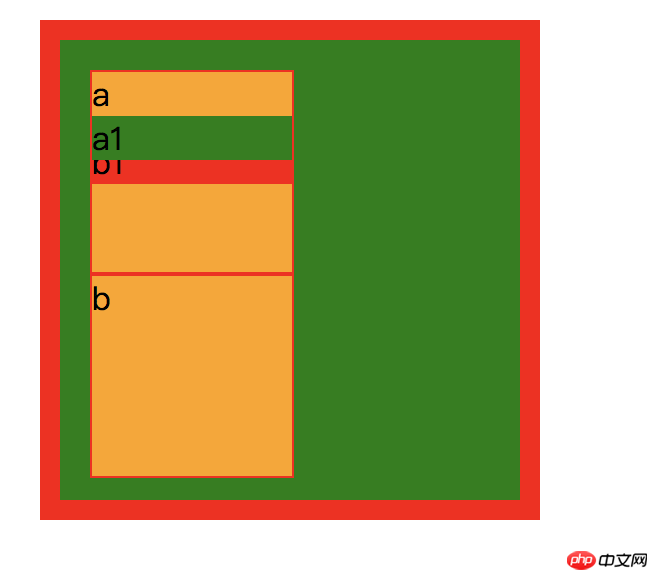
a1跑到b1上面了,这个很好理解,因为 a1 的z-index:2 比 b1的z-index:0 在,所以a1在上面。
现在有一个问题,a1是永远盖住b1吗?
这边你可能会说,a1 的z-index:2比 b1的 z-index:0 永远都大,当然会盖住b1呀!是这样吗?我们试着改变一下CSS堆叠上下文。
我们分别给a 和 b各做一个CSS堆叠上下文: 如下:
.a{
  position: relative;
  z-index: 1;
}
.b{
  position: relative;
  z-index: 1;
}效果如下:

先分析a 和 b它们是谁覆盖谁,因为 两个定位和z-index都一样所以 b 会覆盖 a。还有一个现象有没有发现, b1 盖住了 a1? 明明 a1 的 z-index 大于 b1,这是为什么?为什么小的会盖住大的?为什么?
因为 b 比 a 高一点,所以 b 里面的内容都会比 a 高一点。这就是 CSS堆叠上下文一个特性。
比如说阿里巴巴有一个奇怪的部门叫做政委,是由马云等一些创始人组成的。在这个部门里面,你是不是都比其它部门要高级点。
所以 b1 虽然在 b 里面等级为0,在 b 是高级的一个部门,就是可以压过你 a 这个部门里面的 2 级的人。
The above is the detailed content of What is CSS stacking context? what's the effect?. For more information, please follow other related articles on the PHP Chinese website!

Hot AI Tools

Undresser.AI Undress
AI-powered app for creating realistic nude photos

AI Clothes Remover
Online AI tool for removing clothes from photos.

Undress AI Tool
Undress images for free

Clothoff.io
AI clothes remover

AI Hentai Generator
Generate AI Hentai for free.

Hot Article

Hot Tools

Notepad++7.3.1
Easy-to-use and free code editor

SublimeText3 Chinese version
Chinese version, very easy to use

Zend Studio 13.0.1
Powerful PHP integrated development environment

Dreamweaver CS6
Visual web development tools

SublimeText3 Mac version
God-level code editing software (SublimeText3)

Hot Topics
 Dynamic web page elements XPath and Class names change frequently. How to stably crawl the target a tag?
Apr 01, 2025 pm 04:12 PM
Dynamic web element crawling problem: dealing with XPath and Class name changes, many crawler developers will encounter a difficult problem when crawling dynamic web pages: the goal...
 Is Debian Strings compatible with multiple browsers
Apr 02, 2025 am 08:30 AM
"DebianStrings" is not a standard term, and its specific meaning is still unclear. This article cannot directly comment on its browser compatibility. However, if "DebianStrings" refers to a web application running on a Debian system, its browser compatibility depends on the technical architecture of the application itself. Most modern web applications are committed to cross-browser compatibility. This relies on following web standards and using well-compatible front-end technologies (such as HTML, CSS, JavaScript) and back-end technologies (such as PHP, Python, Node.js, etc.). To ensure that the application is compatible with multiple browsers, developers often need to conduct cross-browser testing and use responsiveness
 How to convert XML to PDF on Android phone?
Apr 02, 2025 pm 09:51 PM
Converting XML to PDF directly on Android phones cannot be achieved through the built-in features. You need to save the country through the following steps: convert XML data to formats recognized by the PDF generator (such as text or HTML); convert HTML to PDF using HTML generation libraries such as Flying Saucer.
 How to solve the problem of style loss after Django project is deployed to Pagoda panel?
Apr 01, 2025 pm 09:09 PM
Detailed explanation of style loss after Django project is deployed to pagoda panel. After deploying Django project to pagoda panel, you may encounter style loss problem. This...
 How to display hidden lines in xml
Apr 02, 2025 pm 11:45 PM
There are two common ways to hide rows in XML: Use the display property in CSS to set to none Use XSLT to skip hidden rows via conditional copying
 How to display the content of the interface with xml
Apr 02, 2025 pm 11:48 PM
XML is widely used to build and manage user interfaces. It defines and displays the interface content through the following steps: Define interface elements: XML uses tags to define interface elements and their properties. Building a hierarchy: XML organizes interface elements according to hierarchical relationships to form a tree structure. Using Stylesheets: Developers use stylesheet languages such as CSS or XSL to specify the visual appearance and behavior of elements. Rendering process: A browser or application uses an XML parser and stylesheet to parse an XML file and render interface elements to make it visible on the screen.
 If you convert XML to PDF on your mobile phone, will the format be messy after conversion?
Apr 02, 2025 pm 10:21 PM
When converting XML to PDF on mobile phone, whether the format is chaotic depends on: 1. The quality of the conversion tool; 2. XML structure and content; 3. Style sheet writing. Specifically, poor conversion tools, messy XML structures, or wrong XSLT code can lead to malformation.
 How to implement a tight transition animation in React using react-transition-group?
Apr 04, 2025 pm 11:27 PM
Using react-transition-group in React to achieve confusion about closely following transition animations. In React projects, many developers will choose to use react-transition-group library to...


